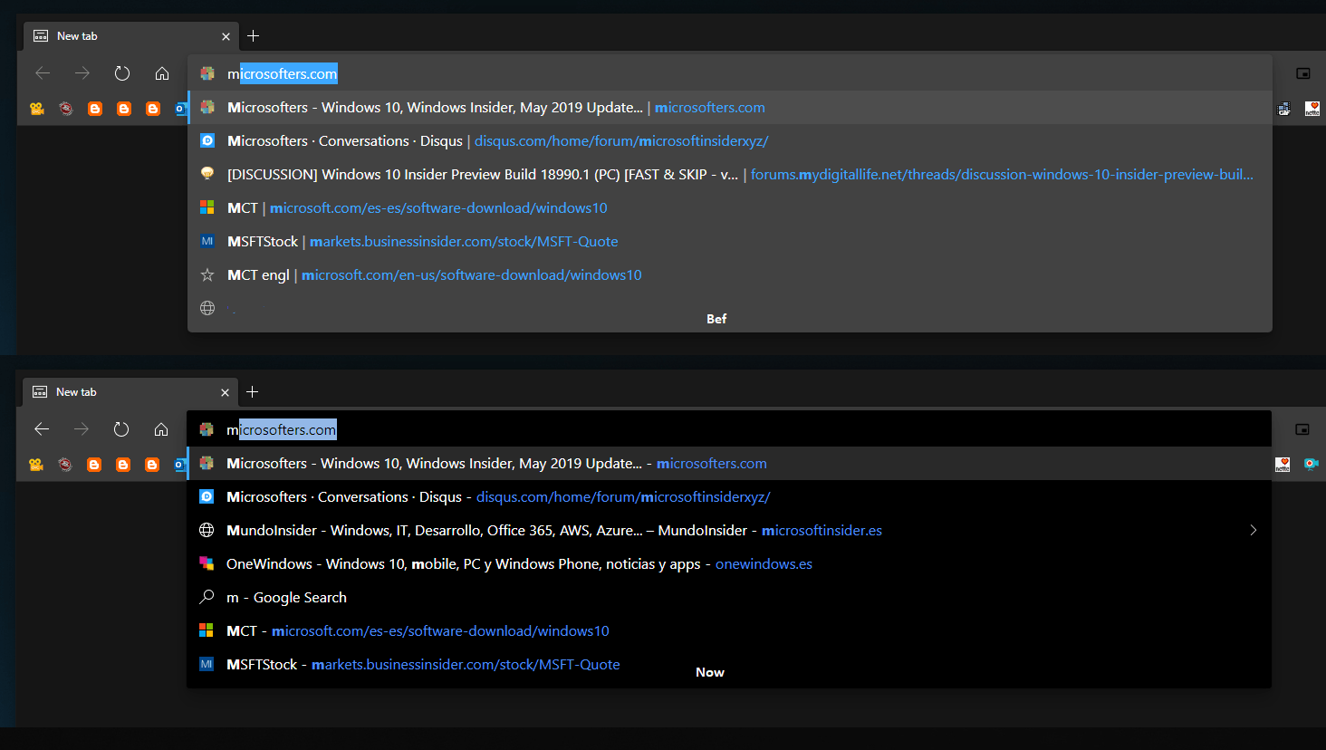
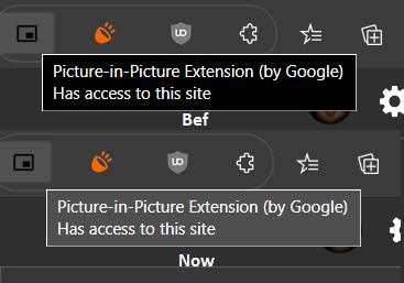
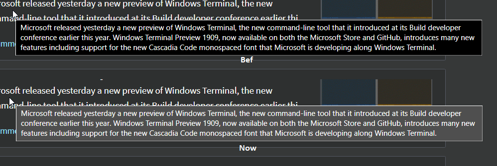
A new update to Microsoft Edge Canary has introduced a small change in the user interface of the browser, bringing a slightly modified color scheme for tooltips and the address bar of the browser.
Advertisеment
Here is how the new address bar looks in Edge 79.0.287.0:


As you can see, the font color is now more readable, especially when you use the dark theme in the browser. The same change has been applied to tooltips. You can see the difference in the following screenshot.


The background color is now slightly dimmed, and the selection color is also less bright to reduce eye strain.

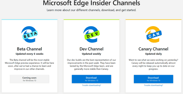
As you may already know, Microsoft is currently using three channels to deliver updates to Edge Insiders. The Canary channel receives updates daily (except Saturday and Sunday), the Dev channel is getting updates weekly, and the Beta channel is updated every 6 weeks. The stable channel is also on its way to users.
Actual Microsoft Edge Versions
The actual pre-release versions of Edge Chromium at the moment of this writing are as follows:
- Beta Channel: 78.0.286.11
- Dev Channel: 79.0.279.0 (see what's new in this build)
- Canary Channel: 79.0.287.0
I have covered many Edge tricks and features in the following post:
Hands-on with the new Chromium-based Microsoft Edge
Also, see the following updates.
- Edge Canary Receives Global Media Controls UI Improvements
- Block Potentially Unwanted Apps For Downloads in Microsoft Edge
- Global Media Controls in Microsoft Edge Receive a Dismiss Button
- Microsoft Edge: New AutoPlay Blocking Options, Updated Tracking Prevention
- Turn Off News Feed on New Tab Page in Microsoft Edge
- Enable Extensions Menu Button in Microsoft Edge Chromium
- Remove Feedback Smiley Button in Microsoft Edge
- Microsoft Edge Will No Longer Support ePub
- Latest Microsoft Edge Canary Features Tab Hover Cards
- Microsoft Edge Now De-Elevates Itself Automatically
- Microsoft Details Edge Chromium Roadmap
- Microsoft Enables Global Media Controls in Microsoft Edge
- How to Use Cloud Powered Voices in Microsoft Edge Chormium
- Microsoft Edge Chromium: Never Translate, Prepopulate Find with Text Selection
- Enable Caret Browsing in Microsoft Edge Chromium
- Enable IE Mode in Chromium Edge
- Stable Update Channel Made its First Appearance for Microsoft Edge Chromium
- Microsoft Edge Chromium Receives an Updated Password Reveal Button
- What are Controlled Feature Roll-outs in Microsoft Edge
- Edge Canary Adds New InPrivate Text Badge, New Sync Options
- Microsoft Edge Chromium: Clear Browsing Data on Exit
- Microsoft Edge Chromium Now Allows Switching Theme
- Microsoft Edge: Support for Windows Spell Checker in Chromium Engine
- Microsoft Edge Chromium: Prepopulate Find with Text Selection
- Microsoft Edge Chromium Gets Tracking Prevention Settings
- Microsoft Edge Chromium: Change Display Language
- Group Policy Templates for Microsoft Edge Chromium
- Microsoft Edge Chromium: Pin Sites To Taskbar, IE Mode
- Microsoft Edge Chromium Will Allow Uninstalling PWAs as Desktop Apps
- Microsoft Edge Chromium Includes YouTube Video Info in Volume Control OSD
- Microsoft Edge Chromium Canary Features Dark Mode Improvements
- Show Icon Only for Bookmark in Microsoft Edge Chromium
- Autoplay Video Blocker is coming to Microsoft Edge Chromium
- Microsoft Edge Chromium is Receiving New Tab Page Customization Options
- Enable Microsoft Search in Microsoft Edge Chromium
- Grammar Tools Are Now Available in Microsoft Edge Chromium
- Microsoft Edge Chromium Now Follows System Dark Theme
- Here’s how Microsoft Edge Chromium looks on macOS
- Microsoft Edge Chromium now installs PWAs in the root of the Start menu
- Enable Translator in Microsoft Edge Chromium
- Microsoft Edge Chromium Dynamically Changes Its User Agent
- Microsoft Edge Chromium Warns When Running as Administrator
- Change Search Engine In Microsoft Edge Chromium
- Hide or Show Favorites Bar in Microsoft Edge Chromium
- Install Chrome Extensions in Microsoft Edge Chromium
- Enable Dark Mode in Microsoft Edge Chromium
- Chrome Features Removed and Replaced by Microsoft in Edge
- Microsoft Released Chromium-based Edge Preview Versions
- Chromium-Based Edge to Support 4K and HD Video Streams
- Microsoft Edge Insider extension now available in Microsoft Store
- Hands-on with the new Chromium-based Microsoft Edge
- Microsoft Edge Insider Addons Page Revealed
- Microsoft Translator is Now Integrated with Microsoft Edge Chromium
Thanks to Leo.
Support us
Winaero greatly relies on your support. You can help the site keep bringing you interesting and useful content and software by using these options:

Actually, the new address bar aka omnibox is a bug. https://techcommunity.microsoft.com/t5/Discussions/The-new-omnibox-is-hideous-and-hard-to-see/m-p/873547
The new appearance of the Aura tooltips are still bad. They should just use native tooltips. You can use dark tooltips by calling File Explorer’s tooltips.
It looks like they increased and decreased the contrast, which is a bit strange. Are all the labels on the images correct? It wasn’t at all a bad looking interface when I last looked at it and compared to the original Chrome, it’s a thing of great beauty.
Leaving Win 10 and Office aside, Microsoft designers usually make things look quite nice in my opinion.