With Windows 10 Fall Creators Update, Microsoft introduced its vision for the future of user interface design. The company started to add more and more Fluent Design elements to its own first-party apps, including the Start menu, Calculator, Maps, Store, Settings and Groove Music. A new version of the Mail app got a refined look with Fluent Design bits in the UI.
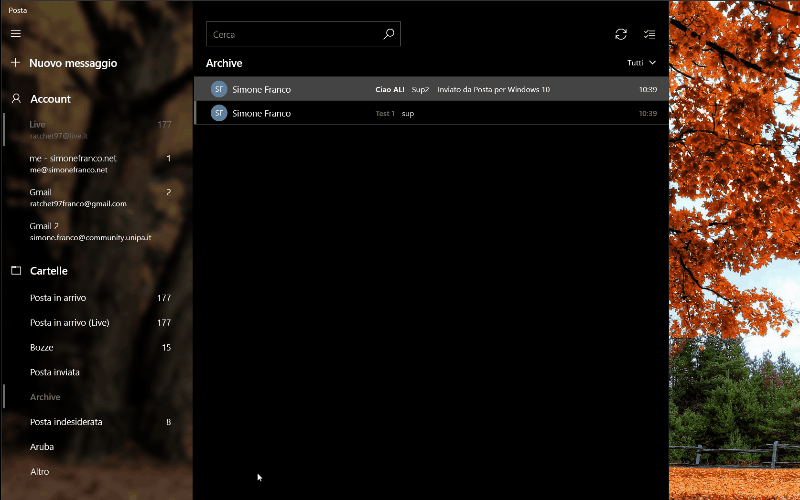
The revamped UI has landed in the Fast Ring for a select group of Windows Insiders with app version 8700.40315. Here is how it looks.
Fluent Design is Windows 10's new UI, previously known by its code name "Project NEON". It is a new design language which is focused on simplicity and consistency along with cool animations. It also adds Windows 7’s Aero Glass-like effects to the Universal app frame and controls.
Tip: You can disable Fluent Design visual effects in Windows 10.
Key aspects of the Microsoft Fluent Design System are as follows.
Material: A graphical solution which emulates the "sensory and invigorating" feel of the materials that things around us are made of.
Motion: A set of animations which give an idea on how to interact with new UI elements like an app menu opening or drawing the user's attention to controls and flyouts which appear on the screen.
Light: Soft highlights of important buttons and features to draw the user's attention.
Depth: Transition animations which make an impression of opening the next level or layer of data presented by the app.
Image and credits: Aggiornamenti Lumia.
Personally, I like the transparency effect applied to the app. What about you? Do you like this change?
Support us
Winaero greatly relies on your support. You can help the site keep bringing you interesting and useful content and software by using these options:

Yes! Bring back Aero glass!
I think I’d have preferred them to fix the faulty Live Tile of Windows Mail, that has never worked properly, and applied some of this ‘design language’ to an app like ‘Settings’ which needs it much more!
Adding fluent design to Mail is akin to putting an evening gown on a scarecrow. Gaudy on the outside but without substance on the inside.
LOL
I personally dislike any design system made to ‘bring the users attention to something”. I don’t want my attention drawn to things… I either know where the thing I want is or I don’t. And if I don’t I’ll go look for it – and then … get this… I’ll REMEMBER where it is! This ‘design philosophy’ being touted by Microsoft to me says, “our OS’s organisation/design is SO bad, that we keep having to remind you where things are”.
I have enough distractions in life and things trying to ‘get my attention’ already. I just want to use my computer to do things with…not constantly be told how clever the Operating System thinks it is… it’s like a child jumping up and down shouting ‘look at me Mum, look at me… Mum look at me… MUMMMMM LOOK AT MEEEEE!” I actually believe that this is harmful to the human psyche – and strangely enough, there are many studies that would back this. As I have reiterated many times – Microsoft didn’t build Windows 10 for its users, it built it for Microsoft. They genuinely seem to believe (because that is how they act) that the $1000 machine I am sat next to, is somehow owned by them – hence why they believe it’s fine to keep distracting me from the ACTUAL work I want to use MY computer for.
Anyway, there’s my twopenneth…