Yesterday, Twitter rolled out a new design for the majority of their users. The new design features rounded corners everywhere: on buttons, on user images, and on borders. Some users like the new design. Others are not happy with this change. Here is a quick hack which will allow you to revert to the old design in Twitter.
Advertisеment
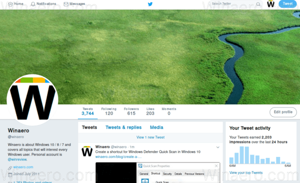
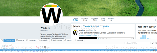
The updated user interface of Twitter looks as follows:
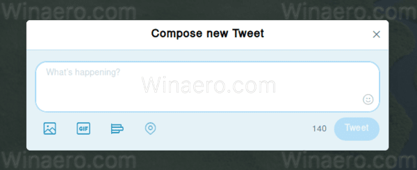
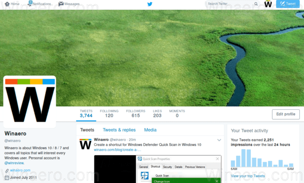
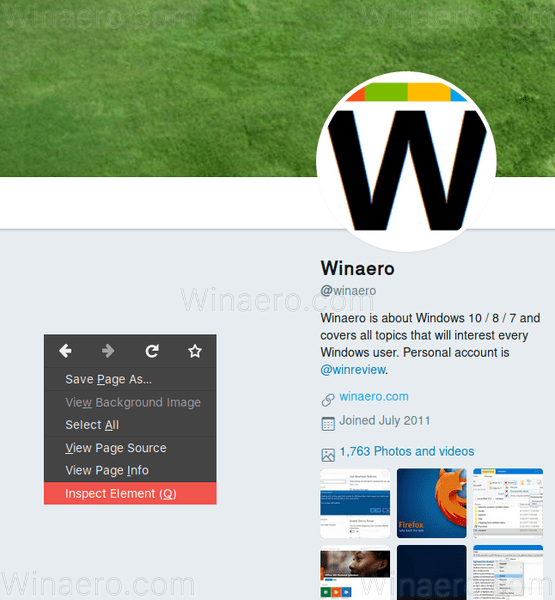
And here is how the old one looks.
To revert the new design of Twitter, you can do the following.
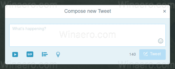
- In your browser, right click the empty space on the left of the Twitter page and select "Inspect element". I am using Firefox:
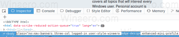
- Navigate to the body node as shown below:
- Delete the "edge-design" portion class from, and the entire design reverts.

To revert Twitter's UI permanently to the classic one, there are two extensions you can use.
For Chrome and Chromium-based browsers like Vivaldi or Opera, use the following extension:
For Firefox, use the following add-on:
Add-ons are released under the MIT license. The source code is available on GitHub HERE.
Credits for the discovery of these tweaks and the software go to Twitter user @dangeredwolf. He discovered the trick and made these extensions. His input is really valuable, since Twitter has no native option to switch between the old and the new design.
So, what do you think about the new design of Twitter? Do you prefer it over the old one or do you find the classic look more attractive? Tell us in the comments.
Support us
Winaero greatly relies on your support. You can help the site keep bringing you interesting and useful content and software by using these options:

Rounded avatars make no sense. I personally use “Stylish” extension on my Opera to alter the display of web pages, this time I just added the following css rule:
* {
border-radius: 0% !important;
}
Didn’t notice any issues yet, though e.g.
.edge-design * {
border-radius: 0% !important;
}
should probably work too.
Making every edge sharp is not a good idea, neither it looks good.
Frankly I did not even notice the difference until I read about it in another article. The new design works just fine.
Wireframe buttons are frustrating. They don’t render good, they look fuzzy. New darker blue background is an unfortunate choice. Bad taste… They many borders, which also an unfortunate choice. It’s just shitty Windows 10 look at best. Thanks for this, I really appreciate.
New twitter is badly designed
And there is no going back! [censored]s!!!