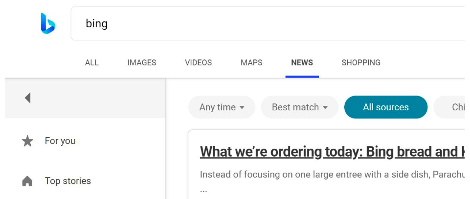
Bing, Microsoft's exclusive search solution, is getting a new logo. Redmond Software giant has enabled it for a small group of users to collect feedback.The new logo features a curvier logo that follows the design of new colorful icons of Windows 10 and Office. Here is how it looks.

The new logo has no sharp corners, and it has some three-dimensional effect that makes it look natural.
On the search results page, it looks even better, displayed in light blue.

As of this writing, only USA users are seeing the update.
Source: Thurrott.com
Support us
Winaero greatly relies on your support. You can help the site keep bringing you interesting and useful content and software by using these options:

With a curved design and a friendlier appeal than the original, the new logo (below) is a more contemporary version of the lowercase ‘b’.