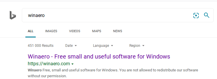
A few weeks ago, we reported that Microsoft is testing a new logo for its search engine . Now the company is gradually rolling out it to everyone.
The new logo features a curvier logo that follows the design of new colorful icons of Windows 10 and Office. Here is how it looks.

The new logo has no sharp corners, and it has some three-dimensional effect that makes it look natural.
On the search results page, it looks even better, displayed in dark gray.

To be honest, I find the new logo more attractive than the old edgy variant. Also fits together the logo and icons of Edge, Microsoft Office, and Windows apps.
Support us
Winaero greatly relies on your support. You can help the site keep bringing you interesting and useful content and software by using these options:
