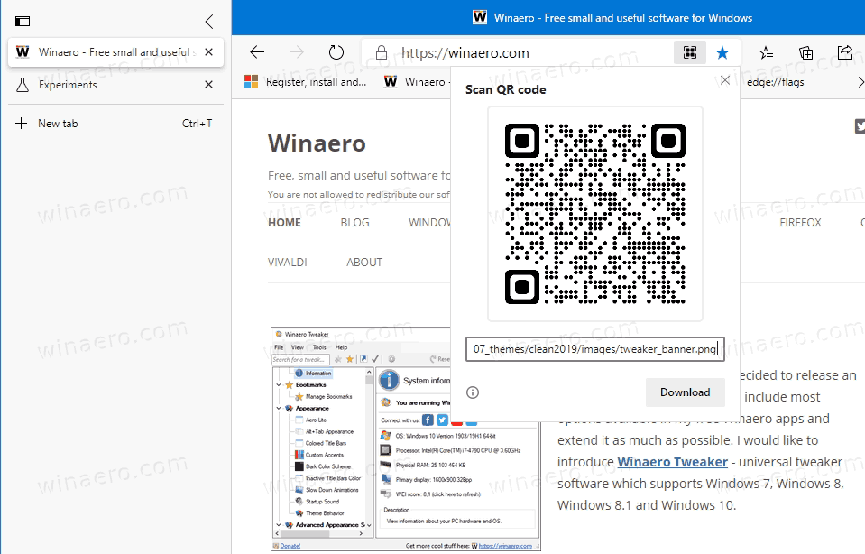
Microsoft is testing various layouts for the Microsoft Edge's Vertical Tab option. Currently, the browser shows a button prior to the tab row on the left. By clicking on that button the user can move the open tabs to the left and stack them vertically, or restore the traditional horizontal tab layout.
Advertisеment
https://twitter.com/ALumia_Italia/status/1312287333467803649
Besides the new place for the button, its functionality remains the same.
The vertical tabs change is one of the most exciting additions to the Edge user interface. Most Chromium-based browsers do not allow customizing the tab row. The only browser that allows you to place tabs on any desired edge of the browser window is Vivaldi. Firefox used to have such an option, but this is no longer possible with its modern versions, due to the radical changes internally made to the user interface of Firefox.

For users who prefer the classic horizontal tab row, Microsoft has added the option to remove the vertical tabs button to save the space: How to Add or Remove Vertical Tabs Button on Toolbar in Microsoft Edge
Actual Edge Versions
- Stable Channel: 85.0.564.68
- Beta Channel: 86.0.622.31
- Dev Channel: 87.0.654.0
- Canary Channel: 87.0.658.0
Download Microsoft Edge
You can download pre-release Edge version for Insiders from here:
Download Microsoft Edge Insider Preview
The stable version of the browser is available on the following page:
Download Microsoft Edge Stable
Note: Microsoft has started delivering Microsoft Edge to users of Windows via Windows Update. The update is provisioned for users of Windows 10 version 1803 and above, and replaces the classic Edge app once installed. The browser, when delivered with KB4559309, makes it impossible to uninstall it from Settings. Check out the following workaround: Uninstall Microsoft Edge If Uninstall Button is Grayed Out
Support us
Winaero greatly relies on your support. You can help the site keep bringing you interesting and useful content and software by using these options:

What’s the point in vertical tabs if it doesn’t shrink the title bar? Minimise, Maximise and Close buttons should just move down to the right of “…”, leaving some gap for the window to be moveable.