The Calendar flyout in Windows 10 has got a beautiful Reveal effect, which is part of the Microsoft's brand new design language, known as 'Fluent Design'. Earlier, the Settings app got the same effect for its front page. It is really visually stunning.
Microsoft released Windows 10 Fall Creators Update in October 2017. Currently, the company is focused on the next feature update, code named "Redstone 4". A number of builds of Windows 10 Redstone 4 were released to Insiders, bringing new features to the OS. For example, you can start apps elevated right from the Run dialog. Redstone 4 is expected to be released next year. It should be a much bigger upgrade compared to the Fall Creators Update. It will also include a number of long-awaited features like Windows Timeline and Story Remix 3D as well as Cloud Clipboard which was cut from the Fall Creators Update release.
As you may already know, Microsoft is applying its Fluent Design bits to all the modern parts of the OS. Microsoft Store, Edge, Mail are just a few examples. The company is going to bring Fluent Design's Acrylic to the taskbar and is adding some more Fluent Design elements to the Start menu already.
New screenshots provided by Windows enthusiast, Rafael Rivera, show the Reveal effect applied to the Calendar flyout. Here is how it looks:
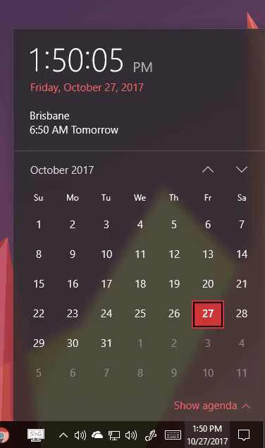
The Settings app has already received the reveal effect for the front page and its side bar. Now, the Calendar pop-up has nearly the same look and hovering over the calendar dates quickly makes the animation look lovely.
Source: Rafael Rivera
Support us
Winaero greatly relies on your support. You can help the site keep bringing you interesting and useful content and software by using these options:

The reveal effect can be a visually interesting effect, but it’s distracting to highlight items you’re not focusing on – specially calendar days, wich are small, so other tiles are highlighted almost as much as the one under the mouse. It literally made me forget what I wanted to see on the calendar and switch to looking for how to disable that effect.
The reveal effect can be a visually interesting effect, but it’s distracting to highlight items you’re not focusing on – specially calendar days, wich are small, so other tiles are highlighted almost as much as the one under the mouse. It literally made me forget what I wanted to see on the calendar and switch to looking for how to disable that effect.
I personally don’t like this at all, and find it frustrating to use. I only want the actual date I am hovering over to be highlighted, all the other non-related date items being highlighted on hover is frustrating and makes it unneccesarily complicated. Microsoft have once again turned a perfectly functioning piece of software into something convoluted and distracting. I understand that some people may like flashing lights and colourful baubles, but given that this is all software, why are we being forced to use interfaces and looks that don’t suit our individual desires. Instead, the way in which info is presented to me on MY computer is instead dictated by a stranger thousands of miles away, who also comes from a different generation – a generation that has been proven over and over to have less capability generally regards critical thinking, regards concentrating on any topic for an appreciable amount of time. I don’t have anything against the generation, but I do not understand why I, and the hundreds of millions of other users who aren’t in that generation, should be forced to use glittery, colourful-bauble like UIs which make it more difficult to perform the tasks for which I own a computer for.
I’d be very grateful to anybody who could provide either a means or even just a hint on how to return my calendar to a state in which it can be used as a practical tool once more.
I completely agree with you. This effect is incredibly distracting and from a functionality point of view, utterly worthless. I would love to know how to disable it.