Windows 11 has already received several previews builds with significant improvements and refinements, but Microsoft still has some treats up in its sleeves for the new OS. Windows Insiders are yet to receive Android apps support and a fancy new Chat app for Microsoft Teams integration (the latter is available for some insiders in the Dev channel).
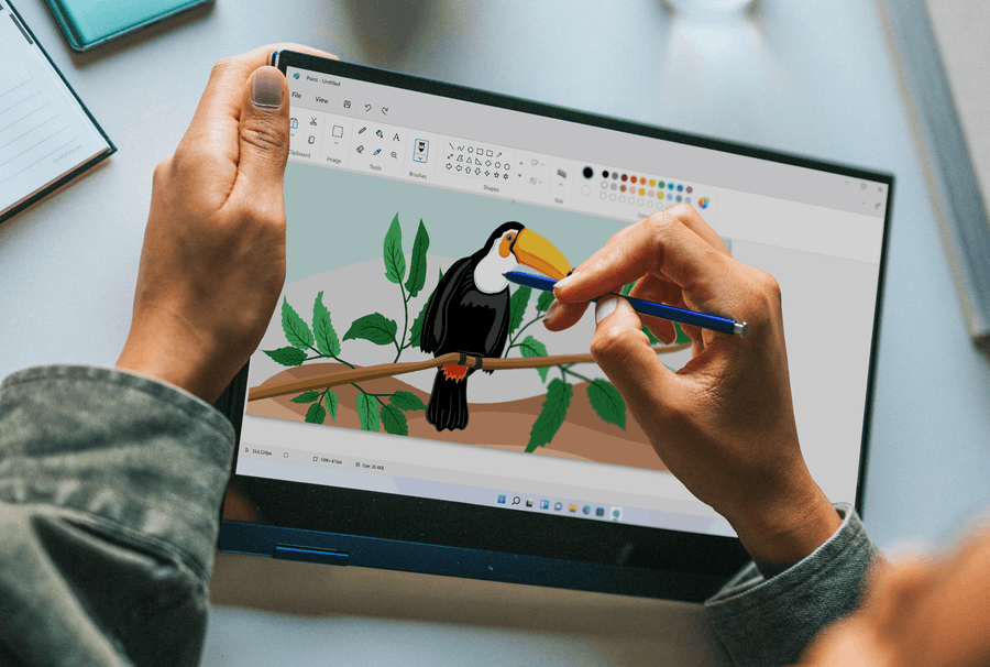
What is also coming soon to Windows 11 is a redesigned volume slider and new UI for some classic stock apps. Shortly after the announcement, Microsoft showed a screenshot with refined Notepad, Office apps, and MS Paint. We do not know when Microsoft plans to release those apps, but we already have a more detailed look at the redesigned MS Paint for Windows 11.

Recently, Microsoft published a few Windows 11 stock images on Unsplash. Among new pictures, users found a photo of a person drawing on a hybrid 2-in-1 computer in a new MS Paint app. While the app remains the same without noticeable feature changes, it now offers a much-improved user interface with modern design, better icons, and, of course, rounded corners.
Microsoft remains tight-lipped on when it plans to ship redesigned Paint and Notepad. According to several hints from Microsoft and its partners, the Software giant plans to release Windows 11 as build 22000 in October 2021. You can expect Microsoft to offer the new Paint for Windows Insiders before that.
MS Paint is a part of the Windows Feature Experience Pack that allows Microsoft to update Windows components without a new build and backport new features to previous releases. Unfortunately, there is no information on whether Microsoft plans to release the updated Paint on Windows 10 as it plans to do with the new Microsoft Store.
Support us
Winaero greatly relies on your support. You can help the site keep bringing you interesting and useful content and software by using these options:

“While the app remains the same without noticeable feature changes, it now offers a much-improved user interface”.
IMHO, vice versa would be better.
You are an idiot if you call removing all color from buttons and icons as “improved user interface”.