The next major update for Windows 10, officially known as Windows 10 Creators Update, comes with a number of features which were spotted during the recent October 2016 Microsoft Event. One of those features is a refined user interface for the Action Center. It will include sliders for volume and brightness.
The Action Center pane shown during the October 2016 Microsoft Event demonstrates nice changes in the Quick Actions area:
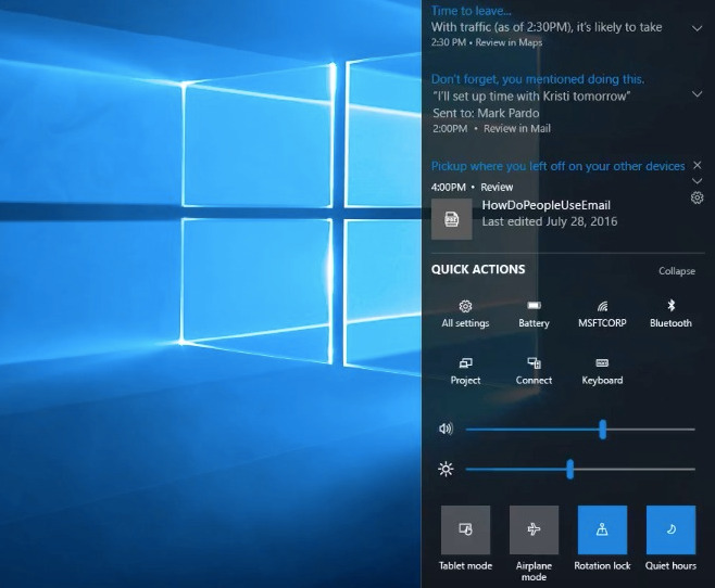
The new pane has a separate area for switches at the bottom, while the action buttons are aligned to the top. The space between buttons is also increased.
The most important addition is sliders to adjust volume and brightness. They are more useful than the current implementation in stable and Insider Preview builds.
Many Windows 10 users will welcome this change.
What about you? Do you like changes in Action Center?
Support us
Winaero greatly relies on your support. You can help the site keep bringing you interesting and useful content and software by using these options:

WOW.
Finally good changes in Windows.
Are you kidding me? You have hotkeys on every keyboard for volume and brightness. And volume can adjusted directly from notification area tray icon. Why do they want to bury it one more click behind Action Center? Brightness slider should also be integrated into the Power icon in the tray!
What about Tablets and Phones? Do they have a brightness slider on their keyboards? Oh, they don’t even have keyboards. Well, there you go.
Also Windows always offered multiple ways of achieving the same thing, that’s what makes it good. Only stupid Mac forces people to do each function one way and one way alone.
I’ll have to agree with Jill. I have a Surface and it does not come with a hotkey for brightness. I had to pin mobility center in the taskbar. This will be a much much welcomed addition.
With all this, the people bar and some other changes it seems that 10 is getting closer in term of features than the old Longhorn (the first, not the reboot so called Vista) and I find this good.
Unfortunately the whole Windows 10 is still too touch oriented while Longhorn is purely designed for traditional mouse and keyboard users. I will never use a touch optimized OS except for phones and tablets.
I get a bit emotional thinking about Longhorn. I loved all the themes so much and still use my collection of Longhorn wallpapers from the days when Microsoft had better taste. Best of all was the promise of a bright and exciting future that turned from disappointment to cynical betrayal.
Yes and I’m still having all Longhorn ISOs taht I keep preciously on my PC ^^
Thats true, I’m the first to say taht 10 UI is too ugly and touch oriented but features are back, even if the UI is still crap, I see this as a small “good” point ;)
Sigh… more smartphoney stuff. It’s good we have Winaero Tweaker to instantly disable the Action Center and keep only the important stuff in the tray!