The new Start menu is something that long time Windows users are looking forward to in the upcoming Windows 10 operating system. Several images of the unreleased Windows 10 build 10114 have appeared on the internet. From the leaked images, we notice some changes which the Start menu is undergoing in Windows 10.
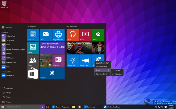
Here is how the Start menu looks in Windows 10 build 10114:
 The File Explorer item as well as Settings and Power have been moved down next to the "All apps" button.
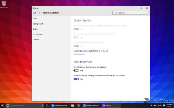
The button in the top right to make the Start menu full screen seems to have been removed. Instead, Microsoft has implemented a new option in the Settings app to make it full screen:
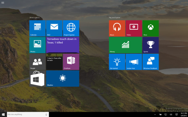
 When fullscreen, the Start menu hides the left area behind a hamburger menu button so it looks similar to the Start screen in Windows 8.1 or Windows 8.
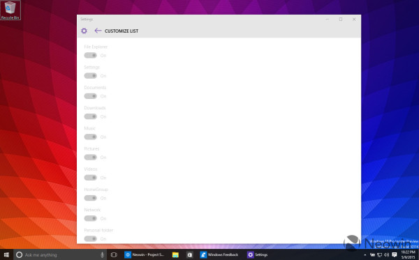
Besides these changes, Microsoft has added some customization. New options in the Settings app will allow the end user to customize the items displayed in the bottom left area of the Start menu. Items like Documents, HomeGroup, User profile folder and several other commonly accessed locations can be added to that area:
 Also, the bottom left area can be used to show "app suggestions" (i.e. promoted apps/advertisements).
So, these are the changes to the Start menu in Windows 10 build 10114. Do you like them or do you prefer the classic Start menu from Windows 7/Vista/XP? Personally, I think the previous Start menus had a more logical arrangement and more features. (via).
Support us
Winaero greatly relies on your support. You can help the site keep bringing you interesting and useful content and software by using these options:


If things do not change quickly, I’ll keep using classicshell :)
Heh, good idea :)
This new garbage start menu is no match for classic shell. I don’t even consider it a proper start menu. all they did is shrunk the start screen and put an awkward app list on the left. This whole OS is shit and is driving me mad that they ruined Windows completely. I will happily stay with Windows 7 for as long as possible and avoid this Metro crap until Microsoft gets their act together and puts back a powerful desktop OS with real innovations and significant advancements.
Stop clinging on to the past. Windows 10 is getting better each build.
Better than what?
Totally agree.
Microsoft just killed a good operating system.
Sound system is crap, the interface for users shit. Metro app? Who uses them on the desktop?
Don’t know not one of my friends who use Metro apps. Who needs touch support on the normal non touch screen? When they get the phone and the desktop are two different things. I use touch devices every day, in the car CarPC installed 8.1 completely reduced no metro crap, phone with touch, home media pc with touch completely reduced no metro crap… but home work pc without a touch screen…I don’t need a bigger interface elements on my work pc, or in M$ think we’re all dorks with poor eyesight…
Why don’t at least give users the choice of what interface they want to use…
It looks like Frankenstein updated to the 21st century
Что это бардак …
That’s it! I had enough! I am back to Windows 8.1 and am at peace. I really don’t want to move to 10 because start menu is back (which is no par to Classic shell) and more themes or colors.
Now the rumours are doing rounds that Windows 10 will not be free for insiders too meaning all upgrading to 10 must have a valid license. To add to woes, it will be free for that first year only (whatever that means).
I really don’t want to get into this mess. I guess will stick to 8.1 until it’s support (hope another 10 years atleast). :)
@All Commenters:
Cheating on comment raiting is a bad idea. It can be restored from the backup or set to desired values in case of cheating,
I couldn’t judge I love the new builds or hate them. :( When I installed Build 10102 it was very unstable and buggy (I know it was the leaked one) but when I multi-booted my pc for Windows 8.1, most of the time I use Windows 10. Anyways, I’m loving the Start menu of Build 10102 because of it’s UI but it’s of no use.