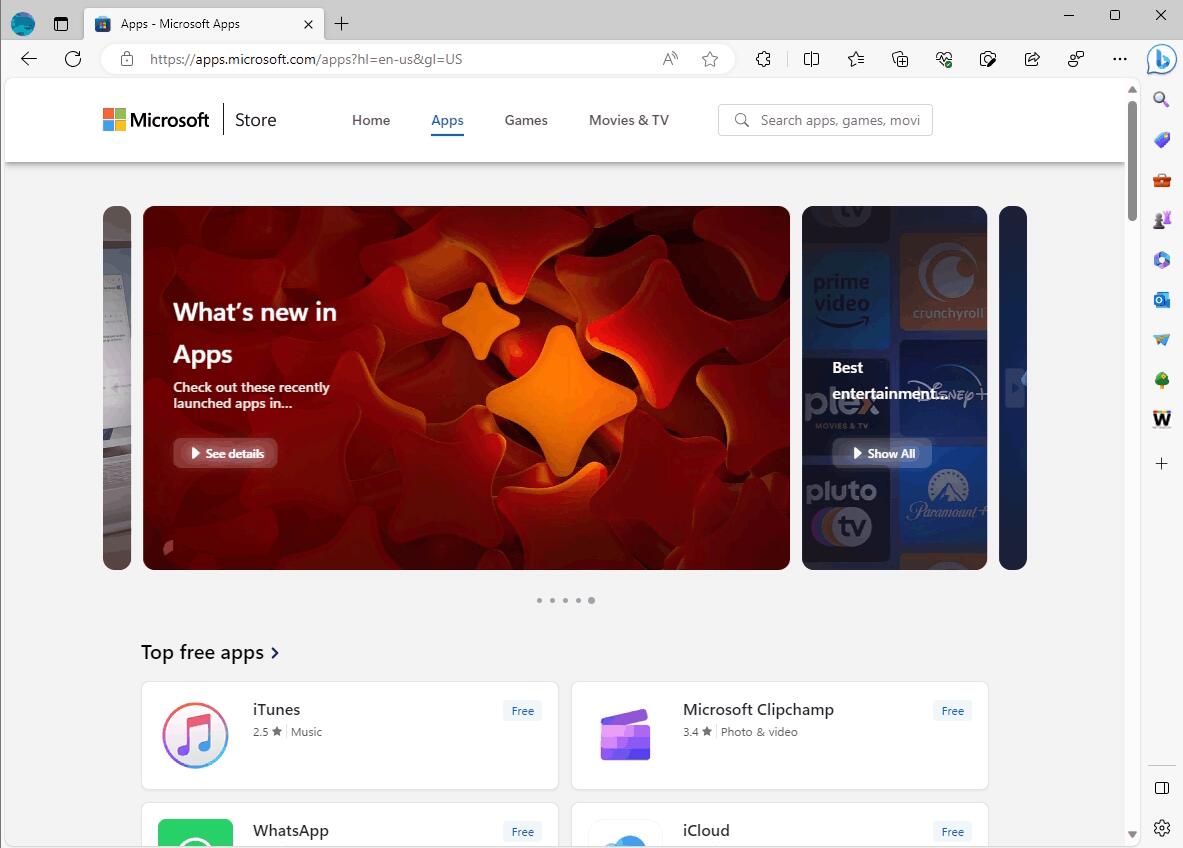
The web version of the Microsoft Store has undergone a redesign, aligning its appearance more closely with the Windows 11 app. The updated site now adheres to the principles of the Fluent Design System, incorporating various design elements such as Acrylic, Reveal, Depth, Motion, and others. However, there are additional changes beyond these.

In the new design of the web version of the Microsoft Store, app listings, and categories are now displayed in a card format, mirroring the layout of the Windows 11 app. The list of categories that used to reside on the left side of the page has been eliminated.
Instead, a menu with sections labeled "Home," "Applications," and "Games" has been introduced at the top of the page, accompanied by the inclusion of a search field.
In addition to various updates, the button to access the Microsoft Store app has been revamped to feature the store's logo. However, the installation button for applications has undergone minimal changes and remains largely unaltered.
Support us
Winaero greatly relies on your support. You can help the site keep bringing you interesting and useful content and software by using these options:
