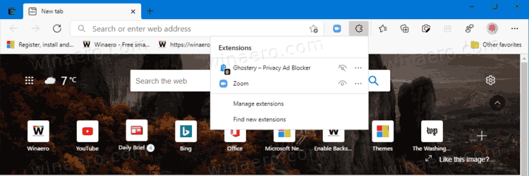
Whenever you install a new extension in Microsoft Edge, the browser adds a small icon on the toolbar. As your extension collection grows, these icons take more and more usable space, reducing the address bar and making the toolbar more cluttered. To resolve this inconvenience, Microsoft has announced the new Extensions Menu for Edge.

With the new menu, users can move extensions from the toolbar to a special flyout. From there, you can toggle visibility and go to extension-specific settings to customize individual options. Also, there is a link to the Add-ons Store for Microsoft Edge, so you can quickly get new extensions.
Advertisеment
The Extensions Menu automatically turns on when users install more than two extensions from Add-ons Store, Chrome Web Store, or other sources.
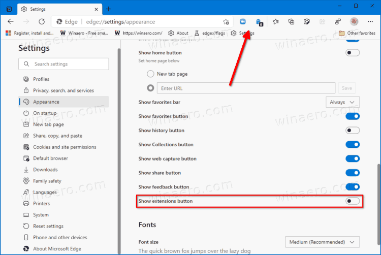
Suppose you prefer the classic view with all the icons on the toolbar. In that case, Microsoft provides an option to turn off the new extension menu. You can add or remove the extension button from the Edge toolbar using the Appearance section in the Settings.

Do note that you can also hide extensions to the browser’s main menu. With the new Extensions menu available, users can now enjoy flexibility and customizability in the browser. The Extensions menu is particularly welcomed on small devices with less screen space.
The new feature is currently rolling out to Edge Insiders in the Dev and Canary channels. It is important to note that it is a part of a controlled feature roll-out, which means only a subset of insiders gets the update first. Microsoft would make it available to more users if there are no significant bugs or compatibility issues. Learn more about the new Extensions menu in Microsoft Edge from the official Tech Community Forum post.
You can download Edge Insider builds from the official website. The preview versions are available for Windows, macOS, and Linux.
Support us
Winaero greatly relies on your support. You can help the site keep bringing you interesting and useful content and software by using these options:

From an Edge insider, the new extensions menu sucks. You’re held hostage into using it since they took away the old dock method. That means that unless you want your URL bar to shrink into oblivion (mine is 1 inch long without the menu) you have to use it.
Now, most of my extensions have no configuration options, however 8 to 12 of them do. So in the old way I could have the 3 most commonly used ones pinned to the toolbar while the rest are ordered in the dock. The top ones had either toggle functions when clicked or some menu that I used on an occasional basis.
The new way of doing things is this:
1) Click the extension icon.
2) Scroll forever.
3) Finally find the extension after scrolling up and down the list trying to remember what exactly the extension was called to figure out where in the alphabet it would be.
(4 Watch as the extension jumps across the screen from under your mouse onto the toolbar. Then maneuver over to that to finally be able to interact with it… until you have to click away and then you start over from step 1 to interact with the same extension. All over again.
I’m heavily considering using Firefox.