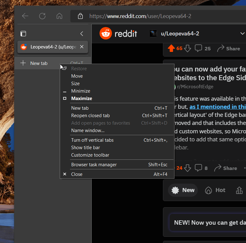
As you may remember, Chrome developers managed to find a way to make the context menu of the window frame support the native dark theme on Windows. Edge has finally received the same change, as they both are Chromium-based. So when you run Windows in dark mode, you have a solid appearance.
For years, the window frame context menu remained always of the white color in both Chrome and Edge. Reportedly, it was a limitation of the OS, which Chrome developers managed to successfully bypass. Now Edge Canary also has the updated menus.
The change affects all kinds of context menus of the title bar. The default one if the menu that appears when you right click a window.

The other one appears when you right-click the vertical tab row. As you can see, it also supports the dark theme.

Finally, the Picture-in-Picture mode for videos now also shows the dark mode context menu, so all the menus have the unified style.

For a comparison, here's how the current stable version of the browser displays the menus:

If you are interested, the following commit is responsible for the (indirect) change of the menu appearance.
It will take some time for the menu to reach stable versions of Edge and Chrome.
Thanks to @Leopeva64 for both Edge and Chrome tips!
Support us
Winaero greatly relies on your support. You can help the site keep bringing you interesting and useful content and software by using these options:
