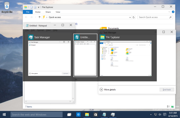
Have you noticed that in Windows 10 the Alt + Tab dialog is updated and has become far more visually richer? Now it respects the actual window proportions for showing thumbnails when you switch between windows. The opened windows are scaled depending on how many windows you have open. It is an improvement in my opinion over the Alt + Tab dialog of Windows 8 or Windows 7.
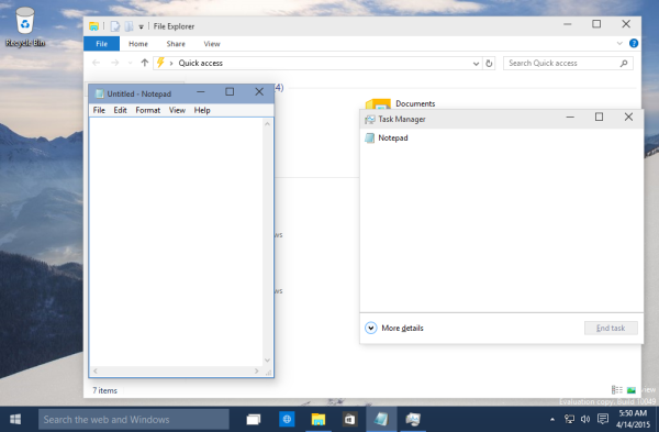
To see the updated Alt + Tab dialog of Windows 10 in action, let's open three apps with different window sizes: Now let's press Alt + Tab shortcut keys on the keyboard to open the window switcher dialog. Notice how it sizes each window differently and proportionally:
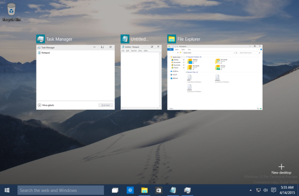
 The same window scaling mechanism is supported by the Task View which is the multiple desktops feature of Windows 10. When you press Win + Tab shortcut keys, it will show similar window thumbnails:
 This change should allow the user to find the desired application quickly. Note there is a way to make this UI persistent so it doesn't disappear when you let go of the Alt key. See the following article: Two secrets of Alt + Tab dialog in Windows 10 you might not be aware of. Or for those who do not like the stock Windows Alt+Tab user interface at all, there is always VistaSwitcher.
Tell us your impressions about the updated Alt + Tab dialog in Windows 10. Do you like it or do you prefer the older simpler Alt+Tab window switching interface?
Support us
Winaero greatly relies on your support. You can help the site keep bringing you interesting and useful content and software by using these options:

Hi,
What plugin are you using to show those keyboard keys as images? Sorry for going off topic.
It the is the <kbd> tag. No plugins required.
Thanks. I wasn’t aware of that tag.
I think that task view should replace the old task switcher altogether. The latter is older and is just a more basic UI of the former, which is new.
I think the Windows 7 Alt+Tab dialog was the best ever.
Very often I have 15-20 windows running and the new Windows 10 dialog is simply annoying as it tries to over-do a simple task.
The old XP-style you offer is better than the new win 10 style, but the win 7 style was superior with its enhanced navigation by use of the arrow keys in combination with the simple XP icon-based view.
It is no surprise though, as every new Windows version always removes some good and nice well-known features in compare to the former version. Microsoft has never understood a simple thing like that.