Windows 10X as a special edition of the OS designed for dual-screen PCs. Here are some more details about this upcoming Windows 10 edition.
Advertisеment
During the Surface event on October 2, 2019, Microsoft introduced a number of new devices, including Surface Neo and Surface Duo.
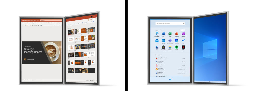
Surface Neo is Microsoft's very own foldable PC, which comes with a detachable keyboard, Surface Slim Pen inking. It will run Windows 10X. It will feature two 9” screens connected by a 360° hinge.
The Surface Duo device is yet another Microsoft's try to enter the smartphone market. Surface Duo is the dual-screen, foldable Android device.
The company describes Windows 10X as a special edition of the OS designed for dual-screen PCs.
Windows 10X includes some advancements in the core technology of Windows that optimize it for flexible postures and more mobile use. We needed to deliver battery life that could drive not just one, but two screens. We wanted the operating system to be able to manage the battery effect of our huge catalog of Windows apps, whether they were written in the last month or five years ago. And we wanted to deliver the hardware performance and compatibility our customers expect from Windows 10.
Windows 10X will be able to run legacy Win32 applications in a container. Windows Containers isolate software from the host file system. All the file and registry changes required to run an application are packaged into Container Images. It is not clear yet if the Container technology for run Desktop apps will be using Windows Server (shared kernel) or Hyper-V VM containers but since client OSes like Windows 10 only have Hyper-V containers, it is possibly that.
A new leak, first spotted by WalkingCat, reveals the OS internals and marketing goals. According to this finding, Windows 10X is designed for both foldable devices and classic laptops. Local apps and PWAs are said to be on an equal footing under Windows 10X.
Windows 10X is designed with user convenience in mind. An example of this is how the “Quick Settings” implemented in this OS, where a user can find their most frequently used settings.
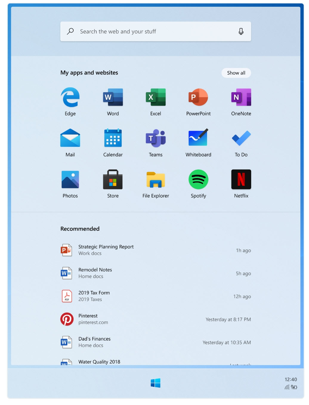
Another major difference from existing Windows 10 editions is that Start Menu is referred to as a “Launcher”, like the launcher on Android. It is seamlessly integrated with a web search, has a special area of user-pinned apps and shortcuts, and a list of recent and recommended documents.
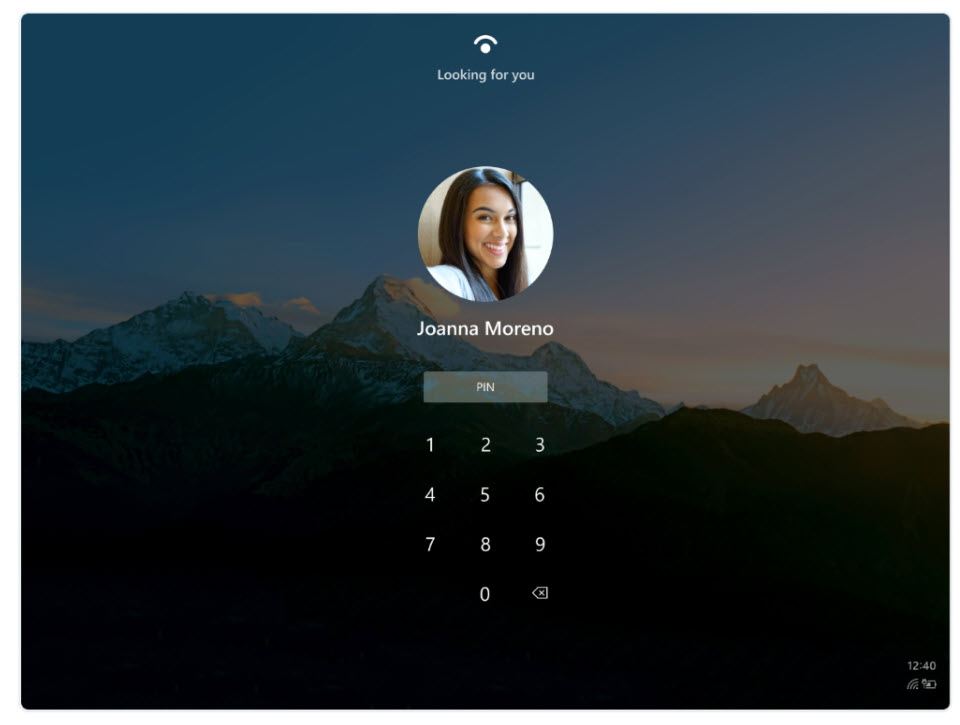
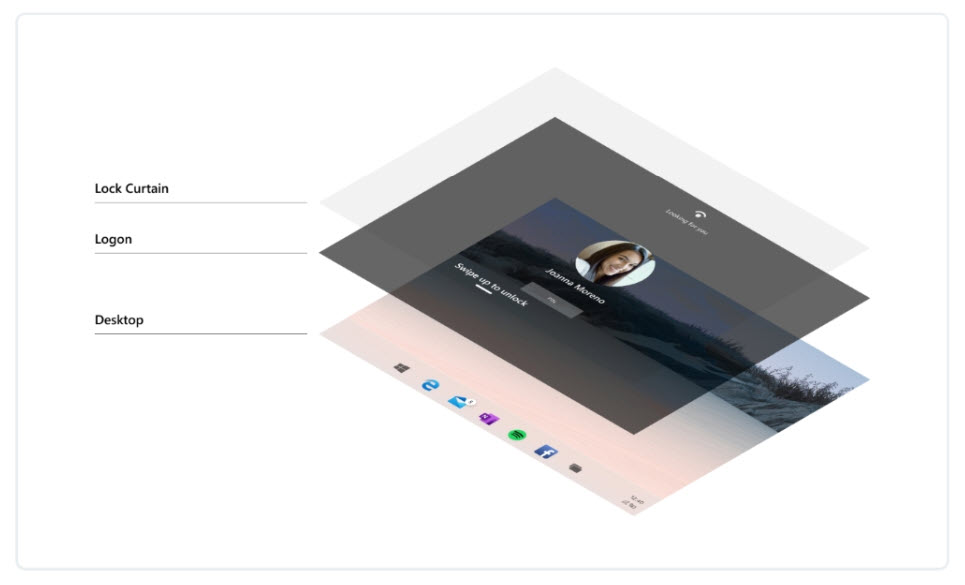
The lock screen feature has been excluded from the OS, so it is no longer required to press a key or swipe to access the login screen.
Here are some screenshots from the leaked docs:
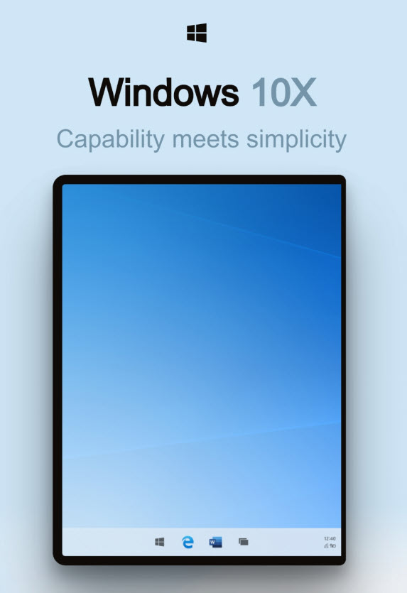
An OS that blends in the background.
Built on an interaction system that lets you focus on the task at hand.
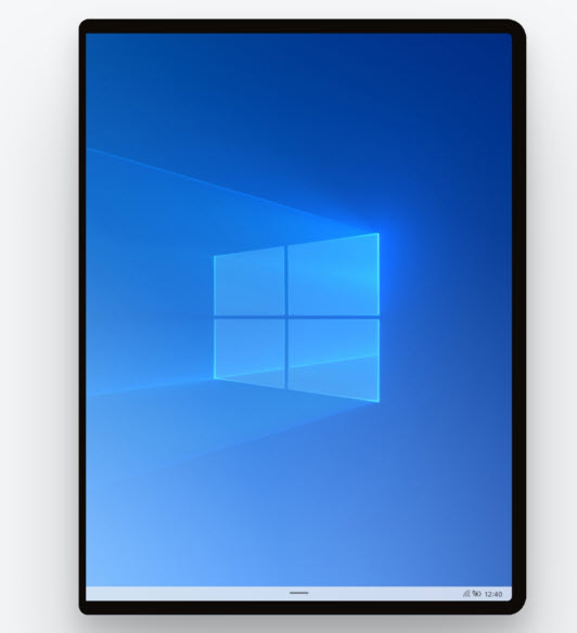
Deliberate approach to the tasks on OS is built for: launching, notifying, searching, and more.
Discover how we approach each task in a simple and efficient manner.
Guided by principles. Inspired by people.
Effortless and magical, we studied our past in order to inform our future. Designed around consumer needs, Santorini adjusts to the way people interact with it.
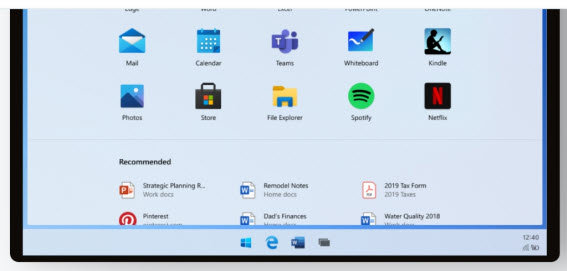
Patterns, components.
Guidance.
A centralized destination for POR design and documentation with a historical view of the design and decision-making process, aided by research, user testing and technical documentation.
Launcher
Launcher helps users start and resume tasks quickly. Search is seamlessly integrated with web results, available apps, and specific files on your device. Next up in the hierarchy of content is your default grid app, which can be customized and changed to meet individual needs and preferences. Launcher is opened and further assists in accelerating users with the use of muscle memory over time. And lastly, Recommended content is dynamically updated based on your most frequently and recently used apps, files, and websites. Jump back into your personal workflow without having to start from scratch.
Goals & Principles
• Get back to your flow quickly and effortlessly
• No dead ends if you can not find what you’re looking for
• Build long term trust in the value of recommendations
Structure & Scope
Search
Find what you need on the web, or look for apps and files on your device. A single entry point to search across your device is simple and effortless.
• Zero input suggestions
• Active input and search results
• Supports touch, keyboard, and voice input
Apps and websites
Drag and drop to re-arrange your apps and websites so your favorites are sitting at the top of the list. To get all the other apps, simply expand the grid to “show all.”
• Inbox default apps include: Edge, Mail, Calendar, Word, Excel, PowerPoint, OneNote, Teams, Whiteboard, To Do, Photos, Store, File Explorer, Spotify, Netflix, Camera, Solitaire, Calculator, Alarms & Clock, Movies & TV, Office, Sticky Notes, Paint, Learning Hub, Settings, Weather, Snip & Sketch, Voice Recorder, Groove Music, People, Notepad, Feedback Hub, Media Plan, Messaging, and up to 4 OEM apps.
• Create folders and groups by stacking apps together
• Remove apps from the grid to remove them from your device
Recommended
Jump back into your flow with recently installed apps; frequently used apps, files, and websites.
• Up to 10 high-confidence recommendations are visible at one time
• If you can not find what you are looking for, tap “Show more” to expand more items inline or,
• “Open the file location” from one of the recommended files to explore related files
Lock / Logon
Logon has a simple job: get you to your stuff as quickly as possible.
With the Restrained Lock model, when the screen turns on you are immediately brought to a state of authentication; unlike Windows 10 where you first need to dismiss the lock curtain before authenticating. Windows Hello facial recognition as well as Windows Hello PIN during OOBE. Upon waking the device, Windows Hello Face instantly recognizes the user and will immediately transition to their desktop.
Goals & Principles
• The customer trusts the device to keep their data safe
• The customer can make their computing job as soon as possible
• The customer feels a personal connection to their device because it is tailored to them
Structure & Scope
Quick settings
Quick settings provides an almost and intuitive way for users to access their commonly used settings. Today, settings exist in multiple surfaces and there is no clear and consistent path for users to access the settings that are most important to them.
Goals & Principles
Efficient
Users can quickly modify their critical device settings
Focused
Only show important device settings so users are not distracted by other settings
At A Glance
Quickly see the state of your device
Relevant
Give users power to tailor the surface according to their needs
Structure & Scope
The quick settings surface has 2 levels of settings: L1 is the main quick surface, while the L2 is available when more lightweight settings detail is required.
Defaults:
- Wi-Fi
- Cell Data
- Input Language
- Compose Mode
- Bluetooth
- Airplane fashion
- Rotation lock
- Project
Taskbar
Goals & Principles
• User can switch between applications on the taskbar
• User can launch applications and websites from the taskbar
• User has access to applications and websites for frequent use
• User has entrypoints to launch Start, Task Switcher, and Quick Actions
Structure & Scope
• Running website: Active web tab in a window, can be either in foreground or background
• Glomming: Taskbar behavior where multiple instances of an app are grouped under the same icon
• Active state: Highlight on taskbar icon which appears When that app is active / in focus
• Running state: Behavior where the taskbar icon is underlined When an app is running, whether the app is in focus or not
• Extended Ul: Glomming behavior where on taskbar icon hover a Ul appears with thumbnails for the various instances of that app
Recent App: App which was launched recently. Can be running or not running on the taskbar
System status: System status bar Status: Bar of the system: Status of the system status; synonymous with “Minimized Taskbar”
• Stacked system status: View the system status when the system status is on the taskbar
Taskbar model
For both clamshells and foldables, the taskbar wants the same base model with a series of “levers” which can be used to create some alternative in the model. While we are still building the same initial model, we want to build the levers to the deltas between the two experiences.
Levers include:
• Centered Vs. Left-aligned Taskbar content
• Number of pins
• Number of recents
• Order of recents
• Divider Vs. no divider
• Task View icon at far right vs. next to start
Connected
The web is where I spend most of my time. I want to access my connected files as they were part of the OS.
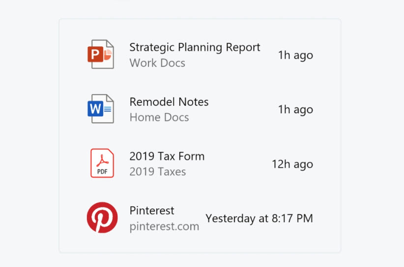
All of your stuff, right when you need it. Find all of your files, on or offline in the Recommended section of the Launcher. Explore the connected surfaces in Windows 10X below.
Family
No need for instructions.
The OS is an intuitive blend of windows and the devices I use every day. Pick up Windows 10X and dive back into your tasks.

Adaptive
An OS which adapts to how I use each one of the devices in my ecosystem.
Windows 10X flows with all the tasks throughout my day with 8 different posts to help me get my work done.
Calm
A system that celebrates focus and precision by making deliberate aesthetic choices.
Effortless
A system that does not get in the way and helps me to get what I want faster.
Thanks to MSPowerUser
Support us
Winaero greatly relies on your support. You can help the site keep bringing you interesting and useful content and software by using these options:

When will WindowsX be available for 64bit PCs? How will I be able to get it?
Thank you
It is not known yet.