Windows 11 build 22567 introduced a bunch of novelties. There are new inbox apps, new Search features, numerous improvements to File Explorer. The latter even supports tabs, what is totally unexpected. Yet another interface change in this release is the updated printer queue.
Advertisеment
In build 22567 the style of the Print Queue has been updated to match the design of Windows 11. It replaces the decades-old classic printer queue which was first introduced in Windows 95.
The new dialog allows you to see the list of tasks at a glance, their status, and manage them in a useful way. To give it a try, click on the "Print" button and you will see a new pop-up dialog "Print Queue".
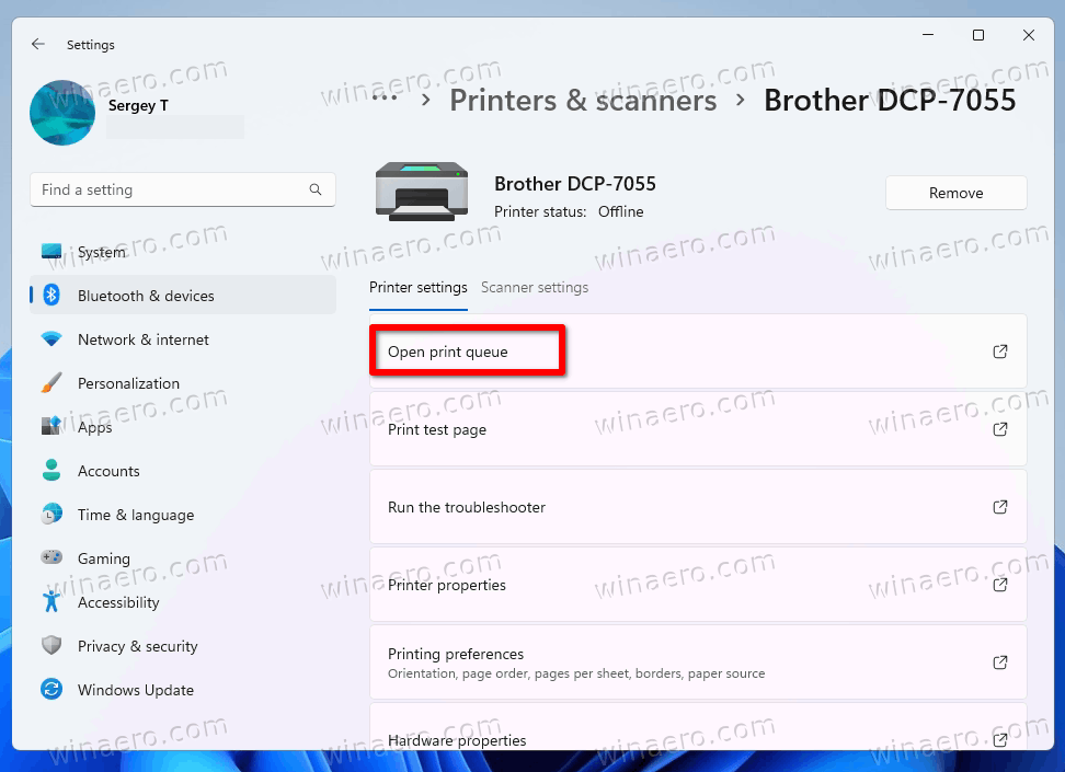
Alternatively, you can open the print queue from Settings, under Bluetooth & Devices > Printers and Scanners. Click your current printer name and then click on the Open print queue option on the next page.

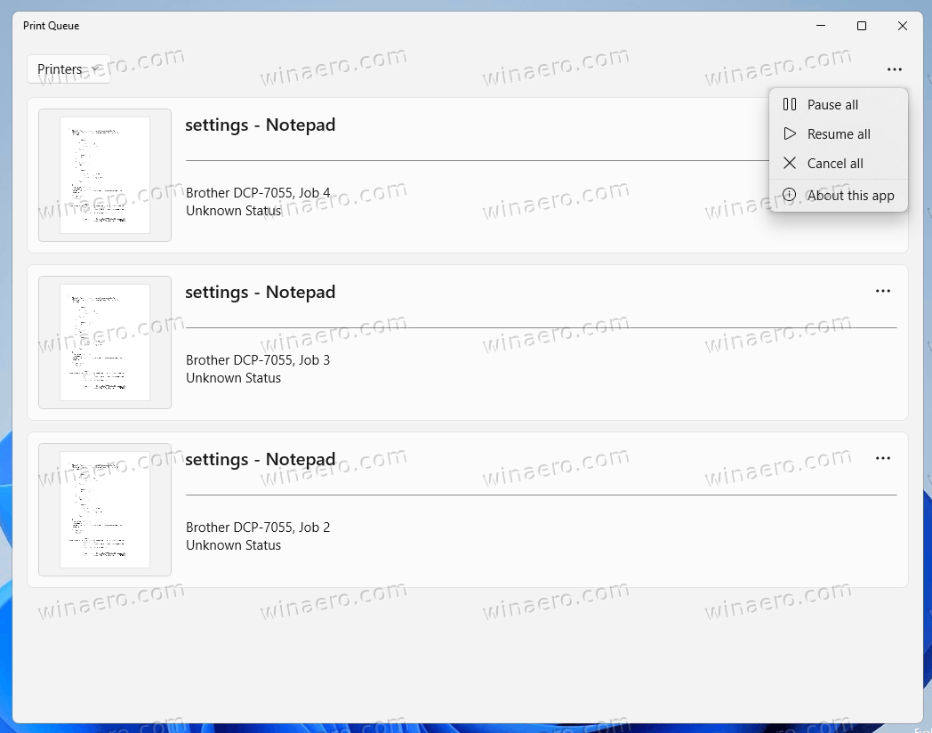
You will see the new dialog.

The updated Print Queue now supports both light and dark app themes, supports HiDPI screens and plays well with touch screens.
It includes a menu button that allows you to resume, cancel or remove all printing tasks at once.
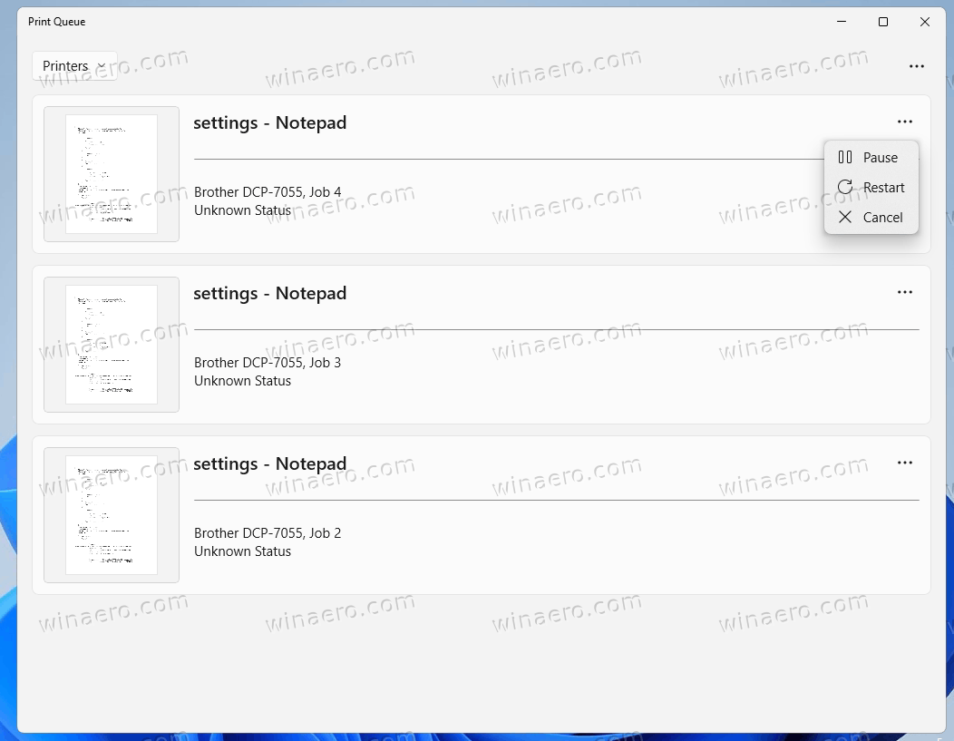
Each of the tasks has its individual menu, from where you can pause, restart or cancel the task.

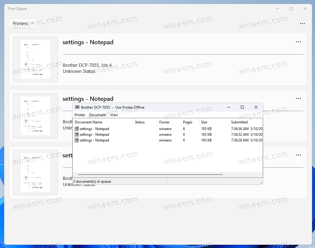
It is worth nothing that the classic print queue is still present in the OS. As of now, I am able to open it from the printer tray icon.

The updated printer queue is a welcome change to the user interface of Windows 11. The classic dialog now looks alien and not friendly to the user. Perhaps it will be eventually removed from the OS.
Other notable changes in Windows 11 are tabs in File Explorer and upcoming Search Highlights. While it is still an experimental hidden feature, it can be easily enabled. The ability to open folders in tabs instead of individual windows is exciting and time-saving addition to the default file manager of Windows.
Speaking about Search Highlights, this new feature is aimed to bring more relevant and interesting information for your location, along with history facts and recently used apps.
Support us
Winaero greatly relies on your support. You can help the site keep bringing you interesting and useful content and software by using these options:

Does no-one give a sh~~ about information density? You’re going on and on about prettiness and all I’m thinking is how much screen space is being used per print job compare to each line in the classic print queue.
What has happened to us?
I completely agree with Jason. The crazy ‘let’s make it all bigger’ UI design is fine for someone who only prints one document at a time, but if I’m printing 90 documents it is completely unusable.
We all bought bigger, multiple monitors because we want to see more information on the screen at once. Why do MS insist on bloating every screen with so much whitespace?
We need compact display modes!!
This new “welcome change” print que is not welcome on my laptop! I am looking for a way to get rid of it. I completely agree with the posts from Jason and Chris Edwards above. It practically takes up the whole screen, when you go looking for a specific print job it is annoying. Bigger is definitely not better in this instance. I really want to find a way to delete this monstrosity. Dislike it one-hundred percent.
allso it dose not have any usful info like how meny pages /file are left to print like it had be for
and a preferred the old vertion far more screen space efficient
and the preview dont work
and wont the point of a preview after u sent stuff to print
if we cant change the que order what the point in the waste of space preview
I agree with everyone else here, I found the site while looking for a way to remove the new print queue to just go back to the old one – it was simple and told me if the file was printing rather than an enormous clunky pretty piece of garbage.
I’m finding the majority of Windows 11 is tinfoil wrapped nothingness. The new Paint for example loses 1/3 its rendering space to just make a fake border on the left and apparently everyone at Microsoft forgot about shortcut keys.
You say “It is worth nothing that the classic print queue is still present in the OS. As of now, I am able to open it from the printer tray icon.”
Please can you tell us how to do this. Like most of th others on here I find th new format ridiculous.
Sorry I’ll have to side with everyone else replying. It looks great, but there’s no sustenance. How am i going to troubleshoot print issues? This is nice for an end user, not for a technician.
Anyway, I just replied cause some may want to know how to open ‘classic print queue’ > find yourself a shortcut to print management (it’s installed by default on a print server) or create one, to %systemroot%\system32\printmanagement.msc
There you can open the print settings, and queues.
Truly, beauty is in the eye of the beholder!
I think this new Windows 11 printer queue is as ugly as sin. Its bloated white space, ridiculous minimalist design and broken functionality is another testament to M$’s ubiquitously condescending approach to its users, and screams “I don’t care about functionality as long as the boss thinks it looks pretty!” which seems to be the only reason for so called “updates”.
For goodness sake M$ – stop fixing what’s not broken!