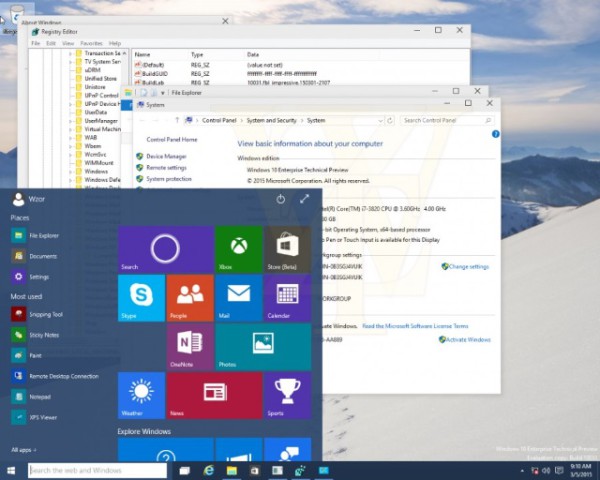
Wzor, the famous leaker from Russia, has published new screenshots of Windows 10 Build 10031. There are small but notable changes to the OS appearance. Let's see what has changed.
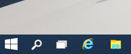
The first change is related to the Start button. Unlike the Start button in the currently released Windows 10 build 9926 which is publicly available, the Start button from the leaked images appears to be smaller. It is possible that the smaller button is designed to fit the taskbar when it is resized to a smaller height. Here is how it looks in the current Technical Preview:
And here is how it looks in Windows 10 build 10031:

Another change is that both the Start menu and the Start screen have transparency. It matches the taskbar style which is also transparent. From the picture below you can notice that the Registry Editor window is visible through the Start menu:

Another change in this build is to the out-of-box-experience (OOBE) which is what you see when you set up and login to Windows for the first time. In Build 10031, this loads from the web aka the cloud so Microsoft will be able to update it.
The icons in this build still have the new Windows 10 look and personally, I don't find the overall look attractive:
![]()
Tell us your impressions and expectations from future Windows 10 releases. Do you like these changes or will you stay with a previous Windows version?
Support us
Winaero greatly relies on your support. You can help the site keep bringing you interesting and useful content and software by using these options:


In fact, this time, I don’t test the future Windows but on the other hand there is so much to read and see over the subject here and elsewhere (Deskmodder, for instance …) ;-) that it is possible to already get a good overview.
Will I go for it ? Absolutely, because I like such changes (it maintains the brain in good shape !) and also because I have the feeling that I’m going to enjoy it ! :-) (I did immediately like Windows 8 a lot and now 8.1 – 8.1.1 even more …)
Furthermore, I agree with people who think that it is going to be a good OS (and why miss a free upgrade ….. to the future ?)
Anyway, thank you, Sergey, for your always interesting articles as well as for your useful softwares ! ;-)
Thank you for such interesting comment.
The changes look good to me. Icons are the very least of my concerns because I can change them. I am more interested in what is under the hood. I have always found Windows to be very customizable with the help of this site, and others. I will migrate to whatever version of Windows is current at the time.
Winaero always kills the transparency (left pane – focus) after applying something. When get this fixed?
I am not aware of this issue.
It would be very helpful if you specify which exactly “something” needs to be applied, so I will be able to fix it.