As you might have noticed if you downloaded the latest Windows 10 Build 10056, for some reason, window titles are always grey in this build. Additionally, by default, the operating system does not use any color for the taskbar and the Start menu. Under the hood of these changes, you will find a new colorization engine which is different from the one shipped with Windows 7/8/Vista.
Advertisеment
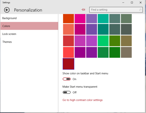
Open the Settings app and go to Personalization\Colors.
Enable the option "Show color on taskbar and Start menu".

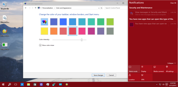
Once you enable this option, the taskbar, Start menu and the Notification Center will use the Aero color from the Personalization Panel.
 Note that the "Intensity" slider is also now ignored by the system. That's because the actual colors used by the taskbar, Start menu and the Notification Center are "immersive". While the "old" Aero window borders could be of any color you wanted, these changes in Windows 10 show us that Microsoft has locked down the color choices to the same predefined restricted set of colors used for the Start screen in Windows 8.1 and Windows 8. This means the end of the classic Aero appearance we know since Windows Vista where we could set any color we wanted.
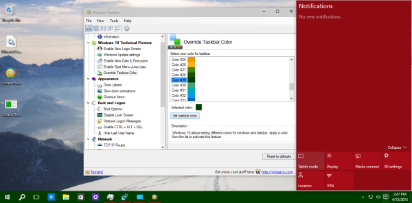
Besides this change, Windows 10 build 10056 allows you to override the taskbar color, so you can get something like this:
 So it looks like Windows 10 will be a completely different operating system yet again than the Windows versions we already know and use. Unlike Windows 8, where the classic Desktop portion of Windows and Modern UI exist separately, Windows 10 will primarily be a Modern UI-based operating system where you will be able to launch classic desktop apps and not vice versa. The end of the desktop Aero engine is one of the ominous signs of this trend.
Support us
Winaero greatly relies on your support. You can help the site keep bringing you interesting and useful content and software by using these options:

with each new build is getting worse and worse….
crap metro stile, and acid colors…ugly interface…
personally i prefer 8.1 its better with custom themes and with aeroglass, startisback, old new explorer, comfort on-screen keyboard(for touch).
it seems I’ll have to stay on 8.1.
Very reasonable.
Moving forward.
That childish look of vista/7 had to go.
a whut? talk about childish, it Windows 10 TP 1056 looks like a 2 year old drew it. I do not need to ASK what the future is for Microsoft… IT will be a complete disaster that ends with microsoft putting an out of buisness sign, and forsale sign on all of their properties
I think, that the end of the desktop Aero engine is a way back.
quite possible
Aero isn’t dead since DWM still exists. And this makes things more consistent.
Welcome to 1993!
Except you can’t customize the window color scheme like you could in Windows 3.1: https://blog.codinghorror.com/content/images/uploads/2005/07/6a0120a85dcdae970b0120a86d4df2970b-pi.png
10 versions later, you can’t.
I cannot for the life of me understand why MS decided to drop Aero, and the 3-D look of Win-7. Win 10 looks so horribly flat, and drab. Even if we could enable aero with bigmuscle’s tool, there is no getting around the overall flatness of the UI. Heck, the Win98 UI looks more sophisticated by comparison, where we at least had the ability to choose colors, and even mix of colors.
The user should have been given a choice, similar to the “classic” vs the new look of 7 and 8. If Aero has caused problems, such as significant memory or image loss, then it might be clear. But I suspect, this is not the case. What is obvious is the allure of tablets to MS and how they will in the future be our desktop mainframes. The greatest negative of MS has always been decisions that are not customer driven but decided by the creator (contrary to what MS is always telling us). That has always been the critical difference between Bill Gates and Steve Jobs: one promoted ugly looking, clumsy function, while the other designed aesthetic-driven, smooth function. Both work well, but the differences to users can be as sharp as differences in gender.