There are plenty of ideas Microsoft prepared and even implemented for Windows 10. Some of them you could already seen and tried. The most famous example is the Sets function, which was supposed to add a tabbed interface to all applications, but it never made it to release. But there are also many of features have never been revealed to the public. Between 2015 and 2020, the company's engineers came up with probably hundreds of different features, but they were never fully implemented.
Advertisеment
Windows Central's Zac Bowden is covering such features in the Windows Unshipped" series of posts. The first post is about the interesting concepts of the Start menu in Windows 10 which many have never heard of.
Windows 10 Start Menu
The Windows 10 Start Menu combined the Live Tiles concept introduced in Windows 8 with the classic Start user interface from Windows 7. This decision was made in response to user backlash against the Windows 8 Start screen. The Start pane in Windows 10 received positive reviews from users and critics, but there was one major problem.
Soon after the release of Windows 10, it became obvious that many users do not customize the Start menu to their needs, as they consider it redundant. Most often, users simply pin their favorite apps to the taskbar or simply search for them.
Microsoft also had evidence that users find the process of customizing the Start menu to be too inconvenient and complicated. They have to manually pin each new app by switching between the list of all applications and the tiles area. After that, users have to come up with a layout and size for each tile so that the menu would be user-friendly and look pretty.
That's why Microsoft was working on several extra concepts to make the Start menu easier to customize and less cluttered. Unfortunately, none of the below ideas made it past the initial development stage.
Pin In Place
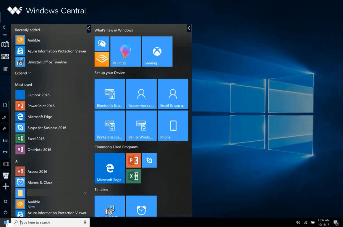
The idea here was to reduce the distance on the Start menu the mouse cursor needs to travel to pin new items. Specifically, Microsoft wanted to use the "Reveal" effect from Fluent Design to hide the "+" button in the tile and hamburger menu areas. It would only appear when you hover over it with the mouse cursor in some empty area.
When you click on the "+" button, the user interface called "MixView" should have appeared, which is a few additional tiles in an exploded view. Here, users could select any desired tile to pin to the home screen.
The name "MixView" was used for the user interface that appeared when using the 3D Touch feature in Windows Phone on an unreleased Lumia McLaren smartphone. Hovering your finger over a live tile on the Windows Phone Start Screen would pop up a number of smaller live tiles that users could tap to jump into specific areas of an app.
It was a great idea, but it never shipped as the device and hardware it required was cancelled. The UI was a logical evolution of the Live Tiles concept, and it's no surprise that Microsoft was thinking about bringing it to Windows 10.
In Windows 10, this UI was planned to use machine learning and cloud recommendations to display both local apps, web pages, and apps from the Microsoft Store that the system predicts you would like to pin.
The + button method has also been tried on the Start's left area, which would make it much easier to pin folders like Documents and Downloads. In the stable version of Windows 10 you have to use the Settings app to customize that area.
Start Places
Start Places is another concept that also did not reach the release. It was designed to make the Start menu more useful by adding other Windows features to it. The idea came about when Microsoft decided to clean up the taskbar, which saw a lot of new buttons in 2017-2018.

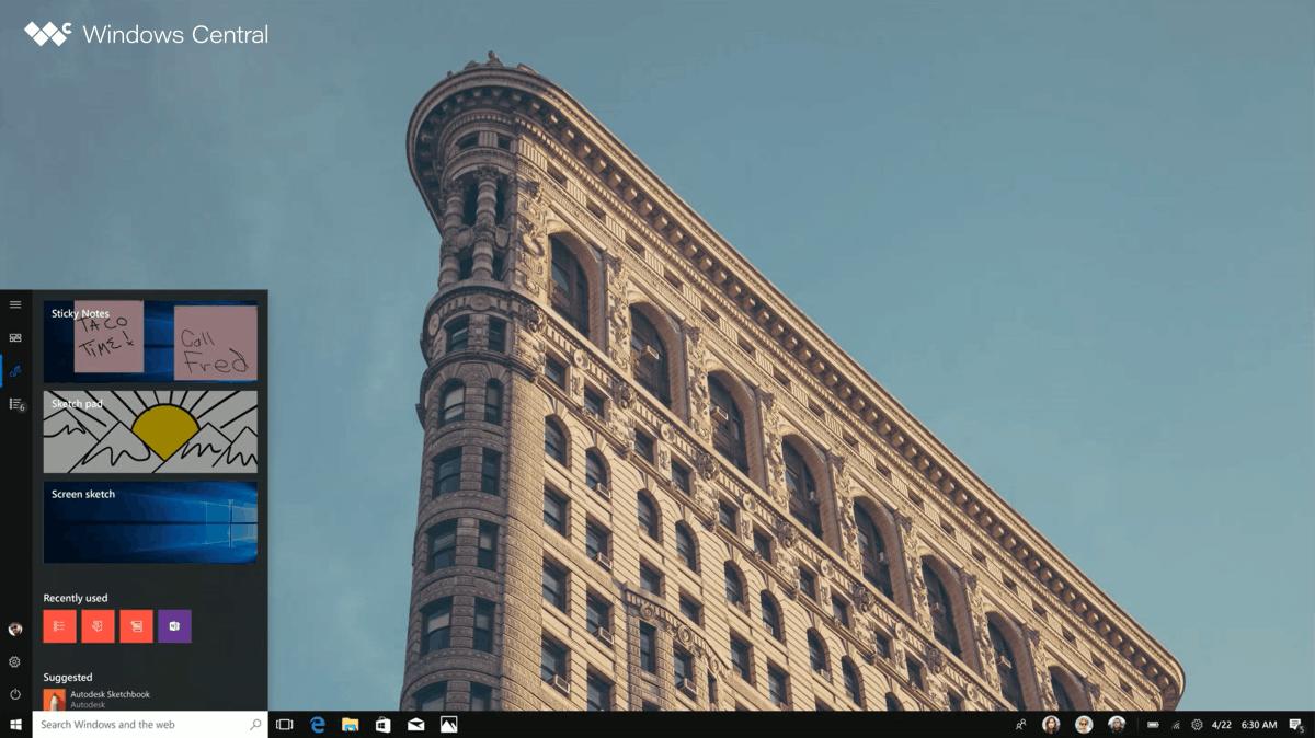
One concept was to move features like Windows Ink Workspace, My People, and so on to the Start menu, along with things like the Documents folder and the Timeline.
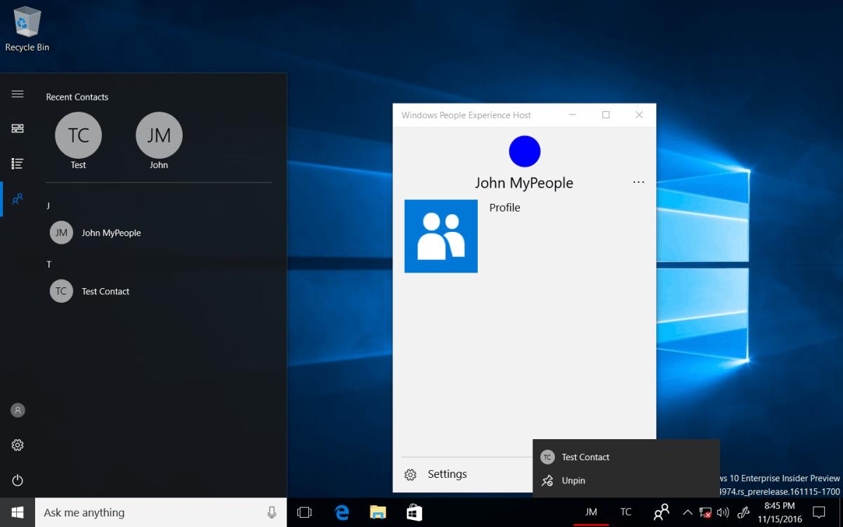
Thanks to Albacore's findings, we can take a look on a semi-working implementation of Start Places in older builds of Windows 10. In the screenshot below, you can see the My People integration in the Start menu.

The top section shows recently accessed contacts, and a list of all contacts below it. The hamburger menu allows returning to the rest of the Start menu objects. Here is how it could look.

Microsoft was exploring the idea of implementing the ability to drag different places from the hamburger menu back onto the Taskbar if the user wanted quicker access.
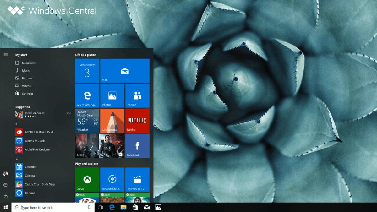
There were other minor changes as well. For example, Microsoft wanted to make the hamburger menu more accented. There was also a short-living “My Stuff” area at the top of the app list in the Start menu, which listed the most frequently used folders from File Explorer.

It is still not known why these concepts weren't approved for the works, since they could actually make it easier to customize the Start menu.
In the upcoming posts from the Windows Unshipped series, Zac Bowden promises to reveal a few features and ideas for the taskbar, the Action Center, a flyout called "Control Center", and the integration of Cortana into the Action Center.
Support us
Winaero greatly relies on your support. You can help the site keep bringing you interesting and useful content and software by using these options:
