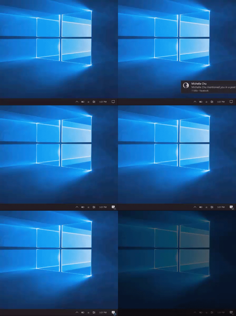
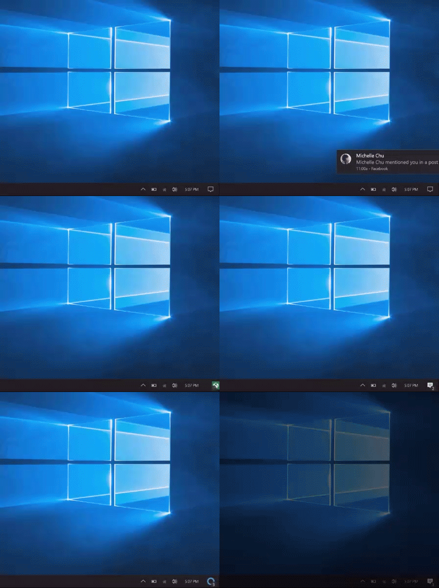
New information about upcoming changes to Windows 10 has become available. The Action Center, which currently shows notifications and provides quick access to system actions like airplane mode or screen brightness, will be extended with new functionality. There are a number of interesting features it will get with new upcoming builds. Let's see what those features are.
The following screenshots demonstrate the planned features of the new Action Center:
As you can see, the position of its icon has moved in the notification area (system tray) and it now looks a bit bigger. It will show a notifications counter on top of its icon and also the icon of the app which produced the notification. This way, it can provide more information to the user even when he has not opened the Action Center.
Microsoft has the following goals:
- Keep incoming notifications subtle but still bring the user's attention to it.
- Move the Action Center icon into a corner, right next to the Show Desktop icon so its position is more fixed and it does not get mixed with other tray icons. Note: The Show Desktop/Aero Peek button does not move.
- Make the Action Center icon easier to click
- Add color to the icon for a brief amount of time
- Give you an idea of the number of incoming notifications
- Help you determine when would opening the Action Center be relevant by giving a sense of which application just sent a notification
- Create an alternative option for those that want a quieter solution than toast notifications while still having a visual cue that a new notification has arrived
via.
What is your opinion about this change? Do you like it or not? Tell us in the comments.
Support us
Winaero greatly relies on your support. You can help the site keep bringing you interesting and useful content and software by using these options:


I think that I don’t want any more attention getting things distracting me from working. I don’t care if there is one message or 3. Three useless messages is no more useful than one and knowing that there are 3 just causes me more stress.
I’m happy that they are giving people the option to vote for which things they prefer.
(I voted for the small icon. The one at the top.)
I usually don’t care so much about the prompts either, but to see at a quick glance whether it’s Facebook, G+ or whatever else, could be useful if I’m waiting for something specific from one of those, which is very rare actually.
It’s nice to see them working on the little details. Hopefully it will all lead to a better and more personal system in the future, depending on the user’s needs and settings. Different notification sounds will also help to differentiate between messages.