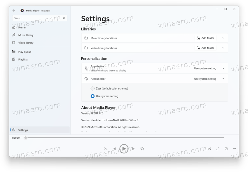
Not so long ago, Microsoft announced a brand-new media application for Windows 11. Although the classic Windows Media Player will remain in Windows 11 for some time, Microsoft wants to attract users to the new app by offering a couple of modern touches and features (hey, there is a new fluent icon). The latest update for the new Media Player also brings more customization options.
Advertisеment
As it turned out, some users did not like the fact that Media Player uses only one orange accent color. While Microsoft allows customizing colors in Windows and its stock apps, Media Player was stuck with a single accent color. Now the company has addressed the issue.
Media Player now follows the system accent color in Windows 11
Apparently, Microsoft understands that there are people that like the default Zest color, so it allows users to select whether the app should use its stock color or the one set in the Settings app. To customize the new Media Player, update the app to version 11.2111.54.0 or newer. Next, open Settings in Media Player and click “Accent Color.”

Media Player for Windows 11 is currently available to Windows Insiders. Besides the new media app, Microsoft is working on numerous updates for other stock apps, such as Paint, Notepad, and others. They are a part of the upcoming “Sun Valley 2,” or the first feature update for Windows 11 coming this year. According to reports, the upcoming release will focus on polishing the operating system and addressing some of the biggest complaints regarding the taskbar, the Start menu, dark mode, and others.
You can learn more about the Sun Valley 2 update for Windows 11 in our dedicated post.
Support us
Winaero greatly relies on your support. You can help the site keep bringing you interesting and useful content and software by using these options:

This “player” looks like a poor chinese copy of some media player for Android. Less features, low performance, the control elements are poorly drawn (look at this skewed “play” button), HUGE album thumbnails and icons, the app hangs and animates like an epileptic, while WMP just works… and even looks modern if you installed a skin.
You mean poor American copy. If Chinese made it, it’d at least work.
I use AIMP for music, and VLC for movies and series! Works for me!
AIMP Light:
https://i.imgur.com/H4onp4E.png
AIMP Dark:
https://i.imgur.com/aucJxs8.png
I’ll be testing Windows Media Player when it comes out. But I’ll probably stay at AIMP and VLC.