Several images of Windows 10 build 10108 have been spotted on the Internet. From the leaked images, we see some changes happening in the user interface in Windows 10. Let's see what has changed in this build.
Advertisеment
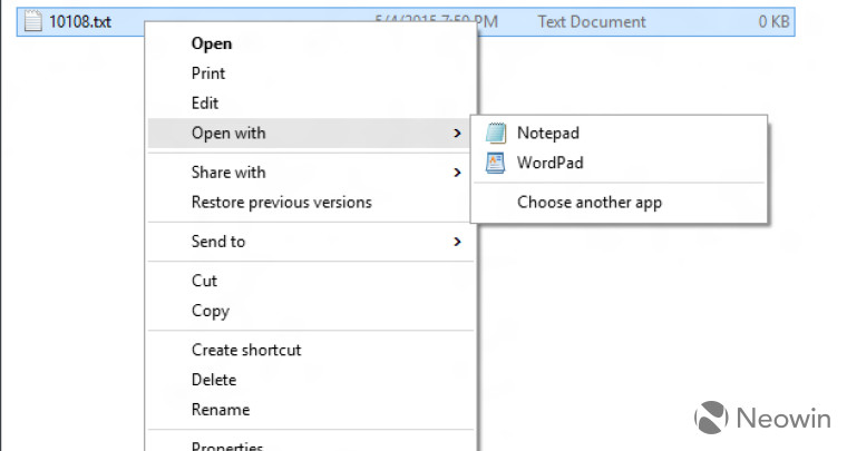
The first change you can notice are the new style context menus. They have more space between items making them more touch-friendly. Also the background color of the context menus is white now, not light grey. In earlier builds, the same menu was implemented but only for the taskbar. Now context menus across the entire operating system have the same white look.
The second change is a new appearance of the toggle switches in the Settings app. Now they respect the current theme color.
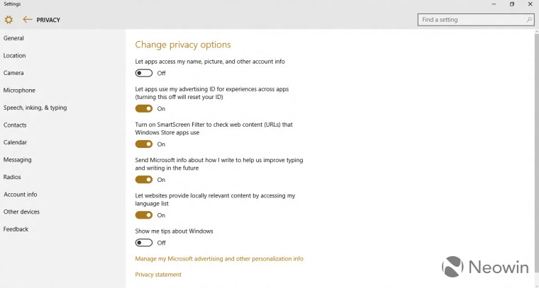
Microsoft changed the appearance of the toggle switch controls due to negative feedback from Windows Insiders.
Windows 10 build 10108 also comes with a new "Get Started" app which is intended to guide novice users through the basics of Windows 10. It includes several training videos. I noticed that the titlebar of this app is dark, which is different from the grey titlebars of Universal apps in public Windows 10 builds:

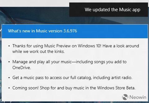
The Music app now shows a change log after the update. This is a useful addition - to see what has changed in apps. Every Universal app may not follow this and may not show a change log:
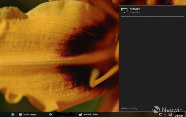
 And finally, the dark theme is now present for all kinds of notifications and panels in this build of Windows 10. For instance, here is how the Network flyout looks in Windows 10 build 10108:
During the setup process, when Windows is finishing with the final steps, the install process used to rotate through various colors but in this build, the screen stays blue the entire time. It is quite possible that Microsoft removed the cycling of colors from the Out-of-Box-Experience stage in Windows 10. Personally I never liked it.
What is your opinion about these changes? Do you like them or do you find these trivial changes not significant to the overall user experience? (via).
Support us
Winaero greatly relies on your support. You can help the site keep bringing you interesting and useful content and software by using these options:

The new context menu reminds me Google Chrome.
Yep, looks a bit similar
So: either blinding brightness or pure darkness. Microsoft pulling a stupid move, not providing a nice dull grey theme that is easier on the eyes but not black as midnight.