Opera 67, an exciting version of the popular browser, has reached the beta stage of development. Winaero readers must be familiar with its impressive changes. Here is a summary of what Opera 67 offers to the user.
What's new in Opera 67 Beta
Workspaces Feature
Opera 67 comes with a new Workspaces feature that allows separating web sites into different groups.
Advertisеment
The official announcement describes it as follows
As you probably know from personal experience, many of us open numerous tabs throughout a day of browsing, and end up getting lost between those related to work and those for side projects such as shopping, home renovation or which movie to watch.
We are fixing this issue with our new Workspaces feature. Accessible through the sidebar, it allows you to simply create two separate areas, letting you open tabs related to a particular concept or project in one group, called a workspace.
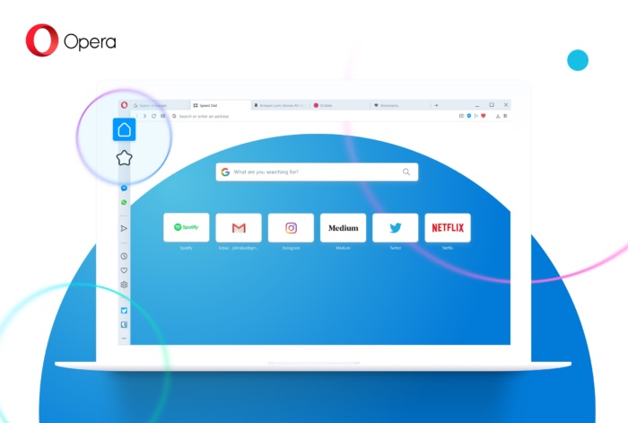
So, with Workspaces you separate your tabs related to work, social network browsing, and gaming, etc. The idea behind this feature is not new. The same can be achieved with individual browsing profiles, virtual desktops in Windows and Linux. Workspaces just makes it more convenient. Also, you may remember Firefox Containers which were the first implementation of this idea.
In the future, the Opera browser will allow you to create multiple workspaces and to choose icons for them.
New Tab Switcher
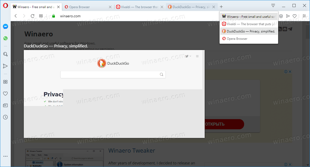
A new tab switcher user interface has been added, with a horizontal row of tab thumbnail previews, which resembles the classic tab switcher look of Opera 12.
The switcher appears when you press Ctrl + Tab on the keyboard. Here is how it looks in the current stable Opera 65:
And here's the new one:
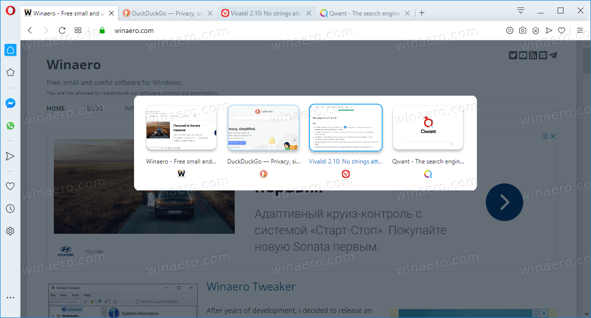
Both implementations have their pros and cons. The current one has a big thumbnail preview on the left, but lacks thumbnails in the list of tabs. The new one makes it easier to spot the tab you are looking for, since they all have thumbnails, but the previews are tiny.
Sidebar setup panel
The Sidebar settings menu has been replaced with a new panel, which can be opened from the three-dot icon at the bottom of the sidebar. It will allow the user to edit or remove all of the sidebar elements individually. Starting from the top, you can customize workspaces by adding, removing, showing or hiding them. Also, all of the Messengers are now listed.
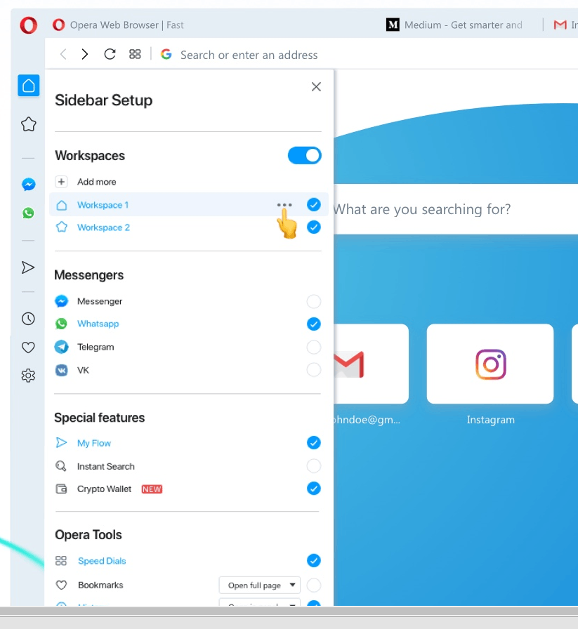
In the Special Features group of the new panel, you’ll find features like My Flow, Instant Search, and Crypto Wallet. Opera Tools is the last category, with browser management areas like History, Downloads, and Extensions. History and Bookmarks can now be opened from either the sidebar panel or the full-page menu.
Highlight duplicate tabs on hover
Here's yet another interesting change in Opera 67. When hovering a tab, inactive tabs in the same window and workspace which has the same address is displayed will be highlighted with a color.

Improved login process for Opera Synchronization
Today's release comes with an improvement for signing up and logging into Opera Synchronization. You can now log into your browser from a new site in a separate tab rather than the previously-used popup. this should make it simpler for new users to join the service or to retrieve a backup when starting Opera on a new machine.
Download Links
- Opera beta for Windows (Using Opera beta for Windows installer means Opera for Computers EULA is accepted)
- Opera beta for macOS
- Opera beta for Linux – deb packages
- Opera beta for Linux – RPM packages
- Opera beta for Linux – snap package
Source: Opera
Support us
Winaero greatly relies on your support. You can help the site keep bringing you interesting and useful content and software by using these options:
