The recently released Opera 36 browser comes with nice user interface improvements. Some of those improvements are designed especially for Windows 10 users. Let's see which benefits it can provide to the end user.
Advertisеment
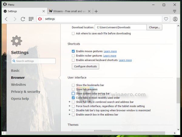
Once you install or upgrade your existing Opera installation, go to its settings. Under the section Browser -> User Interface, there is a new option "Show system color on tab bar". By default it is disabled, which causes the Opera browser to look like a Universal/Metro app with a gray title bar:
Once you enable this new option, the title bar will follow the current color from your preferences in the Settings App - Personalization - Color: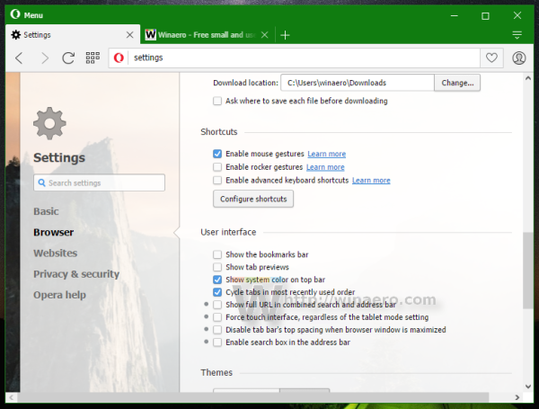
This is a nice feature.
Under the "User Interface" section, you will find other useful options too like a separate search box in the address bar or the ability to force a touch-friendly user interface even if no touch screen is detected.
When the search box is enabled, it looks like this: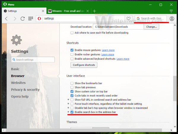
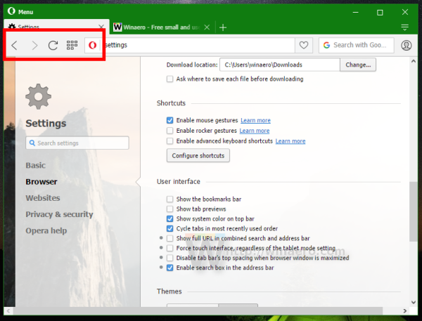
When the touch friendly UI is force-enabled or a touch screen is detected, the browser will automatically increase the size of toolbar items and all context menus, plus it will give you a new icon for going fullscreen.
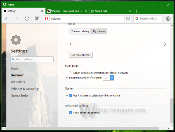
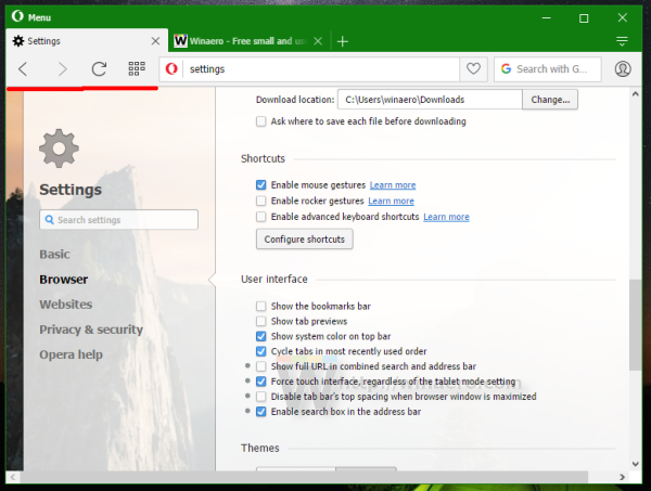 If you enable advanced settings in the browser's options, the Start page options will contain additional items. In the regular mode it looks like this:
 In the advanced mode it looks like this:
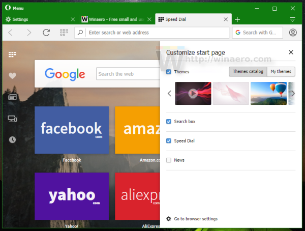 There you can customize the start page news section if you use it:
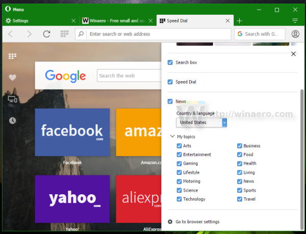 Finally, the start page navigation panel has been moved to the left, to optimize for horizontal space on widescreen monitors which are popular these days.
Opera has become an interesting program, offering features which other browsers does not have. It offers the same control as Google Chrome for the most part in addition to some extra settings and features like an integrated ad blocker which will arrive soon. Maybe some day, Opera will evolve to become suitable for power users once again.
You can download Opera 36 using the following links:
Opera 36 online installer | Opera 36 offline installer
Support us
Winaero greatly relies on your support. You can help the site keep bringing you interesting and useful content and software by using these options:

Doesn’t look like Vivaldi at all.
They even use the exact same icons.