Today, Opera released a new concept browser called "Neon". Opera developers claim it as "the future of desktop browsers". It is built on top of the Opera browsing engine and borrows its core features.
Advertisеment
The official announcement includes the following video.
This is how the browser looks when started:
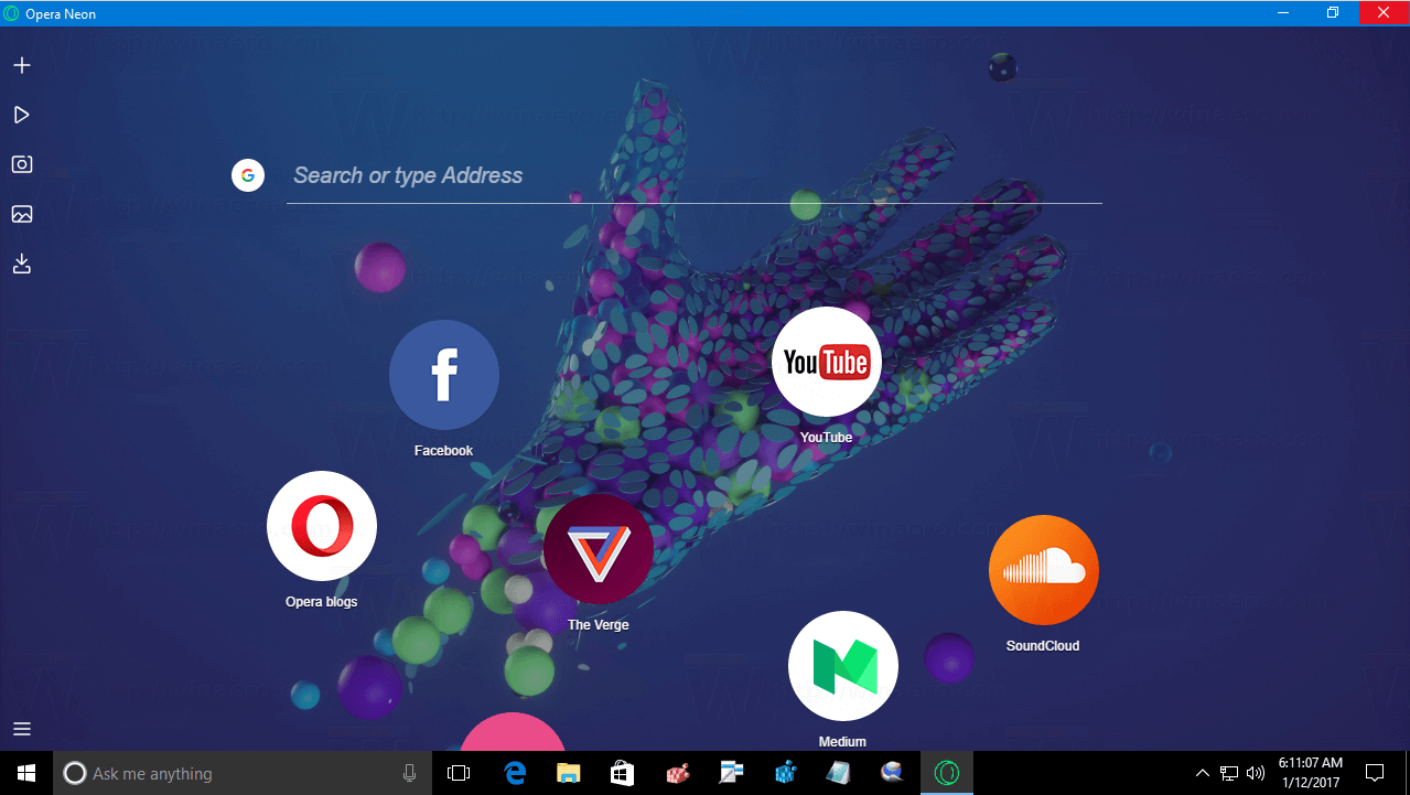 The start page is using your desktop wallpaper. However, if you have no wallpaper set, it uses its built-in background image with the Neon project logo. I disabled the wallpaper when I took a screenshot as you can see above. The start page includes a search box combined with the address bar.
Below the text field, there are links to popular web sites shown as circular icons. You can customize these icons by removing the presets and adding your own links.
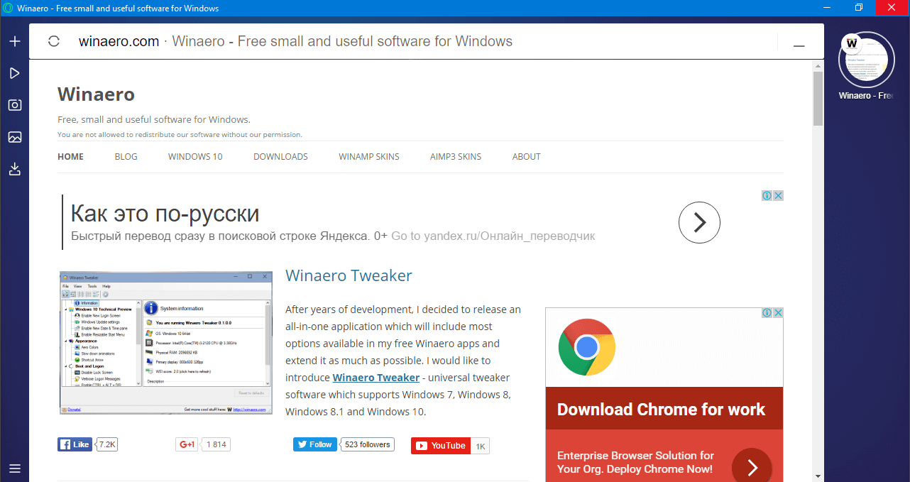 The user interface of Neon is very minimalist. It does not include traditional controls like the address bar, or the horizontal tab bar. Instead, it has only two bars. The left bar is tiny and has the following buttons:
- A 'plus' button to open a new URL.
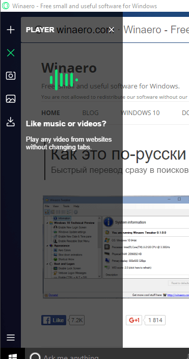
- A 'play' button opens a tiny player pane which can be used to play streams and videos from websites.
- The next two buttons are Snap and Gallery. Snap allows you to capture a portion of the web page e.g. take a screenshot of web content. Gallery can browse your screenshots.
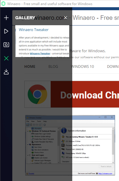
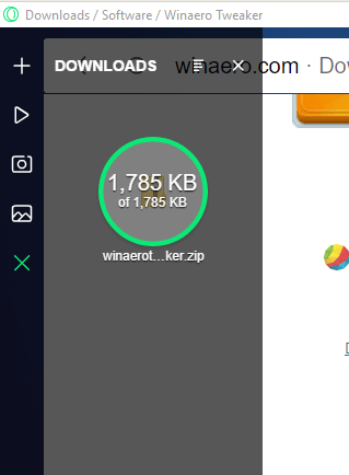
- The last button opens the download manager.
The right pane is much wider and stores open web pages again as circular icons. The browser is trying to make icons recognizable, so you can find the required page quickly. It manages your open websites automatically.
Like gravity, frequently used tabs will float to the top, while less important tabs will sink to the bottom.
The Neon browser inherits the video pop-out feature from Opera.
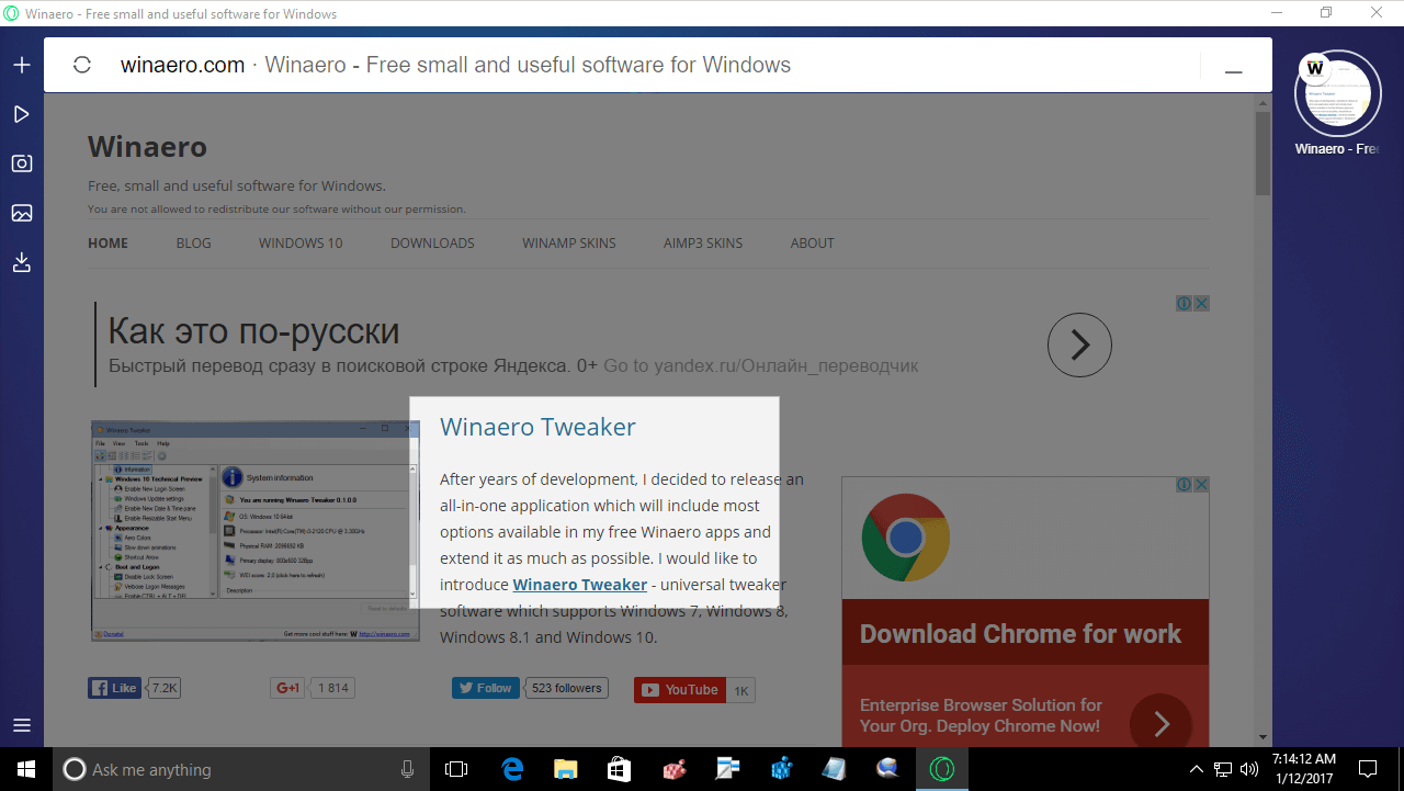
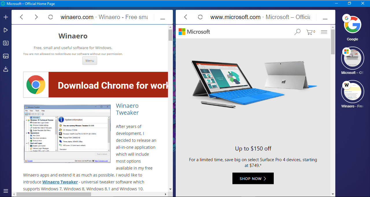
You can drag a page's icon from the right pane to the left area. The browser will open both pages in Snap view. See the following screenshot: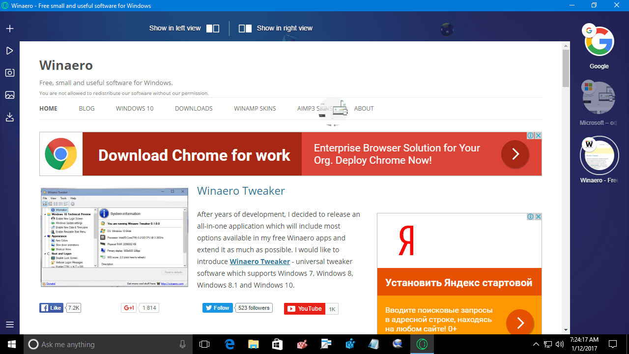
You can download Neon and try it yourself from here:
The browser works as fast as any other Chromium-based browser. As for its user interface, I can't help thinking that I am working with a non-customizable browser designed only for touch screens. I didn't find it useful. The ideal web browser UI for me is Mozilla Firefox with Tab Mix Plus (or Opera 12, which was developed by the same company but killed eventually).
What about you? Do you like the ideas behind Opera Neon? Share your opinions in the comments.
Support us
Winaero greatly relies on your support. You can help the site keep bringing you interesting and useful content and software by using these options:

I think it looks more like a touch screen browser. I tried it did not like it the layout was funny, maybe it was because I was used to Firefox. It seems to me they wanted to change from the basic browser look that everyone has but they went to far in the other direction.
despite the fact that browser was clearly made for touch, some things like moving bubbles or deleting them from speed dial doesnt work without mouse, lol.
hope they will fix this, or improve this concept somehow, not just release and forgot. on my little w10 tablet this browser works faster than edge, for example. animations are also nice.
Yep. I will consider installing it on my 8″ Win10 tablet.
Will there be an offline installer for this browser?
I think they will release it sooner or later.
I admit it does seem rather nice but the departure of a number of staff after the sale with the implication that unacceptable policies were being implemented has left a sinister cloud over Opera for me. It would be nice to have some factual information but for now my enthusiasm is gone. I also find it an odd and questionable choice of name considering that KDE Neon is rather well established now.
According to the video, the beginning of the internet was 20 years ago… And ‘the internet’ consists of web pages and nothing else.
And I don’t like the constant ‘alternate camera angles’ on the presenter. It isn’t as if she ever addresses us directly.
Also, Windows 10 shipped with a ‘minimalist’ web browser and that turned out poorly…
And why call it ‘Neon’? It looks like a lot of balls to me.