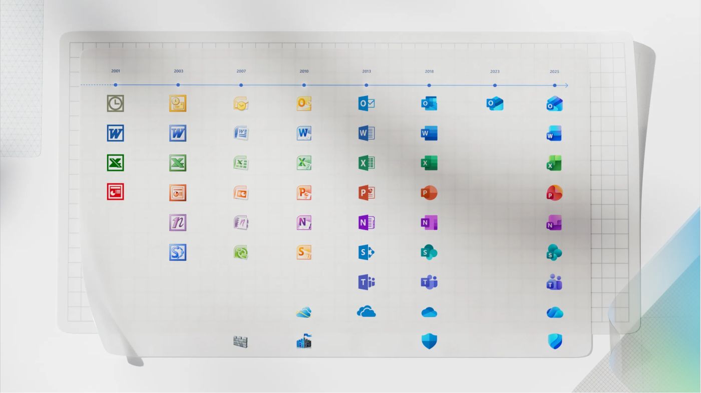
Microsoft has officially launched a redesigned set of icons for its core Office applications. The update introduces more vibrant colors, richer gradients, and softer curves across all 10 primary Microsoft 365 apps. This marks the first major visual overhaul since 2018 and comes in line with the company’s Fluent design language and Copilot integration.
New Office Icons
Jon Friedman, Corporate Vice President of Design and Research for Microsoft 365, has explained the use of company's design principles for the new icons. “The core 10 Office apps were last updated in 2018 and the way we described what the designs represented is almost identical to language used today: connection, coherence, seamless collaboration, fluid transitions,” he stated. The new icons aim to convey fluidity and playfulness while maintaining simplicity, intuitiveness, and accessibility.
Key Visual Changes
The refreshed icons adopt bolder gradients with exaggerated analogous color transitions to enhance contrast and legibility. Microsoft has shifted from sharp, static forms to softer, more dynamic shapes. For example, the Word icon now features three horizontal bars instead of four to improve clarity at smaller sizes. “Sharp edges and crisp lines are replaced by smooth folds and curves, giving the icons a sense of playful motion and approachability,” Friedman explained.
Upcoming Icon Rollout
Microsoft will begin deploying the new icons across web, desktop, and mobile platforms in the coming weeks. The update will reach both consumer and commercial users of Microsoft 365 globally.
Source: TheVerge
Support us
Winaero greatly relies on your support. You can help the site keep bringing you interesting and useful content and software by using these options:

I wonder if Win32 Outlook will get the new icon, or will they keep it on the old one, like when they tried to kill off Win32 OneNote.