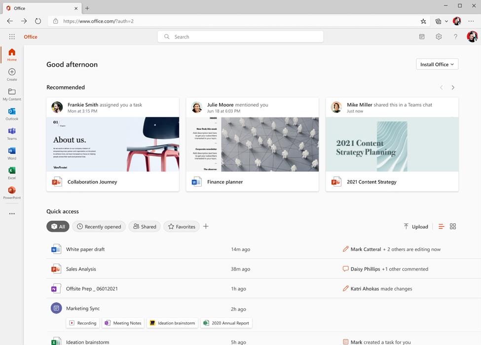
Microsoft has introduced the updated user interface of the Office.com website and the eponymous app for Windows. Currently, the company is rolling out it for business and education customers. The changes aim to make content easier to find, regardless of which Office application was used to create it.

Microsoft has added a new "Home" page that comes with a "Quick Access" section that includes various filters that help you get back to your work faster.
Also, both the app and the website now have a new "My Content" panel with all the files made with the Office suite apps. New “Browse by” views help you find content associated with the people with whom you work or the meetings you've had so can quickly find attachments, meeting recordings, Loops, or any other file you need.
A new "Create" pane has also been added that supports all Office applications. You can create a new file or document with a single click.
There is also a new template tool, which is designed to help you create content without thinking about which of the Office applications is best suited for this purpose.
Check out the following video that showcases all the changes.
Similar changes for users of personal Microsoft accounts will become available in the coming months.
Support us
Winaero greatly relies on your support. You can help the site keep bringing you interesting and useful content and software by using these options:
