More information comes about features planned and implemented for Windows 10 that never seen the light in release versions of the OS. You may already heard about the cancelled Start menu with 3D tiles, which is one of such features. The unified user interface with Cortana and Action Center combined is another one.
Advertisеment
Windows Central's Zac Bowden continues their "Windows Unshipped" series of posts, this time about the Action Center developed for the cancelled Andromeda OS which the desktop Windows 11 could get.
By 2017-2018, Windows 10's taskbar had too many integrated features with appropriate icons, including Task View, Cortana, Windows Ink Workspace, My People, Action Center, and a huge search box.
The presence of a large number of system icons was a real problem for devices with small screens or low resolutions. Users had too little free space to pin their apps and see the running software. Even if some system icons were actively used, users often had to disable them to free up space on the taskbar.
That's why development teams began to work out ideas and concepts for how to clean up the taskbar. The engineers thought about merging some buttons, turning off some of the icons, and changing the system tray to save space.
Some of these ideas are now implemented in Windows 11, but work on them began at the time of Windows 10. It was about 5 years before the release of a brand new operating system.
Control Center
When trying to clean up the system tray and move the quick action buttons from the "Notification Center", Microsoft came up with a new flyout for system options and shortcuts. Functionally, it resembles the same option from iOS.
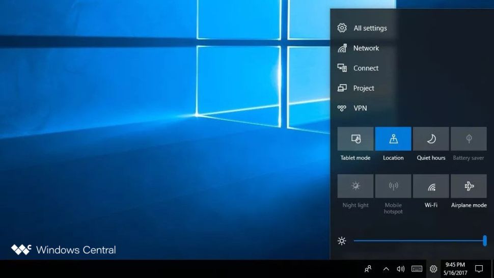
The Control Center could be open from the system tray via an icon. The icon clearly says it is for quick access to system settings and applications. It hosts quick action buttons, brightness and volume sliders, and system tray items such as Windows Security, OneDrive, and third-party app icons.
The idea finally has been shaped into the Quick Settings pane in Windows 11, which can be opened by clicking on the Wi-Fi, volume or battery icons in the system tray. In the concept below, you can see what this menu could look like in Windows 10.
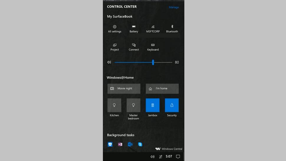
In addition, the Control Center was supposed to be the place to manage IoT devices as part of the Windows@Home idea. The company wanted to turn a Windows PC into a hub for IoT devices such as lights, smart speakers, security cameras, and so on. Unfortunately, Windows@Home had never seen the light.
Microsoft's other system tray optimization ideas were to simplify the date and time popup. But the My People button was supposed to stay on the taskbar, as at the time Microsoft had big plans to develop this feature. Unfortunately, none of these plans have been implemented.
In the pictures below you can see design concepts for Control Center for Windows 10 Mobile and Andromeda OS, as well as a screenshot of an early implementation of Quick Actions on desktop Windows 10.
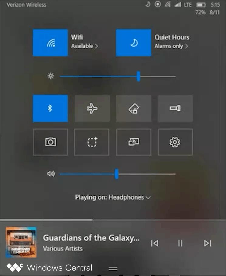
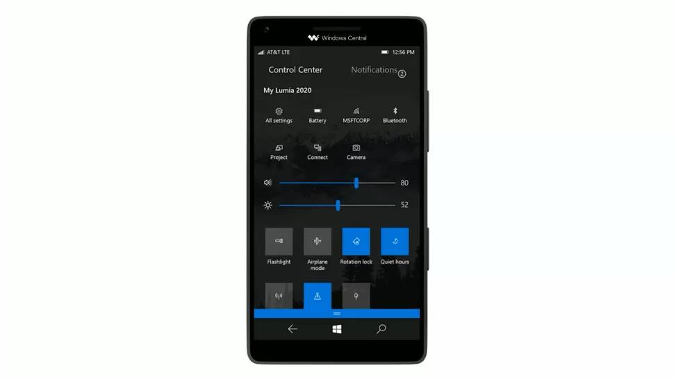
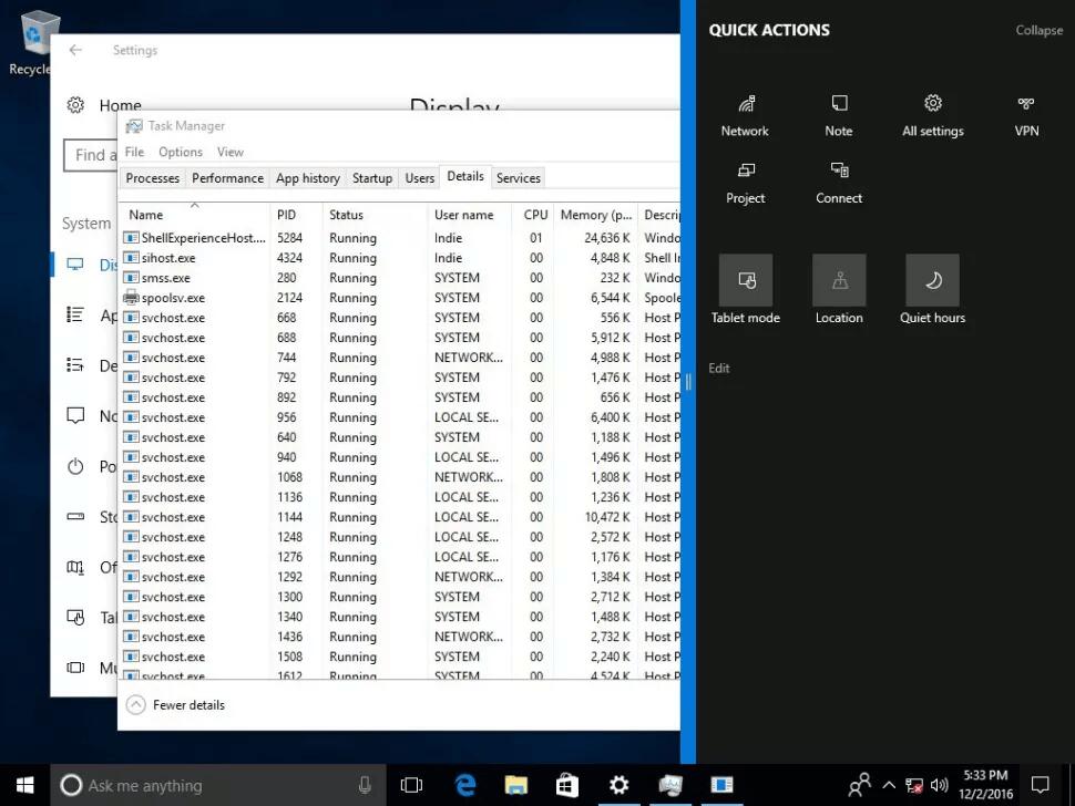 Notice the blue Windows 10 Mobile-style separator control on the left side of the pop-up menu.
This is what the Control Center was supposed to look like in Andromeda OS, a canceled version of Windows created for the Surface Duo in 2017-2018. It is not known if this is a screenshot or a concept render.
The next image is an internal concept of the Control Center user interface for Windows 10 Mobile. At the time, this operating system was under active development. You can see many common things with the desktop version, as they have the shared code base.
Cortana + Action Center
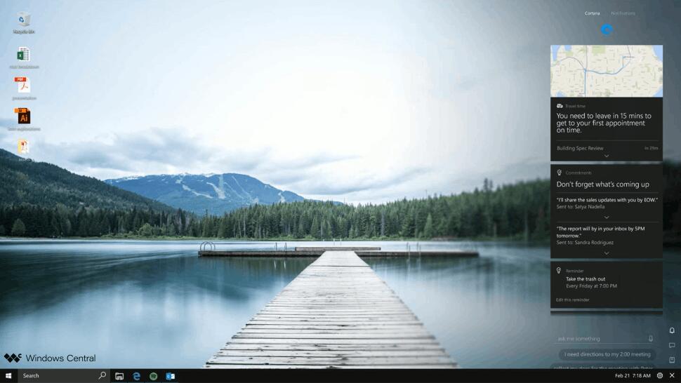
Around the same time, Microsoft was working on a new version of the "Action Center" based on the voice assistant Cortana. The planned to merge Cortana and the "Action Center", and make the new flyout open from the right side of the taskbar.
The idea actually came from the Andromeda OS project. But Microsoft was about to port it to the desktop version of Windows. In the canceled mobile OS, you could open Cortana with a swipe gesture from the right edge of the screen. It would become to the "listening" mode right after appearing on the screen.
Notifications from applications would be displayed in a separate tab. At the same time, Cortana would manage notifications and offer the user those that it "considers" the most interesting and important. The Cortana icon on the taskbar would play an animation and attract users' attention when a new notification arrived.
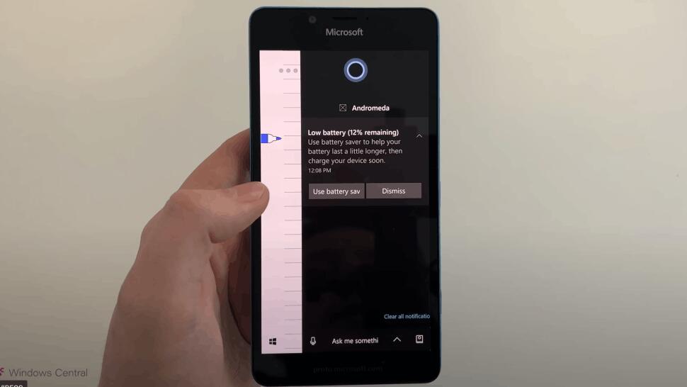
It was an ambitious idea, but, unfortunately, it was never realized. However, a piece of the code for it was written and even worked in some builds of Andromeda OS.
Via Windows Central
Support us
Winaero greatly relies on your support. You can help the site keep bringing you interesting and useful content and software by using these options:
