A few months ago, Microsoft began working on a project, codenamed Sun Valley, which aims to bring a new appearance to Windows 10 and add a number of new features. To name a few, rounded corners are coming for buttons, windows, and other controls, including the Start menu, Action Center and built-in apps. We can now check out how Sun Valley context menus look like.
Advertisеment
The major UI change, known as 'Sun Valley', is probably the change most people are looking forward to in Windows 10, considering the operating system's entire lifecycle so far. It is expected to become available in the second half of 2021.
Sun Valley will refresh the appearance of Windows 10 user interface and make modern UI parts look more consistent, and create a simpler and effective user interface that matches today's workflows.
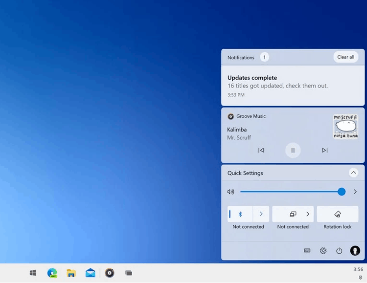
The 'Sun Valley' project is still surrounded by rumors and leaks, Microsoft refers to this move as "reinvigorating" the Windows Desktop. Job postings on Microsoft's careers website confirm the plan to "rejuvenate" the Windows user experience with the "Windows is BACK" slogan.
👉 Visual changes that Sun Valley will include
In the coming months, the changes will be rolled out to Insider builds of Windows 10. But currently, we can check out how context menu will look with Sun Valley. This is possible with Windows UI Library. WinUI is the underlying library that supercharges most recent Microsoft apps and design solutions.
WinUI changes how the context menu look. The screenshots below show the context menus with rounded corners. Notice the spacing between entries and the size of the chevrons. Another important thing to note is that is that the much-hyped Reveal effect, which was part of Fluent Design, is no longer used for menus. Microsoft doesn't find it applicable any longer to menus.
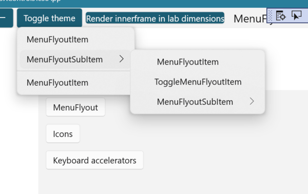
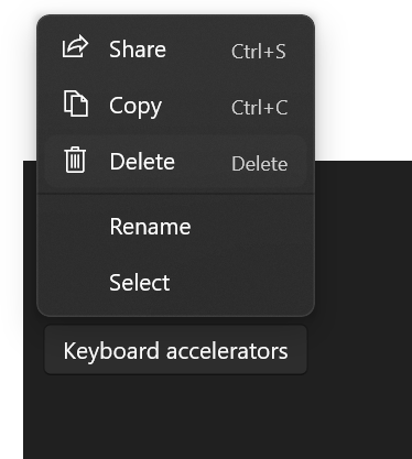
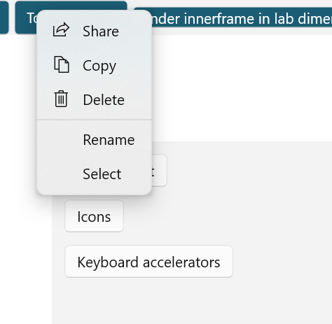
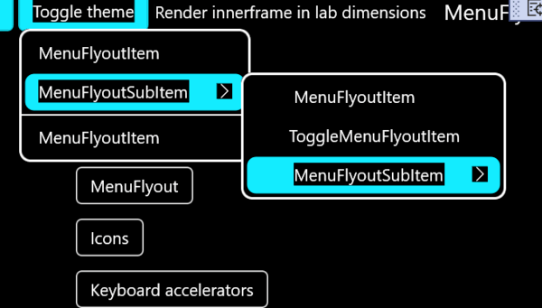
As of this writing, these changes to the controls are tentatively being considered for inclusion in WinUI 3. However, the changes below are confirmed to have been added.
Besides the context menus, the Date Picker and Time Picker drop-down lists have already received a new design. Microsoft is working to include the appropriate changes to the product code base. This shouldn't take long. Here is how it looks:
The highlight effect you see above is called "X-Ray".
Microsoft is expecting to release Sun Valley as an update in the second half of this year. So, it may appear in the October release, which will be "October 2021 Update", version 21H2. Note that significance of the feature updates will be reversed. The major update will be released in the second half of 2021. But the Spring update, version 21H1, will be a smaller one, like Windows 10 20H2 and 1909, which remind of what Microsoft used to call "Service Pack".
Support us
Winaero greatly relies on your support. You can help the site keep bringing you interesting and useful content and software by using these options:

This looks disturbingly bloated. Again, apparently, intended for touch devices. I think many of us have had our experiences with context menus which, due to too many entries, took time to navigate and even went out of the screen.
P.S. Weren’t service packs irregular major updates for Windows XP, Vista and 7?
It would be nice if the UI changes came as theme options.
Then people could change the theme and look of their Windows 10 UI to be like Sun Valley, Windows 7, etc. I definitely welcome visual changes in the future to keep things clean and fresh.
Ngl, the action center looks really cool
Why do they stubbornly make that selected menu background too white to see?