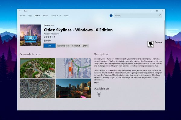
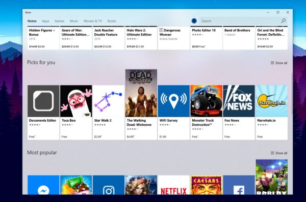
Windows 10's upcoming UI, previously known by its code name "Project NEON", is a new design language which is focused on simplicity and consistency along with cool animations. It also adds Windows 7’s Aero Glass-like effects to the Universal app frame and controls. A few days ago, Microsoft started rolling out a new update for the Windows Store app to Windows Insiders in the Fast Ring which features the Fluent Design.
In the Windows Store app, the whole background now has the Acrylic material effect and all of the UI elements are in the form of a card. It follows the key aspects of the Microsoft Fluent Design System:
Material: A graphical solution which emulates the "sensory and invigorating" feel of the materials that things around us are made of.
Light: Soft highlights of important buttons and features to draw the user's attention.
Motion: A set of animations which give an idea on how to interact with new UI elements like an app menu opening or drawing the user's attention to controls and flyouts which appear on the screen.


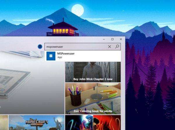
According to MSPowerUser, Microsoft has added some parallax effects to parts of the app, but these aren't easily noticeable. If you are a Windows Insider in the Fast Ring, check for updates on the Windows Store to get the updated app.
What do you think about these design changes? Do you like the appearance of the updated Store app? Tell us in the comments.
Support us
Winaero greatly relies on your support. You can help the site keep bringing you interesting and useful content and software by using these options:

So they ditch glass concept from windows 7 for windows 8, and then they will fully implement it again in upcoming windows 10 release? Finally, I glad Microsoft have their eyes opened now.
I want the taskbar to have the Fluent Design as their is a leaked screenshot of how Redstone 3 would look like.