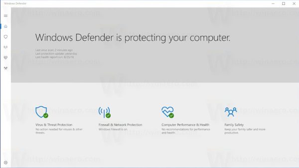
Another interesting change was seen in the leaked screenshots of Windows 10 Creators Update: a new user interface for the built-in antivirus and protection software, Windows Defender. Let's see how it looks.
During the October 2016 Microsoft Event, enthusiasts spotted a completely different UI of Windows Defender's management interface compared to the one that ships in current Windows 10 versions.
Here is a screenshot which shows the new user interface:
 Now it looks like a Universal Windows app and has links to different Windows security tools like firewall, network protection, computer performance and family safety.
It is possible that this user interface replaces the classic Security and Maintenance Control Panel (which was formerly called Action Center in Windows 7/Windows 8.1 and Security Center in Windows XP).
The currently released builds which represent the Creators Update branch, such as Windows 10 build 14955, still come with the old style Defender UI.
Microsoft is actively improving Windows Defender. It is getting major new improvements such as "Advanced Threat Protection", and Defender Application Guard for Edge. Defender in Windows 10 already added offline scanning and Limited Periodic Scanning.
If Microsoft adds such a user interface, it will be useful for touch screen device users. It looks like the Universal apps that Windows 10 comes with.
What do you think about this new look of Windows Defender? Do you welcome this change? Tell us in the comments.
Support us
Winaero greatly relies on your support. You can help the site keep bringing you interesting and useful content and software by using these options:

This one looks not bad! I like it.
Maybe it can be great to have all those settings in the same place but the UI is so UGLY and touch oriented…. (like the rest of 10)
I hope they don’t forget to do some performance improvements as well.
Often times it’s the MsMpEng process which is bottlenecking other processes from running much much faster.
I hope so too.
Why the hell do they keep changing names for the monitoring dashboard? Who can remember all of it all the time? First Security Center, then Action Center, then Security and Maintenance and now Defender which used to be their malware signature scanning tool! This is retarded.
I honestly could not care about the UI – Command line interface only would suffice; so long as the automatically-on AV software actually gave you anything more than rudimentary protection.
In all the major AV tests, Defender/Security Essentials/Endpoint Protection/whatever they are calling it today performed woefully and ultimately gives users false reassurance, when they should be seeking a proper client which will actually protect them.