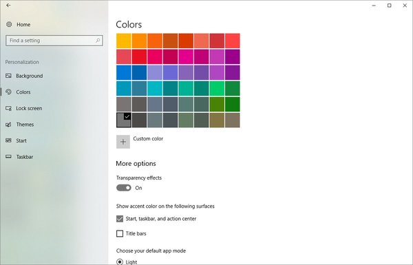
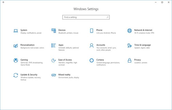
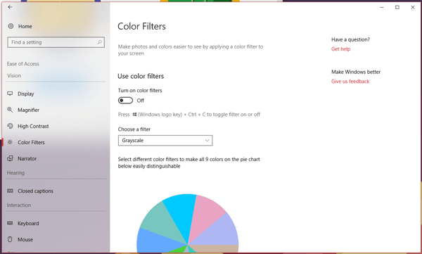
Windows 10 is getting a refined UI for the built-in Settings app. The new appearance of the app received a lot transparency and blur, featuring all the elements of Microsoft's very own design language, known as "Fluent Design". Here is how it looks.

Microsoft released Windows 10 Fall Creators Update in October 2017. Currently, the company is focused on the next feature update, code named "Redstone 4". A number of builds of Windows 10 Redstone 4 were released to Insiders, bringing new features to the OS. For example, you can start apps elevated right from the Run dialog. Redstone 4 is expected to be released next year. It should be a much bigger upgrade compared to the Fall Creators Update. It will also include a number of long-awaited features like Windows Timeline and Story Remix 3D as well as Cloud Clipboard which was cut from the Fall Creators Update release.
Advertisеment
As you may already know, Microsoft is applying its Fluent Design bits to all the modern parts of the OS. Microsoft Store, Edge, Mail are just a few examples. The company is going to bring Fluent Design's Acrylic to the taskbar and is adding some more Fluent Design elements to the Start menu already.
New screenshots provided by Windows enthusiast, Rafael Rivera show a refined user interface for the Settings app. It appears with a new layout for pages and actually looks less boring than the current flat and simplistic design of the app.


The Settings app has already received the reveal effect for the front page and its side bar. Now, the addition of Acrylic has made the sidebar stand out, thanks to transparency and blur.
So, what do you think about this change? Do you like it? Tell us in the comments!
Sources: MSPowerUser, Rafael Rivera
Support us
Winaero greatly relies on your support. You can help the site keep bringing you interesting and useful content and software by using these options:

It looks nice but honestly, getting tired of Microsoft’s emphasis on secondary stuff. Give us some truly new features. Where’s the new file system? Still on NTFS but hey, we got ‘People’ on the taskbar.
I don’t like their “new features”. Starting with Windows Vista, the OS is a mess.
Yeah I wonder who will use their so called ‘new features’ especially since WIndows 8, most of them are only works great with a touch enabled device, but they caused many good old but working flawlessly features for mouse/keyboard and non-touch devices going backwards or simply just removed in favor of touch oriented features at the same time. I’m really curious which company/corporation/enterprise will like their employees to keep moving their hands in front of the monitors rather than typing and controlling the system precise by mouse/keyboard. And system administrators are really getting annoyed with the frequent updates model since they’re very likely have to make adjustment for the updates.
I was going to defend Vista but on reflection, the simple truth is that it looked very nice to me although I can’t think of any new feature that I didn’t turn off. The one exception is the breadcrumb bar but all the new bugs in the file browser that I could not turn off really detracted from the experience! I got into the habit of calling everything after 2003 The New Microsoft. They are currently trying to fix ineptitude by adding greed and I wouldn’t say it’s working. ;)
All that aside, I won’t criticize them for making the UI look nicer since as a designer, I care about aesthetics, as long as it’s a part of making things functional.
so confused why they concerned into fluent design but the UI still not consistant, example right click in taskbar and sound icon in taskbar hasn’t same UI pop up.
We’ve been seeing this mess since Windows 8.