In earlier builds of Windows 10 such as build 9926, there are 2 Start Menus. One of them which could be activated with a simple Registry tweak and was resizable. The other is the "Continuum" (Tablet Mode) Start menu. But this ability is not present in the freshly leaked Windows 10 build 10036. The previous Registry trick does not work, so you only have the new Start menu, which can be switched to a full screen mode.
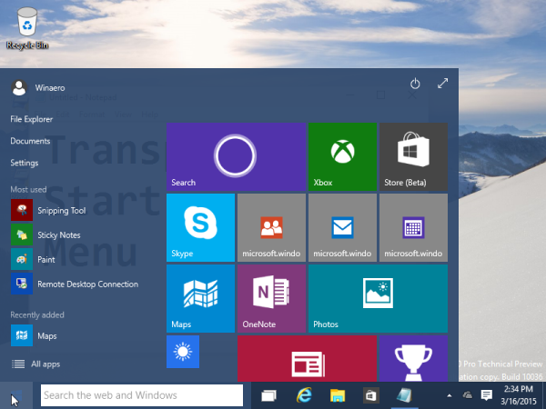
The Start Menu is transparent now. The level of the transparency is different for the fullscreen Start menu and for the smaller one.
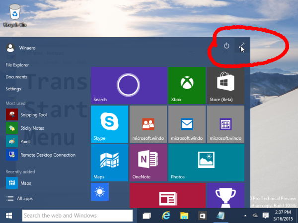
This is how the smaller Start menu looks:
Let's maximize it using the "Expand Start" arrow in the top right corner:
Now see the transparency level of the expanded Start menu:
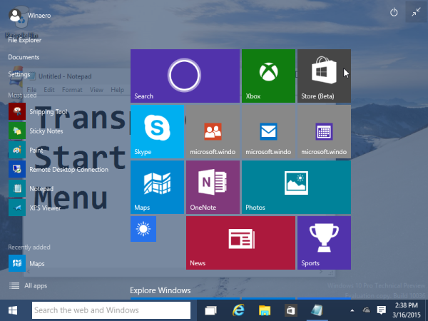 It is more translucent, so it looks worse when the wallpaper color is light or when there is text behind it.
There are a few changes to its appearance.
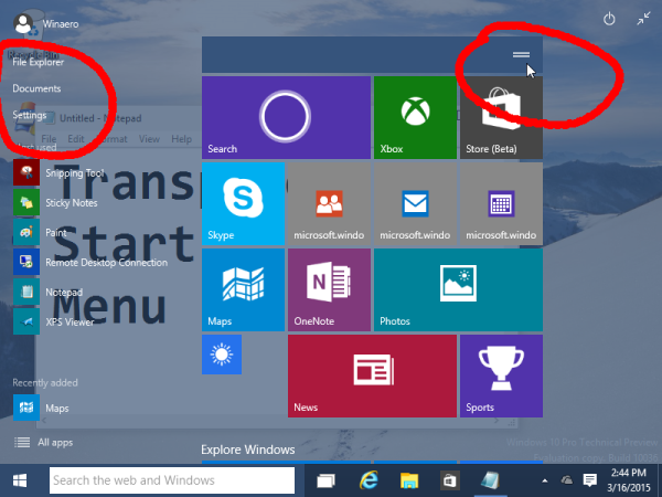
- Icons for items pinned to the top left part are missing now.
- The three Windows Phone-like dots above the tiles group were replaced with horizontal lines. Also, you can grab those lines now with the mouse or touch to move groups:
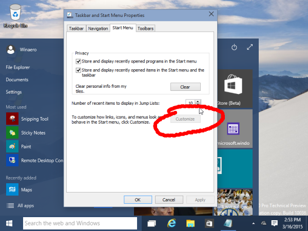
- Another interesting thing is that you cannot customize the top left area of the Start menu in Windows 10 build 10036. The button to do that is disabled in the Taskbar properties window:
That's it. If you noticed some other change, please let me know via comments. Your impressions about the updated Start menu are welcome.
Support us
Winaero greatly relies on your support. You can help the site keep bringing you interesting and useful content and software by using these options:

Sooooo is the translucency forced for the start menu or can you disable it? Even with registry hacks is fine for me…
So did they literally switch from forced opaque start menu with transparent taskbar to forced transparent start menu with opaque taskbar…. Literally what the actual [censored]? Please tell me the transparency is optional!
Not in build 10036, no trick to disable the menu transparency. I hope it will be changed futher.
The start menu is horrible.
No costumization. I dont want the recent apps, I want the apps i choose. Also why do i want, File Explorer, settings, and Documents on Start? Where are Jump Lists?
Microsoft dont learn at all. I will have to use an start menu replacement again.