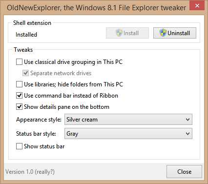
The developer of the famous Start Menu, StartIsBack, has written another app called OldNewExplorer and as the name indicates, it aims to restore some of the Windows 7 Explorer features to Windows 8's Explorer. The name appears to be a play on the famous blog, OldNewThing, by Microsoft's Shell developer, Raymond Chen. OldNewExplorer brings a couple of very interesting features back to Windows 8 Explorer. Let's see which.
Advertisеment

Before delving into the features OldNewExplorer restores, it is also important to note how it brings them back. According to Tihiy, everything is done in-memory. It is a very challenging (but safer) way to revive features this way, as operating system files aren't touched on disk. In-memory patching is always a safer approach than patching files on disk.
Tihiy had hinted in his Neowin interview that he might bring more features besides the Windows 7 Start Menu to Windows 8 and now OldNewExplorer precisely does that. Here are some of the changes OldNewExplorer can do:
- OldNewExplorer can restore the grouping of drives in This PC/Computer folder to what Windows 7 had and remove the folders you don't want: In Windows 8.1, removable drives and optical drives aren't grouped separately from local hard drives. If you prefer having them grouped separately, then you will find value in OldNewExplorer. It can also remove the folders which Microsoft added to This PC with no option to remove them.
Note: Winaero's This PC Tweaker can also selectively remove the folders you don't want from This PC. It can also uniquely add any folder you want.
- OldNewExplorer can restore the Command Bar to Explorer and disable the Ribbon. It does this on-the-fly without patching the OS file on disk. Why would you want to disable the Ribbon? Several reasons - it splits commands across tabs and increases the cognitive load on your memory by making you remember which command is on which tab. If instead you use a toolbar such as the one that Classic Shell's Explorer addon adds, you get faster access to the commands you need and everything is visible on a single row, so there's no switching involved across multiple commands to locate the command you want.
Winaero's Ribbon Disabler also returns the Command Bar. With the Ribbon disabled, you can also use Winaero's Explorer Toolbar Editor to customize the Command Bar.
- OldNewExplorer can restore the Details pane to the bottom as it was in Windows 7 Explorer. This is much better than having the Details pane on the right because if it's at the bottom, you can enable/disable it without affecting the Preview pane which is on the side. Also, you can show many more files in Explorer without scrolling if the Details Pane is set to the Small size at the bottom.
- OldNewExplorer can improve Explorer styling with some built-in visual styles. You can change how the Command Bar with the Organize button looks. It can also make Explorer's status bar gray so it fits the visual style of the OS better.
You can read more about OldNewExplorer and download it from MSFN forum. As of this writing, only a test version of OldNewExplorer is released so bear in mind that it's in-development software and you should excuse any minor bugs or issues and report them to the developer. It being a test version, some programs may also crash but those should be fixed as long as you report them.
Closing words:
OldNewExplorer and StartIsBack are both modifications similar to the excellent and free Classic Shell with the aim being that the user should be able to customize his OS environment the way he wants.
Overall, OldNewExplorer is a very interesting Explorer mod and certainly, a highly useful one if you care about having the most productive and customizable user interface in File Explorer. It is likely that OldNewExplorer will get more features over time as Microsoft makes more changes to File Explorer which restrict customization.
Support us
Winaero greatly relies on your support. You can help the site keep bringing you interesting and useful content and software by using these options:

Windows look much better with Details Pane at bottom.
correct