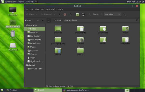
A new GTK+ theme and icons for the upcoming Linux Mint 18 "Sarah" became available few days ago. Earlier, developers had made the announcement that Linux Mint 18 will feature a new look and feel. I was able to get the new appearance in action in my test system. Here are a few screenshots for those who are interested in seeing how Mint 18 will look.
Advertisеment
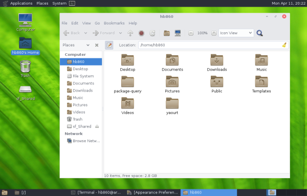
Linux Mint's Github now contains a new GTK+ theme for the upcoming release. The theme is called "Mint-Y". It is based on the popular Arc theme created by . It looks exactly the same, just slightly recolored to match the green style of the distro.Here is the appearance provided by the Arc theme in MATE 1.12:
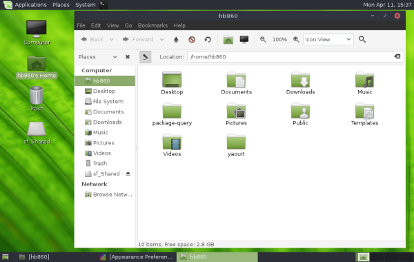
The following screenshot shows Mint-Y in action:
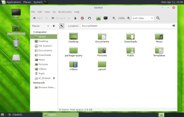 Besides the selection color and icons, they look similar.
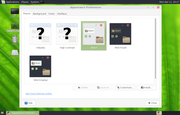
Like the Arc theme, Mint-Y also includes three color variants. The default one is in the screenshot above. There are "darker" and "dark" options available, as shown below:
As for icons, the new icon set is based on the flat icons "Moka". It is also called "Mint-Y".
Moka is a modern icon set which follows the popular flat appearance trend. As of this writing, Mint-Y icons is a mix of Moka and the good old Mint-X icon set which is familiar to every Linux Mint user. While the apps menu comes with Moka icons for categories and apps, folders are still from Mint-X:![]()
![]()
How to get Mint-Y themes in your OS
If you would like to test the Mint-Y suite in your Linux right now, here is what you can do:
Arch Linux users can install it using these packages in AUR:
Other users can just download the following archives:
- Mint-Y GTK theme. Extract the archive content to /home/username/.themes
- Mint-Y icons. Extract the archive content to /home/username/.icons
What do you think about these themes and icons? Will you be happy to see them in Linux Mint 18?
Support us
Winaero greatly relies on your support. You can help the site keep bringing you interesting and useful content and software by using these options:

Mint always looked good but it was a little coarse, with overly thick borders so it always looked better in a screenshot than on the desktop. Hopefully Mint-Y will be a bit more refined.
You have the most comprehensive Linux site. Thanks for all the help you offer!
i made some packages:
mint-y-gtk-theme: https://software.opensuse.org/download.html?project=home%3APival81&package=mint-y-gtk-theme
mint-y-icon-theme: https://software.opensuse.org/download.html?project=home%3APival81&package=mint-y-icon-theme
Great. Thanks for sharing!