Many Windows 10 users are extremely upset by the fact that Microsoft locked down the ability to have colored title bars for open windows. Due to this limitation, all windows including active and inactive ones, have white title bars. The user cannot easily tell if a window is active or not. The only subtle hint for an active window is that it has a drop shadow. If you are not happy with this ridiculous change, here is a solution.
Advertisеment
The default theme used in Windows 10 is extremely problematic and poorly designed which is why the same color is shown for active and inactive window title bars and borders. Microsoft, in their eternal effort to take more choice away from the user, have locked down the theme. The Desktop Window Manager in Windows 10 ignores the colors set by the user and does not apply it to the title bars of windows. While you can bypass this restriction and get colored title bars, there is still no easy way to distinguish between active and inactive window title bars - this, I believe, is a fundamental violation of usability and taking control away from the user. The window borders also remain the same color. What is even worse is that the caption buttons for Minimize, Maximize and Close have also been intentionally dumbed down so they give no visual feedback to indicate an active window. Let's try to fix all this.
How to get different active and inactive window borders and red Close button in Windows 10
The trick is to activate the built-in Aero Lite theme which is bundled by default with Windows 10. Once you do this, working with windows in Microsoft's new OS becomes a lot easier. Follow these instructions:
- Activate the Aero Lite theme as described here:Enable the hidden Aero Lite theme in Windows 10
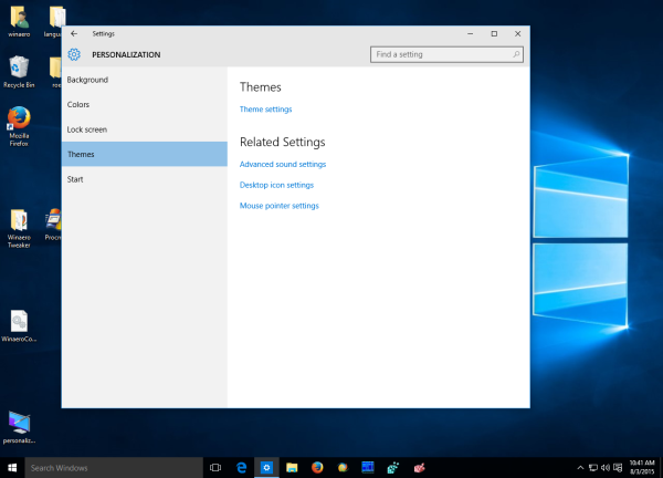
- Open the Settings app.
- Go to Personalization - Themes and click the link "Theme settings":

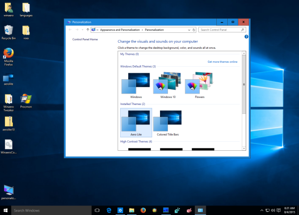
- Click the Aero Lite theme:

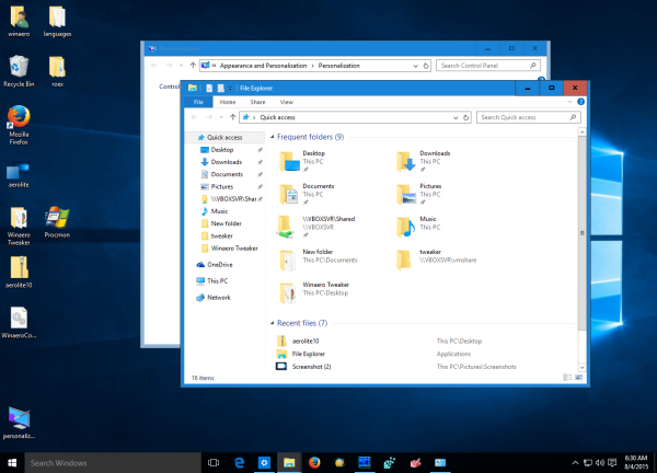
When Aero Lite theme is enabled, the Close button is colored red once again for an active window even if you don't hover over it and the title bar text is black. When a window becomes inactive, the red color goes away from the Close button and the title bar text and caption button symbols turn grey. Also, the window borders are darker for active windows and when the focus is lost and when the window becomes inactive, the window borders become pale.
Even the basic controls such as scroll bars and 3D buttons turn a slightly darker grey with the Aero Lite theme making them easier to see and they turn blue when you hover over them. The separation lines between tabs (property sheets) also become darker and taskbar buttons become easier to see thanks to improved color separation. The downside I see is that the title bar and taskbar text is no longer white but is black making it harder to read if you use darker colors. So I fixed it. If you download the theme file from the link below you will get the white text instead of black. This is an acceptable tradeoff for getting back the ability to differentiate between active and inactive windows.
You can download the ready-to-use Aero Lite theme from here:
Download Aero Lite for Windows 10
Support us
Winaero greatly relies on your support. You can help the site keep bringing you interesting and useful content and software by using these options:


is there any possibility to change the background of the “close” button from red in another color? i’m asking because my Title bars are colored in red and therefore the “close” button of an active windows is hard to be visualized
thanks,
Micha
Unfortunately, it is not possible
Thanks for your quick answer! I really appreciate your work!
Micha
Well, it shall be as this was possible by editing visual styles even in Windows 7. It’s the theme’s atlas file which you need to modify. Of course, you could use a program that would simplify this task as Windows Style Builder does. However, I haven’t seen a version for Windows 10 yet. Here’s a screenshot of Aero Lite’s theme atlas: http://i.imgur.com/LEvSvYe.png
#1patch system for third party themes
#2 yes their is, you need to edit the theme in “windows style builder” WSB program
this is the location…..for doing it.
Windows & Caption Buttons > Aero > DWM Window > Restore /Maximize Button , Minimize/Help
Button and Close Button
(All the CaptionButtons can be found in these areas) edit with photoshop and test
One thing i’ve noticed with this tweak is that the battery/wireless/show hidden icons/start menu (basically anything attached to the taskbar). get a black border around them albeit a few pixels off, with no other discernible border or fill.
If i had to guess how this works, i’d guess that the tweak removes all of the shadow effect windows 10 uses and replaces it with the theme color, and then gives it a 1px black border. However, any items that are part of the taskbar do not follow this behavior. instead, they remove all drop shadow and put the 1px border where it should go, but do not replace the shadow with the theme color, and you get a “floating” border a few pixels out.
I can’t confirm, but i believe this is fixable if you can change the width of the drop shadow border that windows 10 applies to 1px (or 0px if possible). this would likely remove all other borders that are actually useful, so perhaps it would not be the best solution. An alternative would be to change the color of that black border to transparent, if possible.
I’d try to confirm it myself, but I couldn’t find a setting to change in the aerolite.theme file, and the aerolite.msstyles file is essentially gibberish to me, even with Resource Hacker.
TL;DR: AeroLite causes floating black borders around items that pop out from the taskbar. May be fixable by changing border to not be black, a setting i believe is in the msstyles file, but i can’t confirm
Andrew
My text is still black after installing Aero Lite Theme. Signed out and then signed back in and text is still black. Restarted computer and text is still black. At a loss why they are not white like yours.
I re-uploaded the theme file. I am sorry.
It if fixed now.
Given the thick borders on Aerolite, please add the Tiny borders option to Aerotweak. Thanks!
hmm, good idea!
I will “unblock” this feature.
At least, when having colorized titlebars you can tell the difference between active and inactive apps by the strange square which appears around the text in the titlebar.
http://i.imgur.com/xMjfEiw.png
Yep, and I don’t like this glitch. Microsoft broke the theme engine in Windows 10.
Probably, it is the main reason why we have white title bars.
I downloaded and installed Aero Lite Theme. Text is still black in active titlebar. What am I missing?
“The downside I see is that the title bar and taskbar text is no longer white but is black making it harder to read if you use darker colors. So I fixed it. If you download the theme file from the link below you will get the white text instead of black.”
Because I suddenly uploaded the unfixed file by mistake. Re-download it please, now it works.
Yes!!! The new download now shows white text in active titlebar. Thanks so much for your work on this project.
I like that the text of the title bar is now white. This way I can make the title bar a very dark grey, since black is not available.
However, the text of the task bar is now black instead of white.
I think the ideal would be if we could have Black color for the task bar and the title bar, and the text color should be white (or light grey). The inactive window’s title bar should be a very dark grey, and the title bar text a 50% grey perhaps. And the stupid useless grey line that is on the bottom of the task bar buttons should go.
I like the Aero Lite theme a lot, except for the grey caption on the title when the window is inactive. Is there any way the to have just grey text when the window is inactive? In other words, how do i get rid of the grey caption?
Thanks.
Looks good, but the text on the task bar changed to black and is almost unreadable :(
Hi. I downloaded the theme but deleted it yesterday, because of the black title bar fonts. Today, I downloaded the new file, but the black fonts on the tool bar remain. Everything else is perfect. How can I get the text to white. H*E*L*P! Please…….?
Under toolbar you mean the taskbar, right? This issue is not solved yet. We are working to fix it.
How do you change font color to white on the title bar?
It is metrics in the aero lite theme.
Download and apply it to get white color.
How i can change BLACK fonts at taskbar to white ?????? Please, say. My email alex-sgu@yandex.ru.
AeroLight BEST theme because close button is red.
I cannot find any wat to “patch” it.
Try to set “show color on the taskbar” in Settings->Personalization->Colors.
This will make your taskbar more readable.
so…. maybe it is possible to set some lighter color for the background of the task bar? Or maybe more transparent?
I found no way yet.
This was #1 reason I switched back to Win 8.1 :/ Isn’t it possible to make inactive window title bar color different? This greyed caption isn’t enough
Unfortunately, it is not possible yet.
You can set the AeroLite theme in W10 so that the sidebars of inactive windows will be a different color than the color from the active window.
Save your theme. Then Edit with Notepad and look for ColorizationColor. Change this value to any number.
E.g ColorizationColor=0X1234567 will change the AreoLite theme to red TitleBar, red SideBars of active window, and grey SideBars of inactive windows, and a blue TaskBar.
E.g. 2). ColorizationColor=0X112358e13 will change active window to Blue, inactive has green sideBars, taskBar green.
Not sure how it works, but it uses hexidecimal numbers, so use 0 to 9 and A to F. Also, a tip is to edit “DisplayName” in the theme file to “AreoLiteContrast1” or something, so you can find it back easily under your Personalisation themes. Hope this helps, and that someone will find out more.
Alright, I’ve been playing around with this for a while, and I am glad to report that I am now more confused than when I started.
You can also add more digits onto that, and get (currently) unpredictable results, like changing the colour of inactive window fonts from grey to saturated blue. That specific one is ColorizationColor=0200000000. As you can see, I was just progressively trying trail and error to find that.
This one line of code seems to be more powerful than it first seemed; now only if we could figure out a way to use it to get desired colours.
After a quick search on the net I found this http://tweaks.com/windows/39028/change-color-of-glass-with-regedit-with-decimal-to-hex-argb-converter/ . It explains how to get a desired, singular colour using ColorizationColor, but not why it changes other things or how extending it does things. Trying to use any of the codes generated from that calculator seems to not be valid, and results in the theme using the colours of the previously selected theme instead. Adding 0x to the start does something, but I’m not too sure what. 00800080FF is interesting, because although it’s very different from your example, it reproduces almost the same colours as 0X1234567.
If anyone works this out, I’d love to hear it.
Hello WinAero!
Windows 10 has that 1px (very tiny) border around every window possible (Win32 apps and Modern apps).
Is it possible to completely remove the border and only leave the shadow behind windows?
No you cannot. I am sorry.
The 1px border is hardcoded even for Windows 95 and cannot be removed.
I have noticed over the past few days that after returning from sleep that the titlebar text returns to black. I have to go into Themes and select Aerolite to make the text white again. Next sleep returns text to black. For some reason Windows 10 is creating a Unsaved Theme entry which shows black text for some windows not all ie This PC black text while Command Prompt has white text. Go figure. Has anyone else notice this behavior?
It’s better. I prefer the blue title bars, but now they’re always blue, even when not active. Is there no way to have one colour for active, one for not active?
I now have two aero light themes, because I followed your instructions, then found the downloadable version with white text. How do I delete the one I don’t want?
Go to c:\windows\resources\themes and delete it.
Thanks… have now installed Aerolite and it is an improvement.
Couple of points:
1) Firefox is strange… (and I’m sure other apps): it does not adopt the Aerolite colour scheme but instead keeps everything very grey, whether or not it is active. There is however a very subtle difference: I have the menus showing in FF, and the font of these menu headings is grey when inactive, and black when active… that’s the only difference!
2) there appears to be a difference (again, with FF and maybe other apps) between windows being “active” and “focused”. I use an Autohotkey command to bring up a FF window… and it is “active” in the sense that the font is black… but when I then type, nothing gets typed in the browser window, and when I go Alt-B this does not show the “Bookmarks” menu. Only by Ctrl-tabbing away and back again can I make the window gain “focus”. This change of status causes no change of visual cues…
If I had time I would love to look into what Aerolite is actually doing… clearly there is a way to harness system “sensitivity” to questions of “activeness” (maybe focus too?)… hopefully someone with enough expertise and time (and hatred of Microsoft) will one day find time to overcome this particular nonsense from M$…
I agree that MS have made many very bad usability design decisions in their race to create the worst desktop experience. Finding the active window when you have 2×30″ monitors was virtually impossible. With your tweaks, It is now a bit easier, although the aero light theme is as ugly.
Oct 2016
Thanks for the Aerolit theme. It covers many of my complaints with the Win 10 UI. (ignoring the fact the MS has removed all of the customization options we used to have that would have fixed my issues …)
Unfortunately it is still missing one feature The text on the Taskbar is still black, unreadable. Even if I select the lightest Accent color ( in the pitiful selection MS limits us to ) the taskbar text is still pretty unreadable.
Would it be possible for you to tweak that setting?
PS using system colors is coded into the application. One person already mentioned that FireFox does not comply with the active/inactive color. That is true, but funny thing, neither do the MS Office applications!
“Also, the window borders are darker for active windows and when the focus is lost and when the window becomes inactive, the window borders become pale.”
I enabled the aerolite msstyle that came with Windows 10. I like it, except for the window borders becoming darker for active windows. It’s too dark for me. I would prefer the window borders for active and inactive windows to be the same color that is #555555 or lighter. Could you tell me how I could accomplish this? I have downloaded a program called msstyleEditor, but I could not find the setting in there. Maybe you know where it is? Or maybe you know another way to use aerolite but make it so the borders are lighter? My accent color is white, but that has nothing to do with the actual border color as you discussed in the above quote. Your help would be greatly appreciated, or just a reply if you don’t know the answer. Thank you.