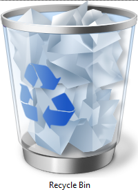
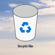
Lately, newer Windows 10 builds have included a new Recycle Bin icon that replaces the old well-known icon from Windows Vista.
The old one looked like this:
Microsoft changed that icon to this:
However, there was much furor and controversy over it. Lots of people started to complain about the new Recycle Bin icon (although I don't see what the big deal is since it is customizable). Microsoft got mostly negative feedback about Windows 10 icons and so they finally decided to replace at least the Recycle Bin icon.
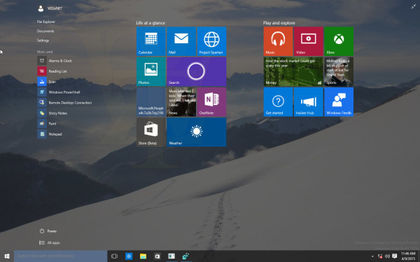
In the most recent builds of Windows 10, (upwards of 10049, which are not available publicly), the Recycle Bin icon looks like this:
![]() Unlike the previous one, this one reminds me of the Recycle Bin icon from Windows 95-98:
Unlike the previous one, this one reminds me of the Recycle Bin icon from Windows 95-98:
Besides the icon, the leaked pictures also indicate some other minor tweaks happening to the new Start Menu in Windows 10. For example, the Power button is moved from the top right corner to the bottom left corner of the Start menu and is located now near the "All apps" link.
There is also an updated icon for the virtual desktops (or as Microsoft calls it, multitasking) but aside from that, it does not look like there is much else new.
![]() The search box takes the whole height of the taskbar and has no borders around it even if the Start menu is not opened.
The search box takes the whole height of the taskbar and has no borders around it even if the Start menu is not opened.
What are your impressions about the new icon? Do you like it or do you think Microsoft should change it again? Or you don't care about it and have much bigger problems in Windows 10 to be concerned about? Tell us in the comments.
Credits: via.
Support us
Winaero greatly relies on your support. You can help the site keep bringing you interesting and useful content and software by using these options:

The icons should keep the Microsoft design style (2D and simple colors). I think that the whiners need to find something better to do. If you don’t like the icons, change them yourself.
I agree, it is not that hard to change the damn Recycle Bin icon.
Not sure to be happy or be grumpy! I know this is testing phase but not development phase. So they cannot experiement with icons at this stage and release few with each build and amuse/confuse/scare users. M$ are known not to listen to users and they should just go that way with icons atleast. Looks like this year M$ kids year where kids of employees get to play with every build ;)
My favorite Recycle Bin was from XP and XP Beta2. Those are so nice icons! Later, MS made icons worse.