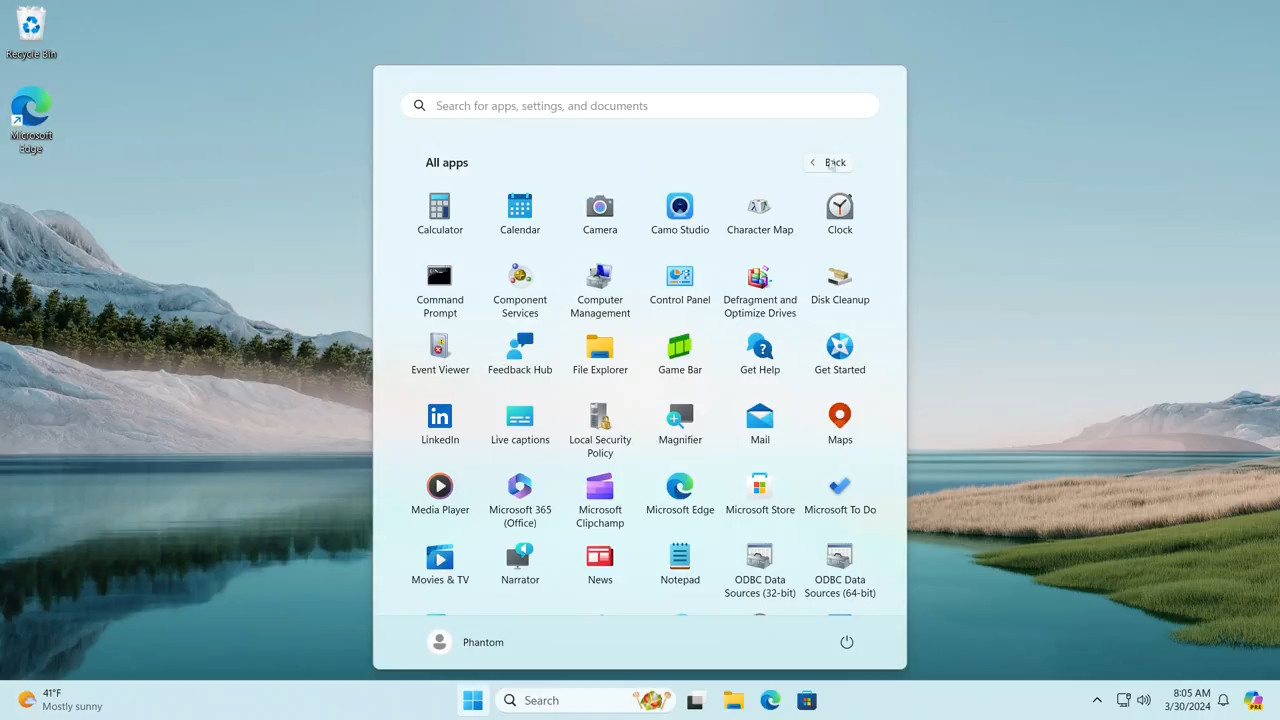
Microsoft is about to refresh the appearance of the "All apps" section of the Start menu in Windows 11. Its new design has been found in Windows 11 Build 22635.3420, the most recent Beta release as of now. The new design replaces the alphabetical list of apps with a grid of icons.

The style of the new app list reminds of what macOS and Gnome on Linux have by default. Also, the alphabetical index allows to quickly go to any letter and launch an app faster. The new grid of icons lacks this handy option. Also, if you have many apps installed, it will take a lot of time to scroll through all those icons before you find the required app. In my opinion, it is one of the worst features of Gnome, and I am definitely not happy to see it in Windows 11.
Advertisеment
As the change is hidden, you must enable it manually with ViVeTool. Also, it is not listed in the release notes for Build 22635.3420.
To enable the new "All apps" section in Windows 11 Start menu, do the following.
- Navigate to this GitHub page and download the ViVeTool zip archive.
- Extract the app to the
c:\vivetoolfolder for your convenience. - Now open a new Terminal as administrator. In Admin Terminal, use a PowerShell or Command Prompt tab - both will do.
- Type
c:\vivetool\vivetool /enable /id:48433719and hit Enter. - Now run one more command:
c:\vivetool\vivetool /enable /id:47205210 /variant:2. - Restart the computer once you see the Successfully set feature configuration message.
Now you can open the Start menu, click All apps, and check out the new design. Here's a video that showcases the changes.
❌ To disable the new UI, use this command: c:\vivetool\vivetool /disable /id:47205210
The change was first discovered by @PhantomOfEarth in the recently released Insider build of Windows 11 Build 22635.3420 for the Beta channel.
Support us
Winaero greatly relies on your support. You can help the site keep bringing you interesting and useful content and software by using these options:

Yeah, this is not great.
I;d rather they made the start menu resizeable and allowed us to get rid of recommended section already.
It just look like an Android launcher. Not really useful on desktop PC.
Even their own launcher for Android (Microsoft Launcher) has an option for alphabetical app drawer sorting, so this is a bizarre change indeed. They should make this an option at least.
Yeah, the change in the Start menu is just insane.
Nah, I’d keep the vertical “All Apps” list on Windows 10’s Start Menu without the tiles on the right side. Like this one: https://www.addictivetips.com/app/uploads/2019/06/start-menu-no-tiles-1.webp