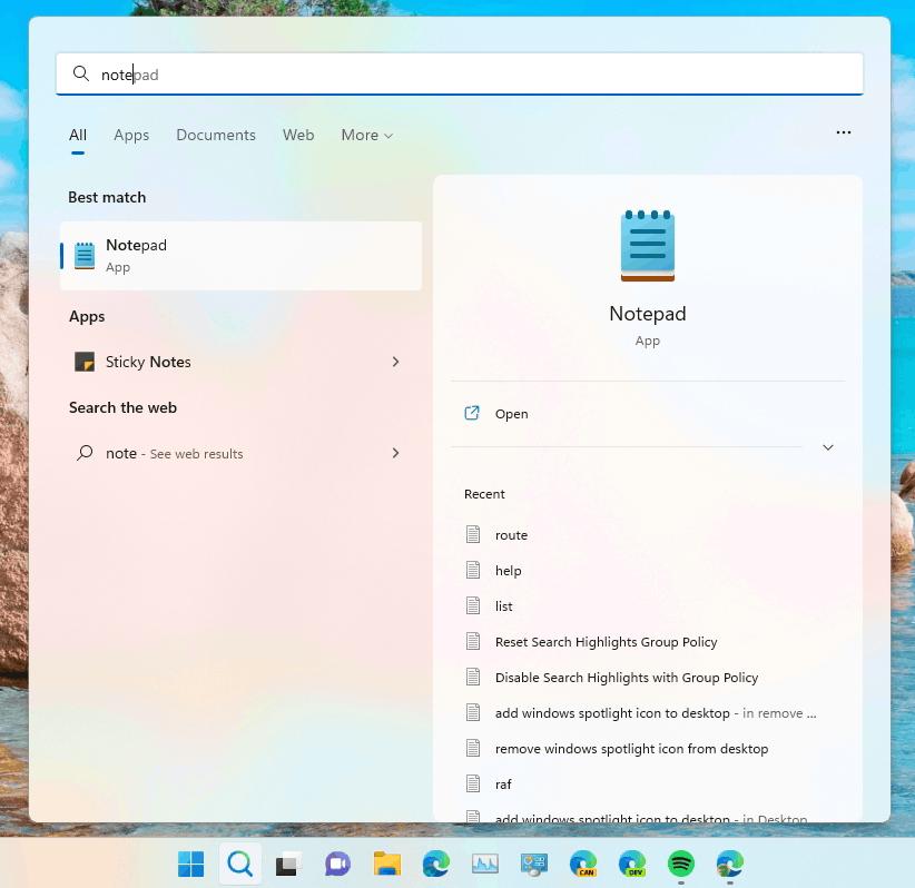
An update Search user interface has beed spotted in latest Dev builds of Windows 11. It retires now-classic Windows 10-like links for search categories, and replaces it with "pills".
Here's how search looks like in the actual version of Windows 11.

Currently, the latest release is "Windows 11 2022 Update", which already brings up with it several UI updates. Despite the fact that it doesn't include a number of planned features, such as Tabs in File Explorer, you can easily enable them with ViveTool.
And this is the newer version of search that start appearing for some Insiders.

While the change is nothing major, it makes Windows Search play well with the overall look of Windows 11. Such interface updates make appearance of Windows 11 more consistent.
The Search UI changes are often server-side, so it is hard to predict when exactly you will see it on your PC. Perhaps it will take some time from Microsoft to test it properly and roll out to everyone.
via FireCubeStudios
Support us
Winaero greatly relies on your support. You can help the site keep bringing you interesting and useful content and software by using these options:

I don’t like new Notepad UWP app because it’s slow. I like classic Notepad win32 app because it’s fast. I’m still using Linux Mint