Microsoft has started working on updating the appearance of the Windows 10 operating system again including the built-in Windows apps. A new design language, codenamed Project NEON, adds more transparency, blur and animations to the user interface of Universal Windows Platform apps. Currently, the apps for Windows Calculator, Windows Camera, Voice Recorder, Paint 3D, and a number of others have received the makeover.
Project NEON is Microsoft's new design language which is focused on simplicity and consistency along with cool animations. It also adds Windows 7’s Aero Glass-like effects to the Universal app frame and controls.
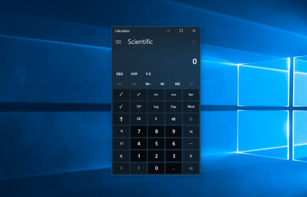
As of this writing, the following apps were updated with Project NEON guidelines, for Insiders in the Fast ring. The Calculator app got a lot of transparency and blur:
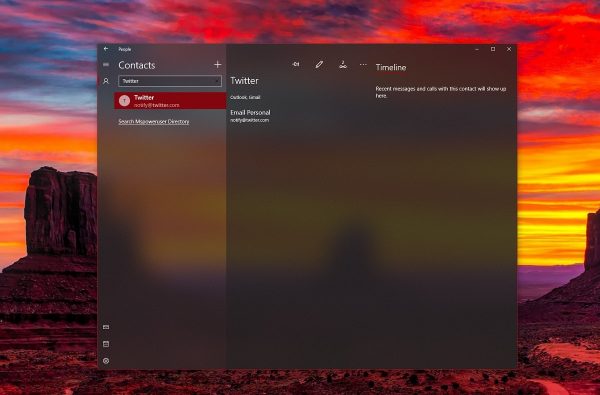
The same change can be spotted in the People app. It looks as follows.
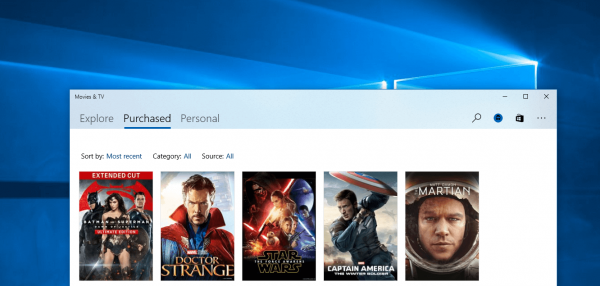
The Movies and TV app is in the screenshot below. Notice the slight blur on the title bar.
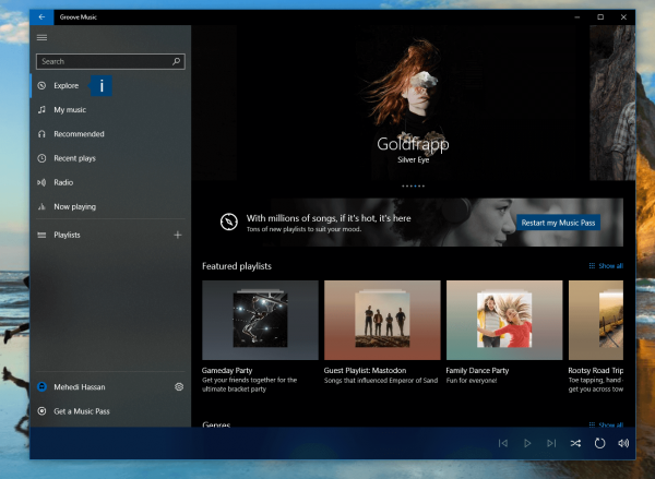
Groove Music:
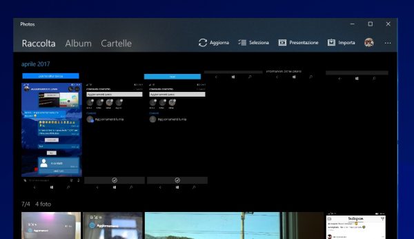
Similarly to Groove Music, the Photos app also has an updated appearance.
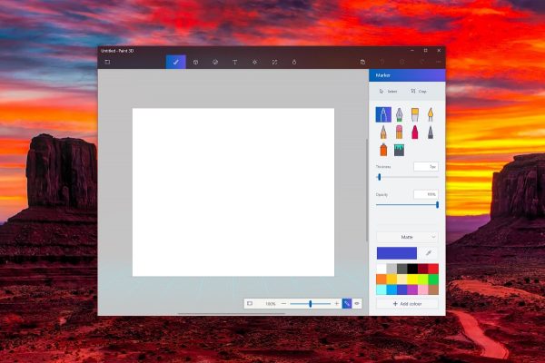
The Paint 3D app got the same makeover.
Do you like this change? Do you find these effects suitable? Do you think it simplifies the user interface that Microsoft has implemented for UWP apps? Tell us in the comments.
Source and image credits: MSPowerUser.
Support us
Winaero greatly relies on your support. You can help the site keep bringing you interesting and useful content and software by using these options:

If they can build it so it works without user intervention and tweaks/fixes yes
Love it! Thanks for the update. With the correct polishing this should definitely look great!
I’ve come up to realize that the Action Center has some sort of difference to it. Or is it just me?
What happens if Project NEON for Redstone 3 doesn’t ship in time when Redstone 3 is released?
Nothing. Apps will have the familiar look without NEON.
A bit overkill for some app. Look at that Calculator app and especially Contact, yikes!
Hmm, first removing old features, then bringing them back updated and as new. Thank God that we had bigmuscle and his software in all these recent years.
Nearly the same as macOS Yosemite design.
I simply want this to be applied to ALL Title bars, especially Win32. The rest is just a bonus.
The change to blurred, transparent elements is a welcome and overdue change to any ugly design.
Microsoft should have never ditched it in the first place.
As the saying goes, if it ain’t broken, why try to ‘fix’ it?
To this date, Windows 7 remains the best OS they’ve created. Vista was a memory hog, but 7 was optimized and streamlined. Shame on them for ruining their best OS.
PS: Sargon is right – W32 apps need to be incorporated into the mold as well. Absolutely.