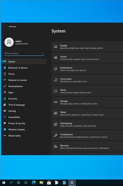
Sun Valley is the name for the upcoming major user interface redesign of Windows 10. We know about it not that much at this moment of writing. We have already seen new icons, some rounder corners of Windows and a bit refined look of controls in built-in apps. We also expect some parts of now-cancelled Windows 10X to be included in the upcoming release. A new leak reveals how the Settings app will look in Windows 10 "Sun Valley".
Advertisеment
Earlier this week, Microsoft announced the "next generation Windows" announcement event that Satya Nadella talked about at Build 2021. The presentation will take place on June 24, and there is no certainty that the company will be able to prevent internal leaks. This way, we have already learned that the next Windows version will be named Windows 11.
In addition to this, a screenshot from build 22395 found its path to the Internet. It demonstrates a new design of the Settings app with new colorful icons and restyled category look. Here' the screenshot.
According to the thecommunity website, a trustworty information source, the screenshot is genuine and actual. They have been able to confirm this with people who are familiar with the internals of Microsoft.

As for the "Settings" application, the main categories will now be moved to the left navigation menu and will receive colorful icons. The list of pages related to the selected section will be displayed on the right side. It's worth noting that the screenshot captures build 22395 from the rs_onecore_wsd branch, which seems to be missing any other Sun Valley elements.
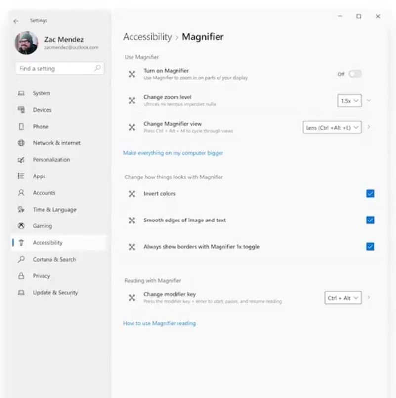
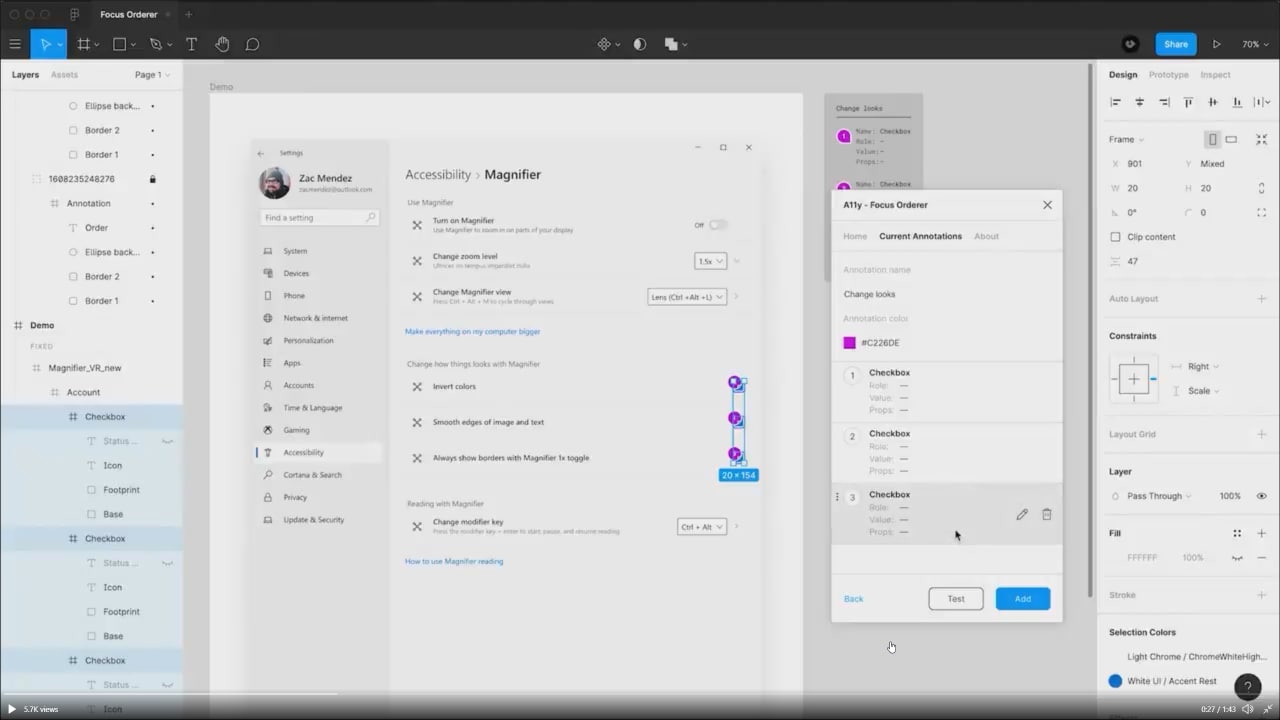
Also, enthusiasts were able to find the official concepts of the "Settings" application, which Microsoft demonstrated during while showcasing the "Focus Order" extension for Figma.


The image quality is low, so the images appear a bit blurry. Anyway, you can clearly see similarities with the leaked screenshot.
Support us
Winaero greatly relies on your support. You can help the site keep bringing you interesting and useful content and software by using these options:

It’s good that the “Primary Categories” are getting colourful icons.