Context menus and their numerous design variations in Windows 10 and 11 are a running joke among the users. After several attempts to fix design inconsistencies in Windows 10, Microsoft introduced brand-new modern context menus in Windows 11. Legacy menus are still there (we have a dedicated guide that explains how to restore the classic context menu in Windows 11), and their looks are a little weird. Fortunately, Microsoft does ignore the situation. The latest Windows 11 preview build in the Dev channel has a slightly improved design for the classic context menus.
Advertisеment
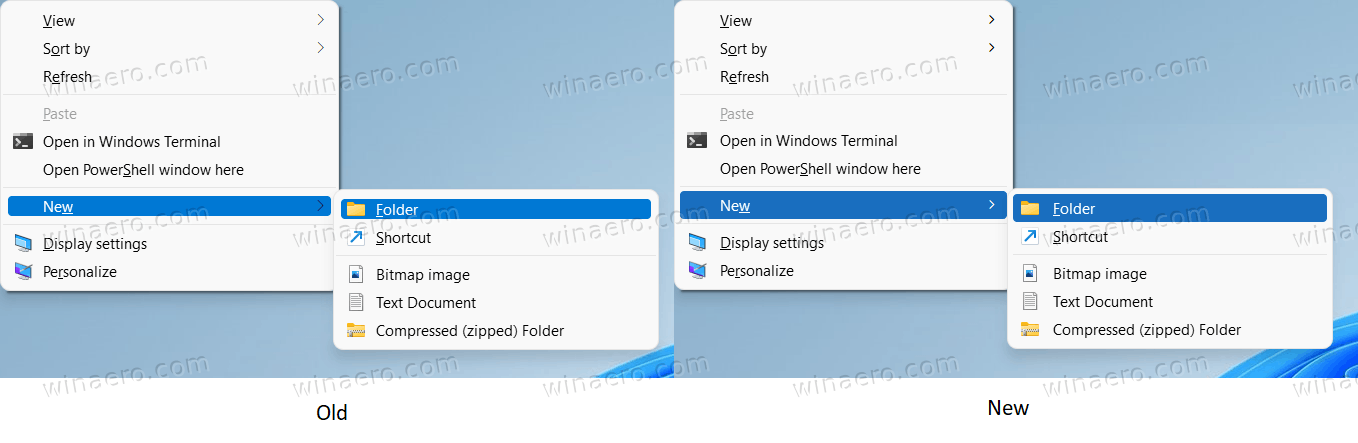
After installing Windows 11 build 22494, users noticed that the legacy context menus have a much better-looking selection highlight, which Microsoft did not mention that change in the official blog post. A surprise, to be sure, but a welcome one.
Here is a screenshot comparing two versions of context menus (Windows 11 22000 and Windows 11 22494).
If you use the stable version of Windows 11 and want to get those improved context menus, chances are you might receive them in one of the cumulative updates. In the changelog for a recent Dev build, Microsoft mentioned that some of the fixes from the active development branch might arrive in the stable channel before the next feature update. Unlike Windows 10, Windows 11 will be getting one "major update" every year. Bringing fixes and improvements from the active development branch will help improve the user experience without long waiting for the next feature update to arrive.
Besides improved UI for the context menus, the latest Dev builds contain several quality-of-life improvements. For example, users can adjust volume levels using the mouse wheel without opening the volume flyout. Also, Windows 11 now allows muting the mic using a button in the notification area during Microsoft Teams calls.
Support us
Winaero greatly relies on your support. You can help the site keep bringing you interesting and useful content and software by using these options:

I don’t like the new context menus with the blue highlightings. In the first insider builds it was highlited in gray. At first i thought the blue was a bug.
You can get the gray menus back easily: https://github.com/valinet/ExplorerPatcher/issues/18
You can get the gray context menus back relatively easily: https://github.com/valinet/ExplorerPatcher/issues/18
Thank you for your hard work Valentin
Finding some spare time to cover it!
Thank you as well for the great work with the site and Winaero Tweaker!
Unfortunately, grabbing `aero.msstyles` from the update and using it in build 22000.282 directly does not work perfectly: you get the fixed menus, but window open/close animations break. For the moment, I still prefer using the classic gray `aero.msstyles` file from 22000.51.
Unfortunately, grabbing the `aero.msstyles` file from the update and applying it directly to 22000.282 does not fully work: the context menus appear fixed and blue, but the window open/close animations break. For the moment, I still prefer using the file from 22000.51: https://github.com/valinet/ExplorerPatcher/issues/18
Thank you!
Definitely better than earlier. I hated the extremely light blue menus for selection of Vista, Windows 7 and 8 and the grey menus of Windows 10. The blue selection is a very welcome addition as it offers nice contrast. I can’t imagine why anyone would want to change them back to the inferior gray ones with lower contrast.