Microsoft is changing the appearance of the dark theme in the Edge browser. The company is shifting to pure black colors for the tab row and toolbars, in addition to the dark gray tone Edge currently sports.
The Edge browser can follow the system app style that allows it automatically switching to the light or dark mode when you change your preferences in the Windows Settings app.
If you don't like this behavior, it is easy to visit Edge's settings and pick the desired theme (light/dark/a customized one) in the Appearance section. The theme will stick and won't change any longer.
The dark appearance is very popular these days, so Edge follows the trend for long. Looks like Microsoft sees a room for improvements when it comes to the dark style of the browser.
Edge Canary includes even more dark theme that the Stable, Beta, and Dev versions have. It ditches the gray color and appears in solid black. The appearance slightly change with Mica + rounder UI enabled. But regardless of the control style, Edge now uses a full black background for the tab strip, toolbar, favorites bar, vertical tabs and sidebar. Here are some screenshots.
With Mica enabled
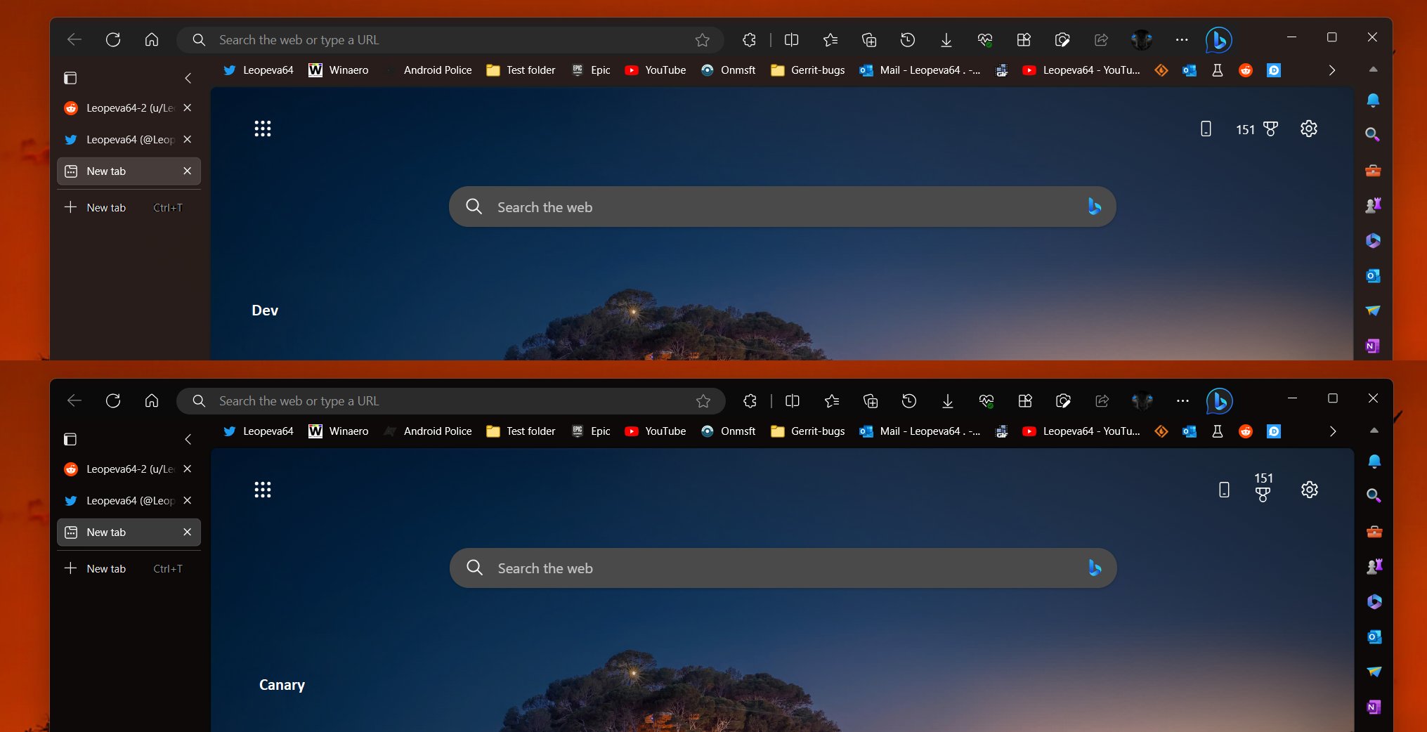
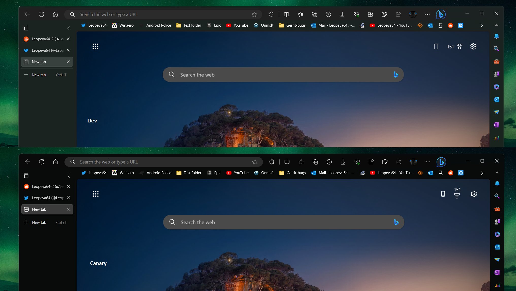
Beta channel vs Canary channel
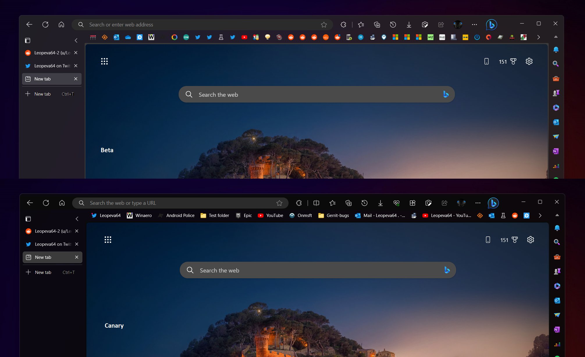
Mica disabled
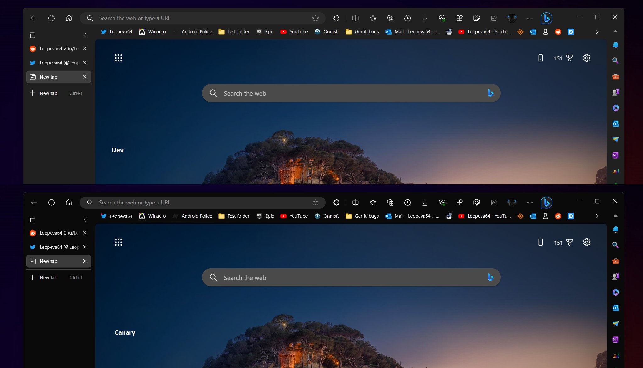
With an older UI style
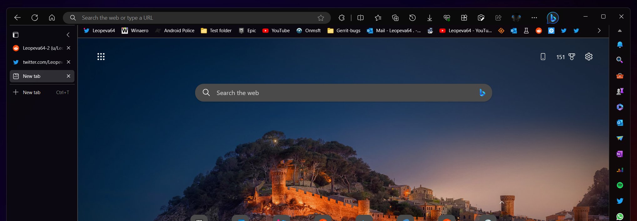
To try the change yourself, open Edge's settings, and navigate to Appearance > Theme. There, pick the Dark option.
Via @Leopeva64
Support us
Winaero greatly relies on your support. You can help the site keep bringing you interesting and useful content and software by using these options:

A year later, and Edge is still using the ugly old brown theme. Just got an OLED monitor, and a pure black UI would come in quite handy right about now… Any day, Microsoft, right? Right?..