If you are a Linux Mint user, you will be happy to know that Linux Mint 19.1 "Tessa" will be released around Christmas time. The release will include the Cinnamon 4.0 desktop environment with a refined user interface, along with various improvements made to different parts of the OS.
Advertisеment
The official announcement say the following:
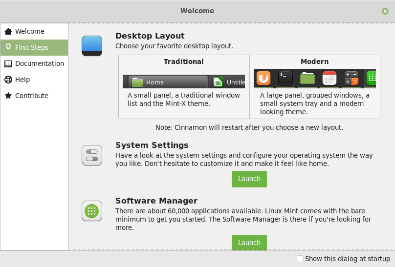
Cinnamon 4.0 will look more modern thanks to a new panel layout. Whether you enjoy the new look or prefer the old one, we want everyone to feel at home in their operating system, so you’ll have the option to embrace the change or to click a button to make Cinnamon look just like it did before. The idea of a larger and darker panel had been in the roadmap for a while.

The user will be able to choose between the traditional panel and a modern window list applet with window grouping and window previews. The modern version of the panel includes the following features:
- 40px icons
- 24px icons in the system tray
- Windows that are grouped by application
Users were given the ability to define a different icon size for each of the three panel zones (left, center and right for horizontal panels, or top, center and bottom for vertical ones). Each panel zone can now have a crisp icon size such as 16, 22, 24, 32, 48 or 64px or it can be made to scale either exactly (to fit the panel size) or optimally (to scale down to the largest crisp icon size which fits in the panel).
Other interesting changes of Linux Mint
Mint-Y improvements
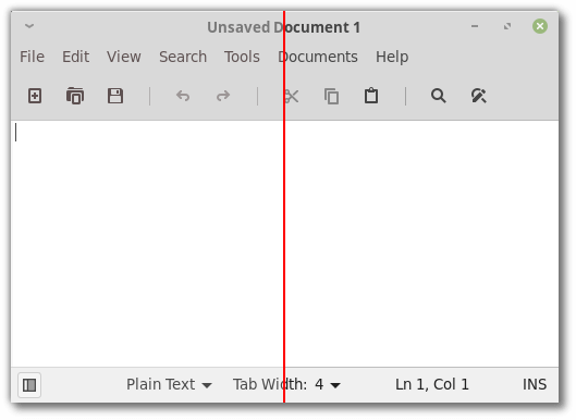
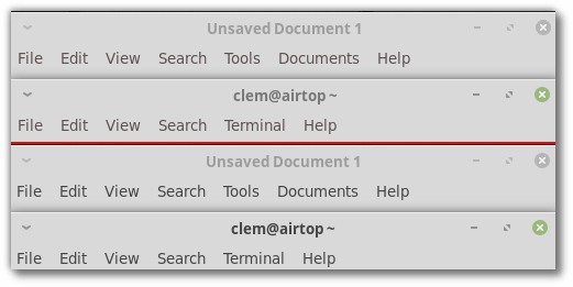
Due to the changes done to the theme, its contrast was increased, making icons and text more readable.

The changes also make it easier to visually identify the focused window:

Also, Linux Mint 19 featured monochrome status icons.
Xapp
There is a new icon chooser dialog added to the XApp library. It will be used by Xapps when it is required to select an icon or specify its path.
![]()
With all these changes, Linux Mint 19.1 looks like a nice Christmas gift to its users. You can learn more about the changes from the official blog post.
Support us
Winaero greatly relies on your support. You can help the site keep bringing you interesting and useful content and software by using these options:

Thank you for that. It strikes me that the word modern has become a bit sinister now. Perhaps the beginning of this was Microsoft’s use of the word to replace Metro but now the word has lost all meaning since up to date designs are considered ancient in a very few years and need to be “modernized.” This is all a bit off topic because I like Mint and I may like their new layout when I see it although I can’t tell right now. What I really can’t stand is that terrible and very common custom Firefox icon. The standard circular one is attractive and easily recognized so I will never understand why this dreadful thing is ever used. If I could replace just that one, it would be wonderful but icon sets always include the folders too so a nice theme gets degraded in the effort to lose that evil FF thing. Giving every icon the same shape makes them much harder to distinguish quickly so it’s just bad design. There, I feel better now! ;-)