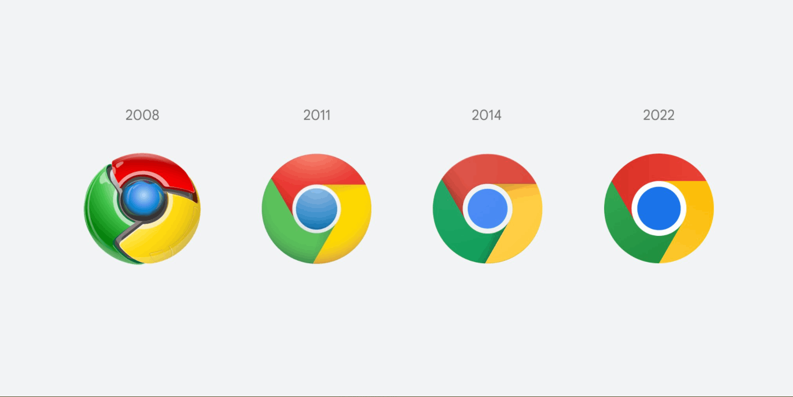
Eight years since the last redesign, Google changes the Chrome logo once again. Unlike the previous update, where changes were more apparent, it might take a minute or two for users to notice the difference between the current and the upcoming icon.
Advertisеment
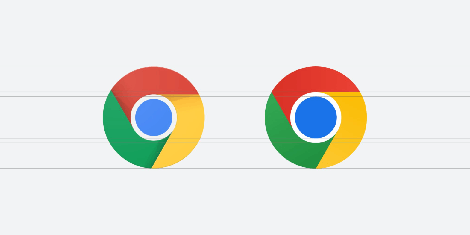
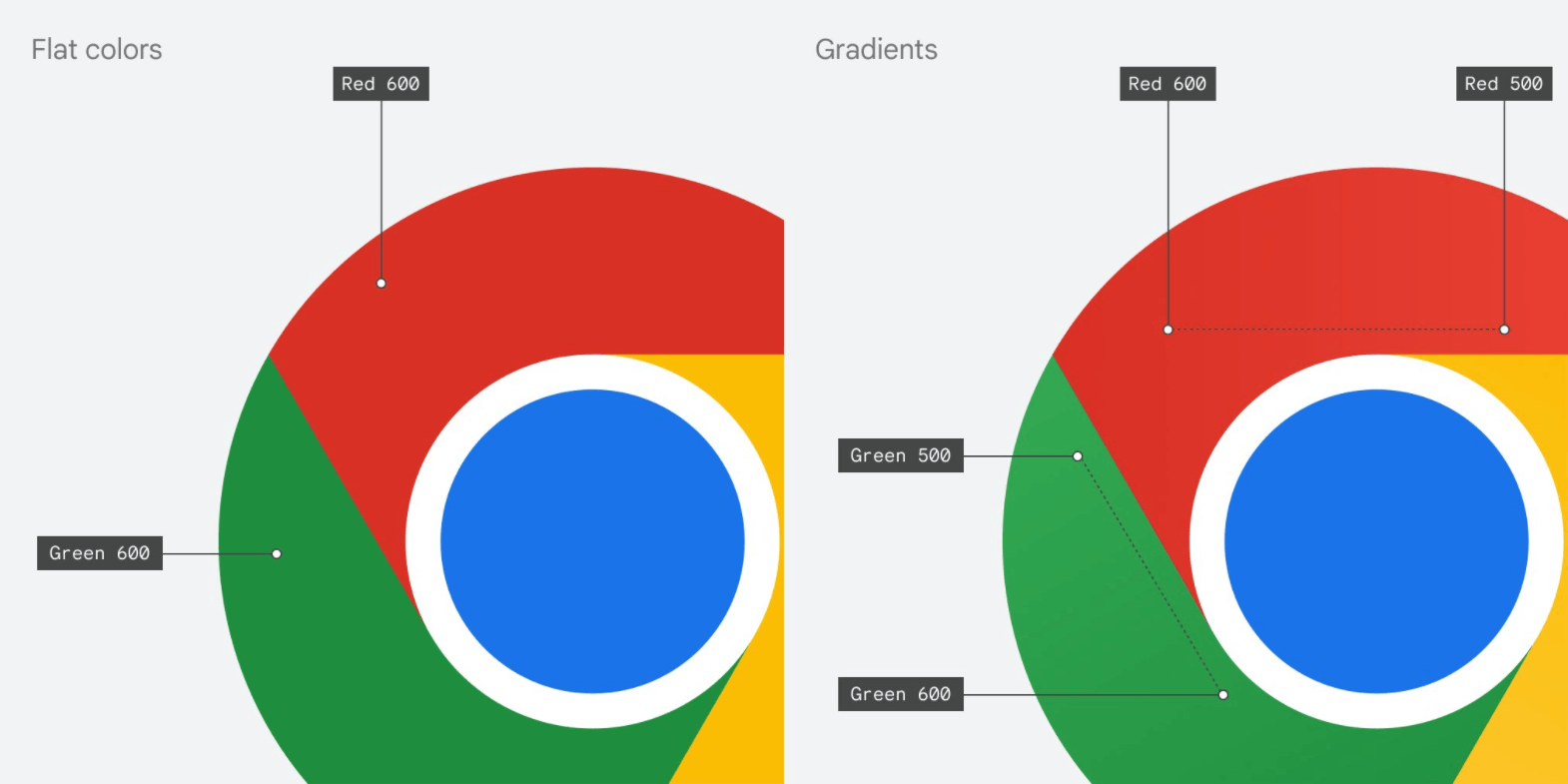
With the "fourth generation" of Chrome logo (previous redesigns happened in 2011 and 2014), Google continues flattening the icon by ditching shadows between colors. The three colors on the logo are now more vibrant, and the blue center circle is slightly bigger.

The company says the new icon has more subtle gradients, making it more accessible and removing "unpleasant color vibration" (a visual phenomenon where adjacent colors blend and create an unpleasant illusion of motion and blur).

Google's design team also tried adding white lines between colors on the logo, but they discovered that such a change makes the icon visually smaller and less distinctive from other Google services.

According to Elvin Hu, one of the Chrome designers at Google, the company will roll out the new logo soon. Right now, the updated icon is available for users in the Canary channel.
It is worth mentioning that the way Chrome looks on your device will depend on what operating system you use. Google will tailor the Chrome logo to OS-specific design guidelines.
For example, on macOS, Google Chrome will have an icon with a white background and a slight shadow.
On ChromeOS, Google will crank up the colors to make the logo look on par with other icons in the operating system.
Finally, on Windows, gradients on the Chrome logo will be more apparent. Again, to match other apps on your taskbar.
You can read more about the upcoming Google Chrome logo redesign in a thread here.
Support us
Winaero greatly relies on your support. You can help the site keep bringing you interesting and useful content and software by using these options:

Queue the oversimplified icon meme. When will this end?