Ever since Microsoft redesigned the taskbar in Windows 7 and simply declared it as a superior one, long-time users of Windows have been frustrated at being unable to use it the way they were accustomed to in classic versions of Windows. Not only did the reimagined taskbar change the design of many features without giving any choice but it also eliminated some features of the classic Taskbar. Let us see how we can make the new Taskbar work exactly like the good, old classic Taskbar. You will need to install a free third party program.
Advertisеment
Not all features of the Windows 7 and Windows 8 taskbar are bad. It does have some genuine improvements such as larger icons, the ability to rearrange icons of running apps, jump lists, and a system tray where you can easily drag and drop icons in and out of the overflow area for notifications. There are also some subtle improvements such as the date being always visible, progress bars on taskbar buttons, icon overlays to indicate status and Thumbnail Toolbars.
The new concept of pinning takes over the responsibilities of the Quick Launch toolbar but doesn't quite let you pin everything. There are definitely some improvements, but there is no reason why users should put up with the loss of many classic Taskbar features such as not being able to:
● Separate running apps from the non-running/pinned apps
● Access the right click (context menu) using only the mouse
● Ungroup multiple windows of the same app
● Reduce the extra spacing between taskbar icons and notification area icons
● See extra details in the tooltips of pinned apps
● Have multiple columns of icons for running apps when the Taskbar is vertical
● Select taskbar buttons and perform group actions on them such as group minimize, snap, close or cascade
● Turn off the Always on top behavior
.....and several other limitations
The good news is that even though Microsoft does not consider giving users flexibility in customizing the Taskbar, a third party developer, RaMMicHaeL has taken it upon himself to fix all these issues and allow us to tweak the taskbar to our liking. His free app, 7+ Taskbar Tweaker, lets you configure the taskbar exactly the way you want and it does so using its own code, not by tweaking registry values. Let us see some of the features and options it offers to make the new taskbar behave like the classic one.
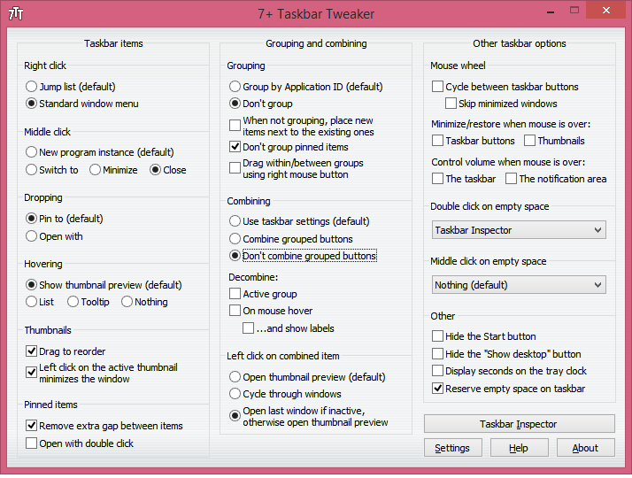
A walkthrough of basic options in 7+ Taskbar Tweaker:
- Download 7+ Taskbar Tweaker. It is free to use. The installer comes with a Standard option as well as a Portable option. If you choose Standard, the settings are stored in the registry. The Portable version will store settings in INI files. I recommend you to do a Standard installation so you can easily delete the Registry values at any time to get back the default settings.
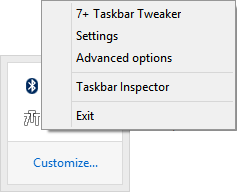
- Once you open it, it shows its tray (notification area) icon. Click the icon to access its regular options and right click it to access more Advanced Options. Let's explore some of the basic options one by one.
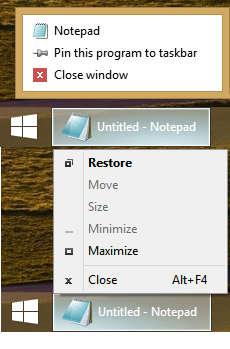
- The 'right click' option lets you change what right clicking on the Taskbar buttons does. I recommend you set it to Standard window menu instead of the default Jump List. You can still access jumplists in 3 different ways even if you set regular right click to show the context menu. You can Shift+right click with the mouse to show the jumplist. You can drag any taskbar button towards the center of the screen to show the jumplist. Finally, you can use the keyboard combination hotkeys, Win+Alt+Number # to access an app's jumplist.
- The next option lets you configure what middle click does. The classic taskbar had no use for middle click so you can set this one to anything you want. I set it to Close.
- The next option deals with what dropping something over to the taskbar button does. By default, when you drag a file from Explorer or the Desktop to an icon on the taskbar, it gets pinned to the icon's jumplist. You can change this so dragging a file opens it with the program you dragged it to. In the classic taskbar, you could drag a file to an icon inside Quick Launch to open it. You could also drag a file over to a running app's icon, wait for the window to get focused, or Alt-Tab to it, and then drop it inside the window. I personally leave the default option to "Pin to" because I can hold down Shift while dragging to do an Open With.
- The next option lets you turn off those thumbnail previews, so that only a tooltip shows like the classic Taskbar did, or turn the thumbnail previews into a list. Thumbnail previews are useless and annoying for me because they popup at the most inopportune times and show nothing useful because they are so small. Moreover, if there is more than one window of an app open, the thumbnails looks very similar and it's difficult to distinguish between the two without hovering over the thumbnails to preview the actual window. So I recommend you change this option to List.
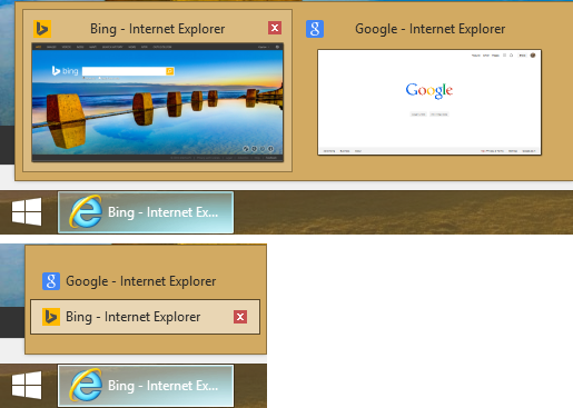
Thumbnails vs List Bonus Tip: Windows includes a hidden secret registry value to customize this particular behavior. You can set the following registry value so for a single app, a thumbnail shows but if there are more than 1 windows of the app open, it automatically shows a list. This is actually better than 7+ Taskbar Tweaker's option so if you set the registry value instead, set the 7+TT option to "Show thumbnail preview (default)". Note that after setting the registry value, you must restart Explorer.exe.
Windows Registry Editor Version 5.00

[HKEY_CURRENT_USER\Software\Microsoft\Windows\CurrentVersion\Explorer\Taskband]
"NumThumbnails"=dword:00000001
- The next option controls thumbnail behavior. Checking "Drag to reorder" allows thumbnails to be rearranged just like taskbar buttons. If you changed thumbnails to a list, you can drag list items up and down too. I also recommend checking "Left click on the active thumbnail minimizes the window" as this was the classic Taskbar behavior. This is useful if you taskbar buttons are combined.
- Check "Remove extra gap between items" so icons are placed less far apart. We covered this option in detail.
- The Grouping and Combining section is the most important. The classic Taskbar allowed you to turn off grouping whereas the new one doesn't let you change this unless you use 7+TT. Set this to "Don't group". Also check "Don't group pinned items", so you can cleanly separate running apps from non-running apps. This option is important to reduce the distance the mouse needs to travel to switch between running apps.
- The next option lets you always combined grouped buttons or never combine them. Personally, feel any form of combining is not intuitive because it requires more clicks to switch between apps. Also, grouping eliminates the ability to freely drag individual app window buttons. So set this to "Don't combine grouped buttons". There are also options to combine items but decombine them when the mouse hovers over them. Such level of customization is outstanding. Kudos to RaMMicHaeL for giving what Microsoft didn't.
- The section "Left click on combined item" will be of interest to those who prefer combined buttons but would have Windows open last window if inactive, otherwise open thumbnail preview.
- The next couple of options in the last column let you customize the taskbar behavior with mouse wheel. If you use a mobile device such as a laptop which has a touchpad or a touch screen tablet, these options aren't important.
- The "Double click on empty space" option is another useful one. It can do various functions - Show Desktop, show a sticky Alt-Tab (same as Ctrl+Alt+Tab), open Task Manager, show a Taskbar Inspector, toggle mute the system volume, toggle the Taskbar's auto-hide behavior, invoke Flip 3D or toggle between the Start Menu and Start screen (on Windows 8). Again, the abundant level of customization is simply superb. I set it to Taskbar Inspector since all other features have direct keyboard shortcut hotkeys in Windows. The Taskbar Inspector is a rather amazing feature of 7+ Taskbar Tweaker.
What is the Taskbar Inspector:
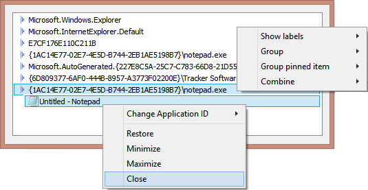
The Taskbar Inspector lets you view AppIDs of desktop apps (since only desktop apps get a taskbar icon as of Windows 8.1). I have written in the past about AppUserModelIDs which let you directly launch their respective target applications. AppIDs are stored in the registry (for Modern apps) and can also be stored inside shortcuts. Shortcuts with the AppUserModelID property are used by some desktop programs and all Windows 8 Modern apps for launching.
The Taskbar Inspector uses AppIDs to let you further control the grouping of taskbar icons per app! You can right click an AppID to control if that app always shows labels, or is always or never combined/grouped. You can also select multiple running apps/tasks in the Taskbar Inspector and right click them to group close, minimize or snap them (Tile horizontally and vertically). Once you open Taskbar Inspector, you can operate it using the keyboard too. Ctrl+A selects all items, and Ctrl/Shift keys let you select tasks, just as you would select files in Explorer.
Well, that's it for now. You can see that 7+ Taskbar Tweaker is an extraordinary app. The Advanced Options of 7+ Taskbar Tweaker are covered in another article.
Support us
Winaero greatly relies on your support. You can help the site keep bringing you interesting and useful content and software by using these options:

Nice find. I like that it is portable.
Mouse wheel options of 7 taskbar tweakker are gr8! thx
great program. thank you for sharing
’Left click on combined item’ will be definitely useful. I was using this program for several months, but didn’t know that there’s this and advanced options (other article ^_^).
Can this be run with Classic Shell/Menu installed?
Yep it is possible.