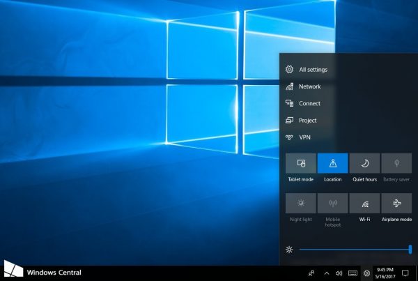
On the page announcing Windows 10 build 16199, Microsoft accidentally showed a different user interface for changing commonly accessed settings. While the screenshot was immediately removed from the announcement page and the feature is not enabled in the released build, some sharp-eyed observers were able to spot the change and save the screenshot. Let's see how it looks.
This new feature is currently known as "Control Center" and is represented by a gear icon in the notification area. This is the same icon that is used for Settings. When the user clicks the icon, the following pane appears on the screen:

Its appearance will remind you of Action Center. The same Quick Action buttons and controls are located at the bottom of the flyout. However, there are no notifications in this pane. Instead, there are quick links to various parts of the Settings app.
The Control Center is entirely customizable, allowing the user to change what shows up there, with additional options that allow you to reorganize some of the settings to your liking.
According to WindowsCentral, the Redmond giant may consider moving Quick Actions from Action Center, leaving it exclusively for notifications. This change is expected to be included in Fall Creators Update, which will be released in Fall 2017.
As of this writing, it is hard to say if the new pane is a good idea. Let's wait for a few builds and see how useful the Control Center can be.
Source: WindowsCentral.
Support us
Winaero greatly relies on your support. You can help the site keep bringing you interesting and useful content and software by using these options:

I don’t like it one bit. I prefer them all in one place.
Each build seems to clutter up the taskbar more and more.
This also means that we won’t be able to access quick setting via a swipe any more.
Why does the taskbar say “Windows Central”? Is this a similar implementation to OS X displaying the title of the currently focused program on the very left of the top bar (or whatever it’s called)?
I used their image. They put a “watermark” over the taskbar.
Hahahah