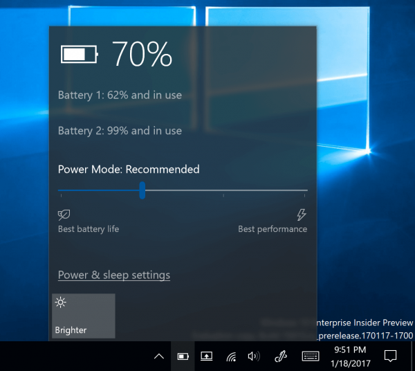
Starting with Windows 10 build 15014, Microsoft is starting to roll out a new user interface to change the power plan directly from the battery flyout. The feature looks promising and really useful. Let's see what has changed in the battery flyout in Windows 10 Creators Update.
Advertisеment
Windows 10 Creators Update will come with a refined user interface for the battery flyout. Here is how it looks:

It includes a power slider which allows the user to adjust the level of performance versus power saving features. Using this new option, the user can quickly switch the current power mode from "battery saver" to "best performance".
The slider includes four positions, as follows from left to right:
- Battery saver
- Recommended
- Better performance
- Best performance
The leftmost position means the best battery life, while the rightmost position of the slider enables full performance.
To Change Power Mode in Windows 10 (Power Level Slider), you need to click or tap the slider to set the desired value.
This is very useful for both touch screens and classic Desktop users. The power slider allows quickly switching the power mode of your device with just a few clicks. If you are typing some text, you can enable the battery saver mode and save as much battery life as possible. Once you start a game, you can continue with the best performance profile to get a smooth gaming experience.
As of this writing, the feature is still experimental and not enabled for all users. Microsoft is performing "A/B" testing for a select group of users. As of Windows 10 build 15019, some users have the new GUI enabled, and some Insiders have no access to this new user interface at all.
Microsoft is going to collect some feedback about these settings. They want to see if people like the battery flyout with the power slider or whether they are happy with the previous version of the user interface. If you are a Windows Insider, you can provide your feedback in the Feedback Hub app, under Power and Battery > Settings category.
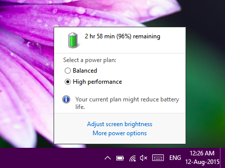
Tip: Get the old battery indicator and power applet in Windows 10 system tray

Previous versions of Windows starting with Vista had Power Saver, Balanced and High Performance power plans. Before that, in Windows XP, you had various power schemes. Microsoft has changed this terminology again in Windows 10.
So what do you think about this new user interface? Do you like it? Did you get it enabled in your Windows 10 installation? Tell us in the comments.
Support us
Winaero greatly relies on your support. You can help the site keep bringing you interesting and useful content and software by using these options:

Hi,
Thanks for sharing valuable information.
My question is that I’m on the same build by not seeing this option :(
The enabled it only for some users. Not for everyone.
hi thank you but I have not the slider like you !
is it normal ?
I have w10 familial 1703 – 15063.608
screen
https://s26.postimg.org/x55y1hew9/no_slider.jpg
This is a new feature of Windows 10 Fall Creators Update. You will get it in October 2017.