Accidentally, Microsoft today released a new 'canary' build of Windows 10 to all Insider rings. Windows 10 Build 18947 comes with features which weren't officially announced yet. One of them is the new Start menu.
Advertisеment
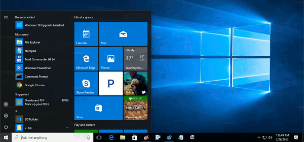
Windows 10 comes with a completely reworked Start menu, which combines Live Tiles introduced in Windows 8 with classic app shortcuts. It has an adaptive design and can be used on displays with various sizes and resolutions.
Starting in Windows 10 May 2019 Update, also known as 'version 1903' and '19H1', the Start menu has got its own process that allows it to appear faster, increases its reliability. Besides that, there are a number of usability improvements made to the Start menu.
Windows 10 Start Menu has Live Tile support for Universal (Store) apps installed on your PC. When you pin such an app to the Start menu, its Live Tile will show dynamic content like news, weather forecast, images and so on. For example, you can add a useful data usage Live Tile.
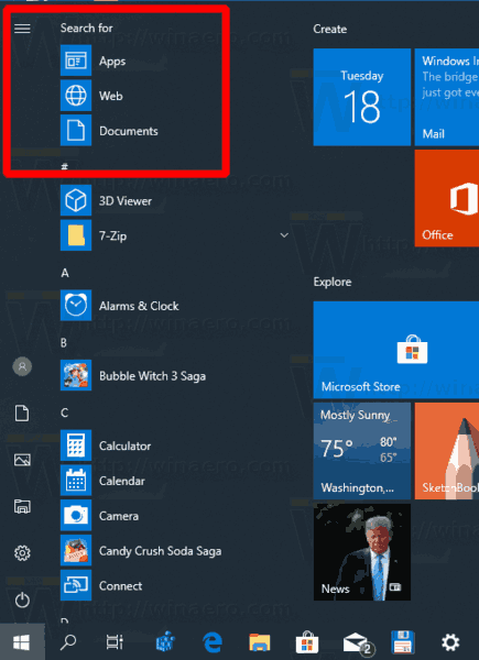
Starting in build 18917, which represents the upcoming 20H1 branch of Windows 10, the Start menu includes a new "Search" section in the top left corner.

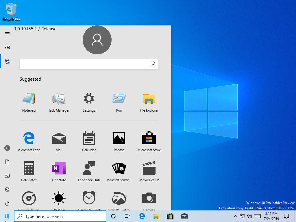
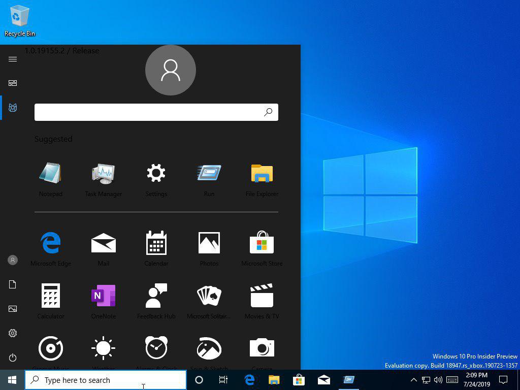
It looks like Microsoft is about to introduce a new Start Menu layout. It doesn't include Live Tiles out of the box. Instead, the Start menu pane renders large icons of pinned apps, and a huge search section. Here are a couple of screenshots:


The search box also includes the Suggested apps section that must be populated from your recent app activity.
It is a work-in-progress, so the new Start menu doesn't play nice with the dark theme of Windows 10.
What is your take on this new Start menu layout? Do you like it or do you prefer the current one? You are welcome to share your opinion in the comments.
Support us
Winaero greatly relies on your support. You can help the site keep bringing you interesting and useful content and software by using these options:

I like the new menu! :) Thanks Sergey!
Still not modern enough.
Will womit from new start menu! It’s awfull!
Looks like more advertising to me.
Can that search section be disabled?
No idea. I wasn’t able to install it here.
Same old, same old, nothings changed, just smoke and mirrors
I hate it.
I never could get used to their Metro UI Design. It always felt like a big step backwards from Windows 7. Yes, I know that relatively speaking, Aero is ancient, but it’s still gorgeous in my opinion at least.
By ‘Aero’ I obviously mean the thematic elements from Vista + 7 UIs. Vista is so beautiful too to this day, but it’s a memory hog.
I love Aero, specially over Vista UX!
Here’s how my Windows 10 looks with some cosmetic chnages here and there: https://imgur.com/yG1JCNG