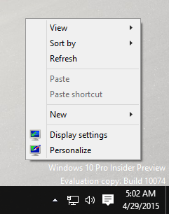
Users who installed the leaked Windows 10 build 10074 might have already noticed that in this build, Microsoft has removed almost all Appearance and Personalization options and moved all of those to the Modern Settings app! Also, the Personalize item in the right-click context menu of the Desktop now opens the Settings app.
If you right click the Desktop and select "Personalize" from the context menu, this is what happens:

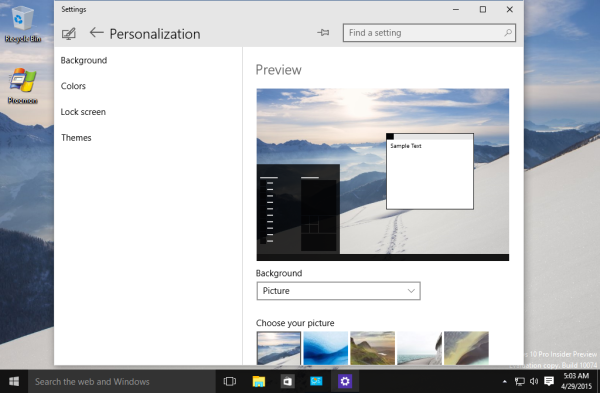
Instead of the traditional Control Panel window, the following page of the Settings app will appear:
Here, you can pick the background image for the Desktop, its layout, and toggle the desktop slideshow feature.
Note that you cannot pick the theme yet. This could mean that Microsoft decided to remove themes support from Windows 10 entirely to make it look the same on every device and for every user. Or maybe they haven't implemented it yet. Removal of themes might not be welcomed by many users.
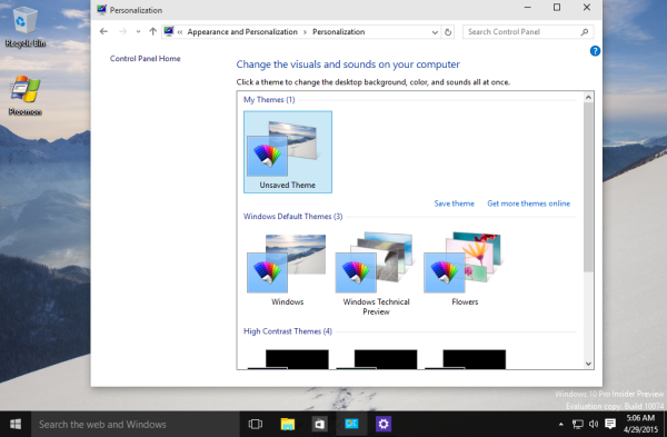
What happens to the classic Control Panel Appearance settings? Let's try to open them:
As you can see, there are no options any more here besides the themes list. There are no color options, no screensaver button and no desktop background options - everything is removed in favor of the new Settings app.
See these changes in action in the following video:
So, what do you think about these changes? Do you like them or would to like to have the option to customize Windows using the good old Personalization applet from the classic Control Panel?
Support us
Winaero greatly relies on your support. You can help the site keep bringing you interesting and useful content and software by using these options:

I think this is problem if you have common code for all devices. Just because it doesnot play well no one device they remove the code from all devices. Not good at all. I still prefer Classic control centre as against app but who am I to say? :)
I like the classic Control panel too, but will learn new way to manage these settings.
It looks like you didn‘t learn since you‘ve created an app for bringing back classic Personalization panel :D.
I see no point of moving everything into the Modern UI. I hope that in the future they at least improve the browsing window which is terrible when using Windows 8.1 (I‘m talking about the Modern UI one).
I think they already replaced it with “more classic” dialog in Windows 10.
Haven‘t tried yet.
i hope they not remove the classic Control Panel Appearance settings when Windows 10 general releaase
I think they will remove it.
They can remove whole classic Control panel.
Maybe in future.
I told ya so ;)
The old Control Panel is going away for good (finally!) It was a mess anyway.
And the whole Windows userland is becoming WinRT-based since Win32 is dead outside of the kernel, drivers, and specific use cases.
I see it around so that it is in these settings, increasing chaos. Windows 10 users still pushing slowly and surely do that you do not change anything from the appearance. Account management to turn off the annoying Buzz will not get to a modern setting. It starts moving in the same direction as the first Windows 8, Metro had loaded up to the start menu, this is a desktop computer for anything and it takes the whole surface.
Still, I just seem to think it’s more for touch devices than desktop keyboard and mouse and pissed me that it really can not be edited, because it is trimmed like a pig.
Therefore, I see no progress, but rather jump until the stones.
I think the removal of themes was a bad move I loved the fact I could pick one and everything matches. removing that makes everyone the same, no individuality. I hate it. The control panel thing is deal-able.
I cant find the download link of personalization panel v1.1.0.1 bcause it has classic display properties which was introduced in windows 98